Category: Web Design

Examples of Bad UX Design on Websites

A bad user experience, also known as “Bad UX”, is something probably every company has from time to time. We tend to think of digital interfaces when we think of UX. However, that association derives from the time the term “user experience” first originated in the 1990s, when widespread use of the Internet began.

UX is, in fact, a broad subject that applies to practically any facet of life. For example, here’s a sidewalk as an example of poor UX design:

bad UX design examples

Keep in mind, though their popularity goes hand-in-hand, there is a difference between web design and UX design – they are not the same creature.

Examples of Bad UX Design

You will discover several bad UX design examples throughout this article. Most of the examples will involve bad UX design websites, as the MARION team has unfortunately encountered these too often in our industry.

We’ll cover some bad website UX design topics like:

Websites with bad UX are still easy to find. It’s no surprise. It’s not easy to devise a brilliant website that meets or exceeds every expectation. Still, some could try a little harder. Below is a rogue’s gallery of bad user experience website examples.

Autoplay Videos

Autoplay video. Think CNN. Think Netflix. It isn’t only that you choose an article or film and suddenly scramble to turn the volume down. You also experience a perturbing lack of control when these things happen. You did not choose to watch anything; the website or app decided it for you, along with the effort of switching the annoyance off.

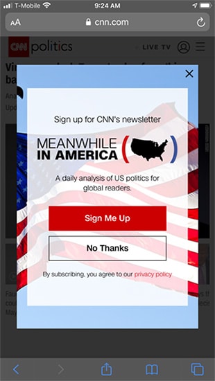
CNN’s autoplay videos along with its persistent popups in every session begging for email subscriptions make it one of the worst user experience websites.
bad UX design websites

Hidden Navigation

Making a website or app easy to navigate for everyone should be a top priority. Because modern websites need to fit both desktop and small smartphone screens, the navigation is often converted to a hidden feature revealed only by toggling a button or icon.

Usually, when the width of the screen falls below a certain threshold, the full menu is hidden, and the mobile menu toggle appears. Sometimes, websites resort to hiding navigation on both desktop and mobile screens. How a user interfaces with a product is generally referred to as user-interface, while the whole experience is considered “UX.” Navigation is typically a part of UI and UX, but keep in mind that there are differences in UI vs. UX.

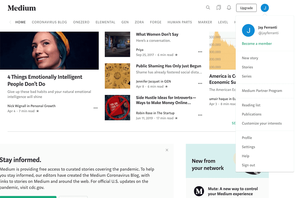
Here’s an example of hidden navigation: Medium.com. There’s nothing to indicate the icon at the top right is clickable and contains many important links.
websites with bad UX

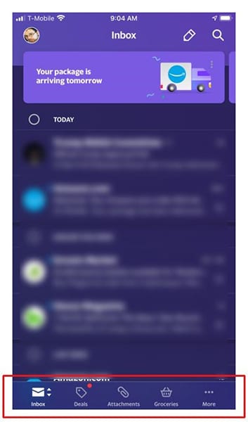
Usability studies show that this practice can be improved by adding icons that kept in plain view at all times for essential features. Here’s an example of web design that includes effective icons: The Yahoo mail app inbox. Because icons alone are often not enough to help people identify their purpose, a text label is also included.
good vs. bad UX design

Difficult Navigation

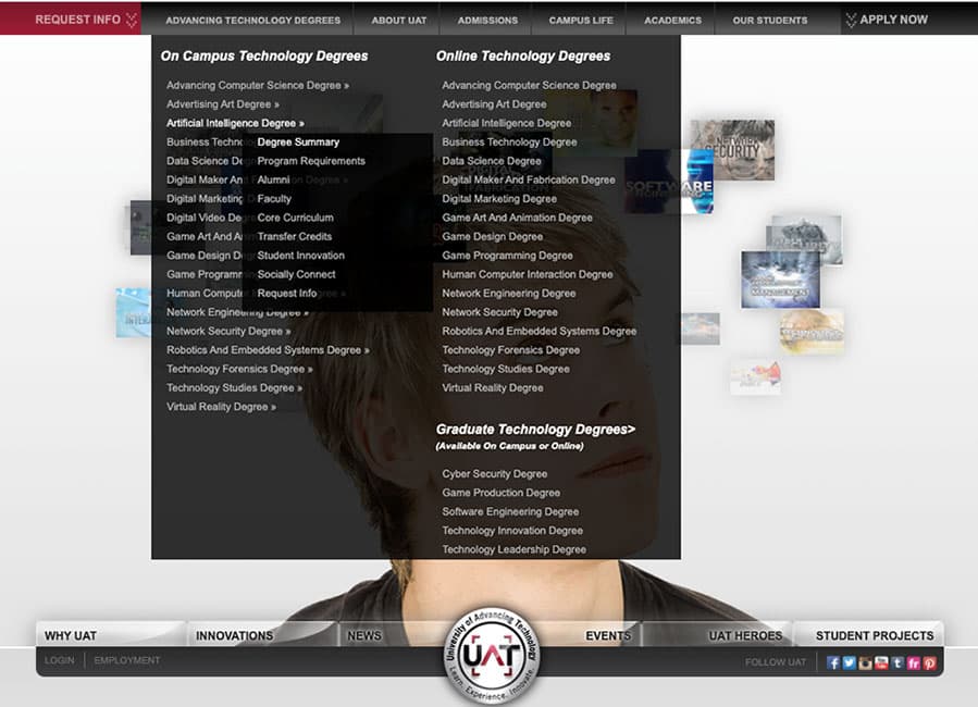
The University of Advancing Technology offers a challenging curriculum. But, to find a course you must first take this eye-test of a multi-layered flyout submenu, in tiny gray text over a black background on their website.
examples of bad UX design

And we all know and love the Amazon header. This combination of usability disasters is incredibly busy and unattractively designed. In the desktop view, you see a horizontal row of destinations, but most of the menu is hidden under the mobile menu toggle.

The menu “hamburger” icon is squeezed into the top left corner. Because it’s fighting for its life in the space provided, the menu toggle is exceptionally difficult to find.
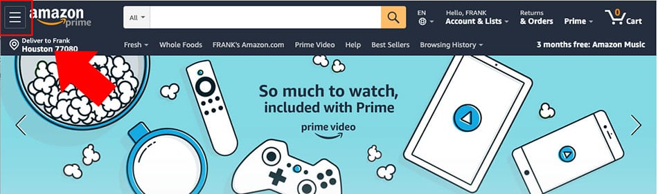
bad user experience website examples


Dark UX

“Dark UX” or “dark patterns” refers to ways some websites intentionally deceive, conceal information, confuse, or attempt to trick the user. To learn more about the many techniques of Dark UX, such as misdirection, privacy Zuckering, roach motels, and others, visit https://www.darkpatterns.org/.

Darkpatterns.org was conceived by Harry Brignull as part of a campaign to raise awareness of dark patterns. Darkpatterns’ twitter feed, @darkpatterns is a great place to expose these shady techniques should you run across any.

Here’s one of the most pernicious examples of dark UX trickery: the giant green download button ads. For the unwary, these buttons trick the user into thinking he’s found the download link for a product he needs. But in reality, they are misleading and possibly dangerous attempts to get the user to do something he did not intend.
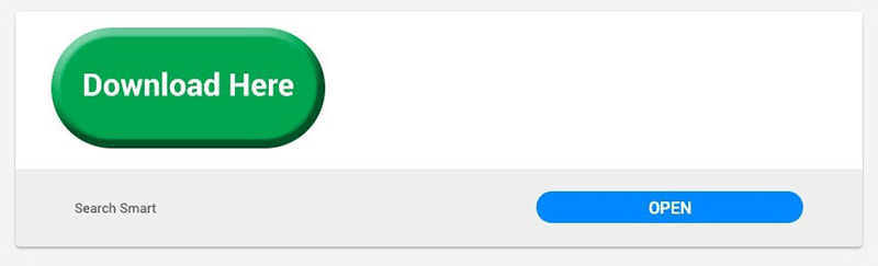
poor user experience

Google has provided policing of this practice and will block websites that display these types of ads, however, they are still in wide use as of this writing.

Discoverability

When something is hard to find on a website, it falls under the UX category of discoverability. For example, see the Facebook Friends List, below. The link is hidden in the left menu at the bottom, but only visible after clicking More. Why is it so hard to find? It doesn’t make sense.

Friends are what Facebook is all about. It’s at the end of long list of ugly clip art style icons. The Friends List is not the only hard-to-find option on Facebook. To update your security settings, you may need to consult Google for the latest Facebook security How-To.
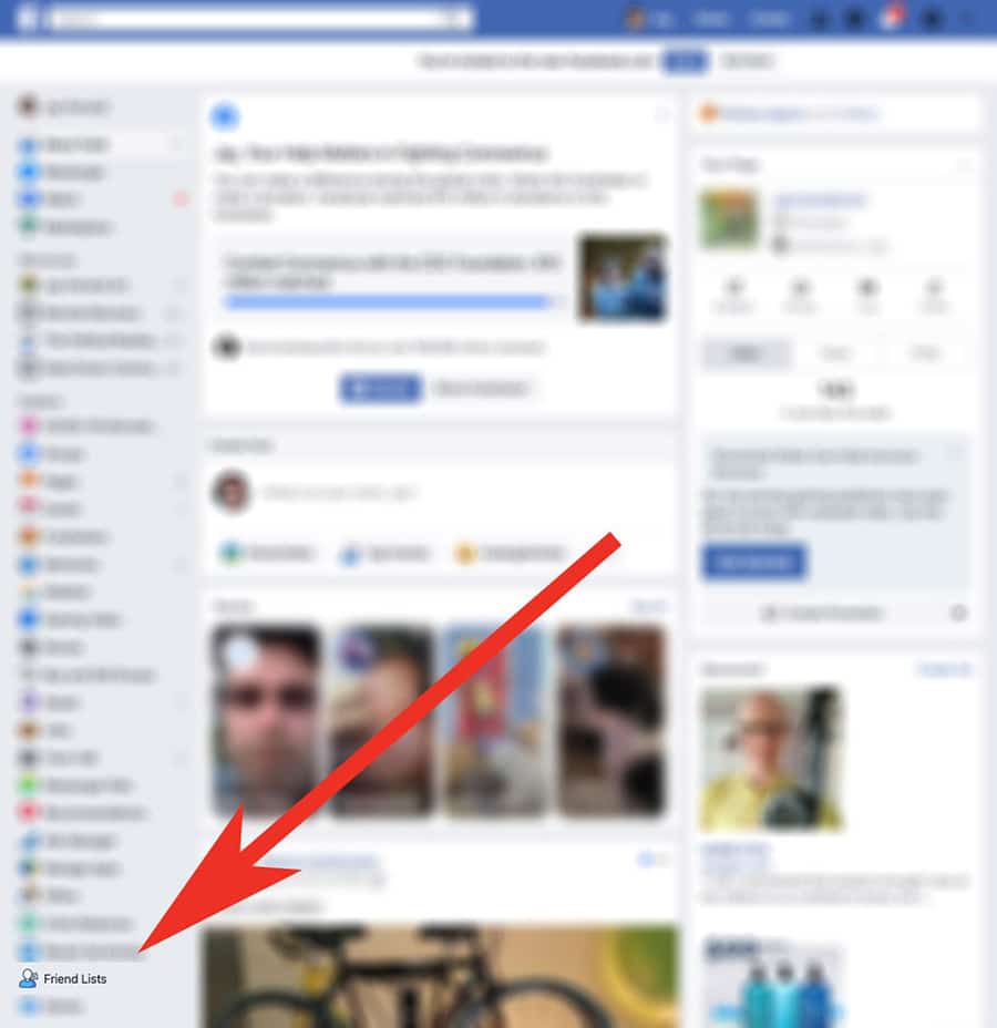
worst user experience websites

Performance

Probably the most serious of all usability issues is a slow loading website. It’s the most serious because it’s the one that will prevent someone from ever seeing your content. Many usability studies show that websites that take more than 2 seconds to load have high bounce rates, that is, the user simply chooses not to proceed to the site at all. Enlisting the help of a quality SEO firm is one way to combat slow load times.

We checked performance of some well-known ecommerce sites and were surprised to see this major retailer receive a grade of 4 (out of a possible 100) for its mobile experience. The desktop experience was not a lot better at a grade of 15. Frequently, taking some simple configuration steps will help improve website load times.
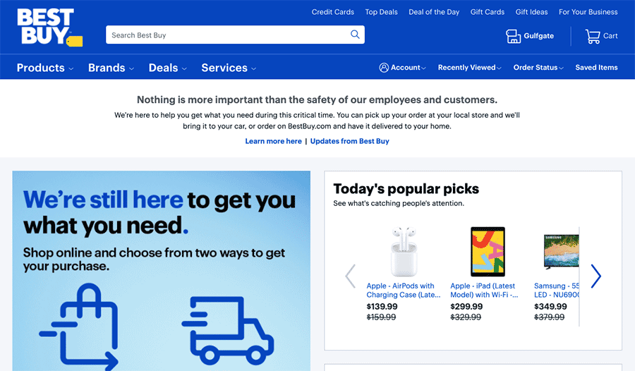
bad user experience websites

Get help from our SEO agency in Austin if you’re struggling with slow load times!

Get Quality Design with Help from MARION

While our article mainly concerns digital UX, naturally, at MARION, we are concerned with good vs. bad UX design in everything we create for our customers, whether it’s a website, a business card, brochure, or box!

Our Houston, DFW, and Austin web design team and marketing strategists are at your fingertips. Contact us today to schedule a free consultation!

Marketing emails you’ll actually want to read.

Get marketing tips and news sent to 
your inbox.

This field is for validation purposes and should be left unchanged.
Name(Required)


UX Design vs. UI Design: How Are They Different?

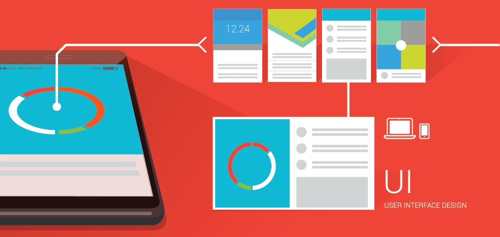
UI and UX design are often confused with each other. While they can overlap, they are substantially different concepts. So, what exactly is the difference between UI and UX?

In this blog post, we’ll aim to explain the two processes in simple and easy to understand terms and how they complement each other.

What Is UX Design?

UX design vs. UI design

User experience (UX) encompasses the overall experience that users have with your product or service. UX design is the process of making this overall experience as smooth and enjoyable as possible.

Keep in mind, the differences between web design vs. UX design are a different story, but we cover that on the MARION blog as well!

Why Is UX Design Important?

Effective UX design shows that you understand what your consumer needs and wants and that you are willing to help solve their problems. Good UX design will create loyal and returning customers because you care about providing pleasant and painless interactions so they can focus on other things.

What Does a UX Designer Do?

A UX designer will first create the wireframe and “logic” of the user’s journey. This means they must conduct a considerable amount of research to identify the consumer’s pain points. Their job is to create an experience that is as seamless and beneficial as possible.

UX designers must imagine all sorts of undesirable scenarios in advance and create solutions to prevent those issues. UX team members often develop and conduct user tests to do so.

UX designers must have a holistic knowledge that can overlap with roles like data analyst, copywriter, graphic designer, and much more. They must be able to coordinate with several other teams of programmers, designers, and possess persuasive speaking and presenting skills.

For all-encompassing web design in Austin, Houston, or DFW, contact the MARION team today!

What Is UI Design?

UI/UX design difference

User interface (UI) design typically involves anything the user interacts with, such as buttons, screens, visual layout, color schemes, or sounds. Anything the user can physically see, touch, and hear would fall under UI design.

Why Is UI Design Important?

UI design is important because you want your product or service to be easy to understand and impactful. Bad UI design can often lead potential customers to feel like your website or application is difficult or confusing to use. Unappealing visuals and clunky interactions can also make your business seem behind-the-times or bland.

What Does a UI Designer Do?

UI designers are responsible for creating the brand’s look and how to execute this style consistently and recognizably in an accessible and relevant manner. They will create several prototypes and tweak until any flaws are gone. UI designers must also be able to work with several other teams, making effective communication one of the most important skills a UI designer should possess.

Our marketing agency in Houston has decades of experience delivering attractive, high-performance marketing materials for Texas-based clients. Contact us for help!

Main Differences Between User Interface vs. User Experience

UX design can be both physical and tangible. UX design encompasses customer service, visual and audible designs, usability, and much more. UX design focuses more on the “human”- delivering what the consumer knowingly needs and wants. There is also an element of project management and the ability to construct and track goals. Generally, UX design will come first and UI design after.

UI design, on the other hand, is concerned with the visual design and the aesthetics of the product. This includes components such as layout, typography, buttons, color scheme, animations, and much more. Their goal is to naturally guide users seamlessly through their journey through each screen they interact with.

A metaphor that can help explain the difference between UI and UX designers is that the former is how good a car looks while the latter concerns how it feels to actually drive the car.

How UI and UX Design Cooperate

UX designers create the blueprint with research to back up their decisions. First, they provide the framework for the product and dictate its purpose. Meanwhile, a UI designer makes the UX designer’s plan happen. They make sure the dream is realized through attractive visual design and making the interface as intuitive as possible.

While the UX designer maps out the flow of the user’s journey, the UI design team will be hard at work fleshing out the elements of each stage. Without a UI designer to translate the UX designer’s wishes, the result would not be as beautiful or intuitive.

Contact MARION for Expert Web Design and UX

Effective design helps create positive experiences for your customers, which translates into loyalty and an increase in reputation. Whether you need assistance with UX design or UI design, MARION is happy to help! Our Houston web design professionals have decades of experience helping clients achieve their desired results.

Contact us today for more information on the services we provide.

Marketing emails you’ll actually want to read.

Get marketing tips and news sent to 
your inbox.

This field is for validation purposes and should be left unchanged.
Name(Required)


3 Best Contact Us Page Content Examples [With Contact Page SEO Tips!]

The contact page is extremely important because if a visitor is on this page, they’re trying to speak with you or ask some critical questions. This can be a turning point for your business relationship. Make sure you direct them to the right person or department so both parties can benefit.

Content for Contact Us Page

Any effective website contact page should have the following basics:

  • Company name
  • Addresses
  • Phone numbers
  • Email addresses
  • Contact form

Your Contact Us page should also clarify any potentially confusing information, such as multiple locations or departments.

Contact Us Page Message

Your contact page may be the first page a potential customer clicks on after searching for you online. Therefore, it’s good practice to have a short summary of your business including who you are and what you do.

Contact Information

Visitors may have different needs and preferences – generally, businesses should try to include as much contact information as possible in case one might prefer email over calling first. Of course, this may not work in your company’s situation, so keep your specific priorities in mind.

When to Include Phone Numbers

It’s always necessary to have a general office number displayed somewhere easy to see on your contact page. However, if you have multiple departments or specific people to contact about certain issues, you may want to include their numbers, as well.

It’s also a good idea to include office or contact hours when possible if the people behind the phone numbers aren’t reachable 24/7.

When to Include Map

A map isn’t always necessary, but if your business is located in a confusing spot or have frequent visitors, it could be beneficial for you to provide a map to highlight where you are. There are also several tools that allow you to embed interactive maps onto your website so people can get individual directions from their specific locations.

contact page content for forms

Contact Us Form Content

Even if you’ve provided information like phone numbers or emails, a contact form still makes it extremely convenient for a customer to take the next step with your business. Every contact form should include boxes for website users to fill out their:

  • Name
  • Contact information
  • Reason for messaging your business

You can get more specific if you’d like. For example, it might make sense for you to ask them to leave their company name or get the parameters for the potential project they’re inquiring about.

Contact Us Page SEO

A contact page can assist with your website’s SEO, so take advantage of these smaller elements that are often overlooked.

If you’re in need of SEO in Austin or Houston, contact MARION to schedule a free consultation today!

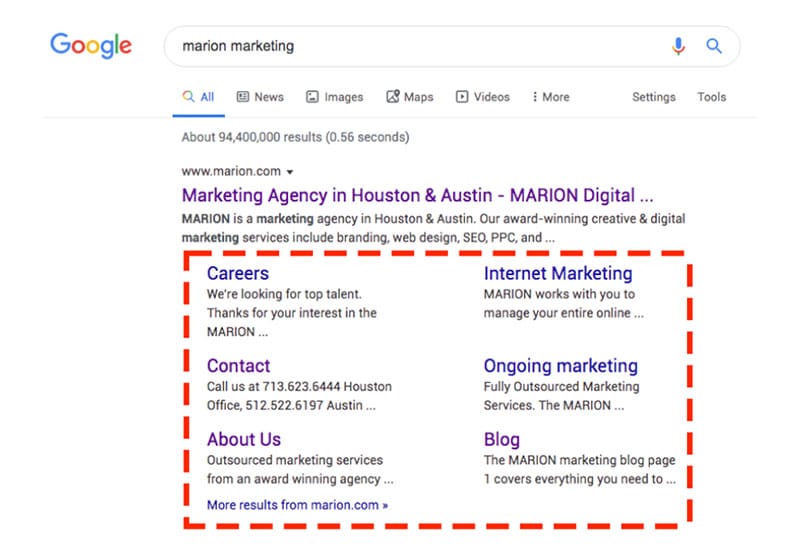
Site Navigation Element Schema

The SiteNavigationElement schema markup allows search engines to understand relevant information about your website’s layout that could affect your business’s search results.

According to a study by Searchmetrics, websites with schema markup rank an average of 4 positions better than websites without, but it’s important to note that this may not be a direct, causal relationship.

With contact pages, Schema and an SEO-friendly web design can make it easier for visitors to directly click on the webpage from search results so they can quickly find the contact information they need.

meta-description for contact us page

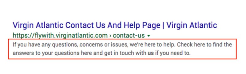
Contact Us Page Meta Description

A meta description pulls a snippet from the website, but you can also change it to your liking in your website’s CMS (especially if your site uses a WordPress web design).

Try to keep the description around 160 characters and use relevant keywords so it’s direct and to the point. For a contact page, it helps to have a short description letting visitors know they’ve found what they’re looking for.

contact us page SEO

How to Write a Contact Us Page for a Website

When writing a contact page, you want to keep things direct and simple. Make sure you have all the basic information, such as phone numbers, email addresses, physical locations, etc.

For those who don’t want to exit the page or call, a contact form is a great way to generate new leads. If you want to go beyond, you can write additional copy listing which city (or cities) you operate in and the services you offer so new visitors immediately see what your company does.

Contact Page Examples

Look at some of the best contact us page examples we’ve seen recently:

1. FreshBooks

website contact page examples

Source: FreshBooks

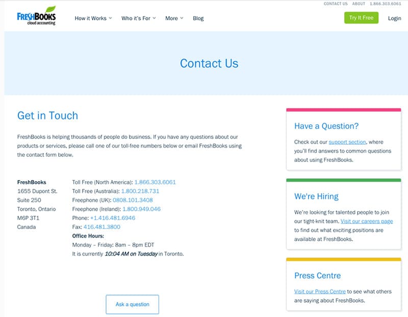
FreshBooks has all the basic information such as their address, phone numbers, and a contact form. Beyond that, this is a good example of a clean and simple, yet innovative contact page. All the relevant phone numbers are displayed in a simple manner so it’s easy to find the correct number for your specific need.

They also list their office hours and have a handy, live notifier underneath to let you know what the current time is in their location. On the right side, they’ve listed other possible departments and webpages you may be looking for.

2. Protest Sportswear

contact us page examples

Source: Protest Sportswear

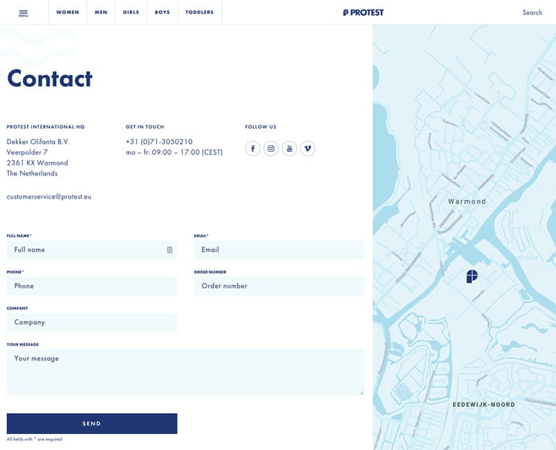
This contact page is very straightforward yet pleasing to look at. They list their address, phone number, email address, office hours, contact form, and buttons to follow their social media profiles. They’ve also incorporated a picture of their location on a map as part of the design of the contact page. This page is effective because it shows you everything you need to know in a clear and direct manner.

3. Wendy’s

how to write a contact page

Source: Wendy’s

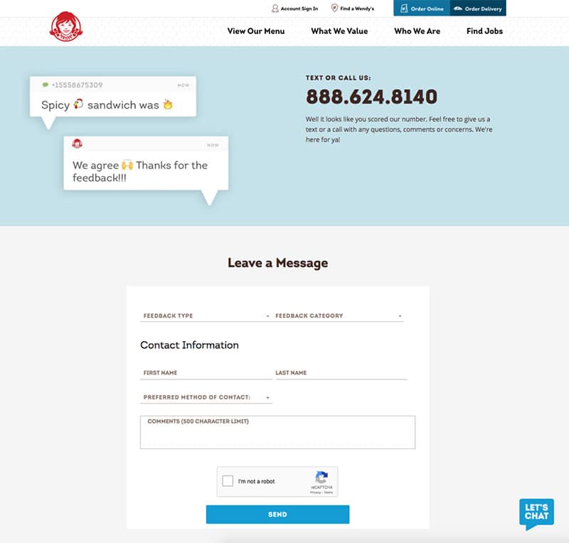
Wendy’s contact page is a good example of making sure your contact page aligns with the rest of your branding without distracting you from critical information. They have a casual message and witty copy with a blown-up phone number so you can’t miss it. There’s a simple contact form underneath if you prefer an electronic “paper trail” as well.

If you’re looking to step up your graphic design in Houston, contact MARION today for a free design consultation.

Let MARION Enhance Your Website and Search Presence

Optimizing your contact page copy is a great way to help boost your website’s SEO, but it can be difficult to know what you’re doing without an experienced Houston marketing agency in your corner. If you’re looking to improve your website’s search presence and user experience, MARION can assist you.

Contact us online today to see how our expert team can help!

Marketing emails you’ll actually want to read.

Get marketing tips and news sent to 
your inbox.
This field is for validation purposes and should be left unchanged.
Name(Required)

Website Homepage Content Ideas – What to Write

When creating an effective business website, one of the most important elements to think about is the first thing your potential clients will see – the homepage!

Your website’s homepage is often the first thing your potential customers will see.

4 Questions Your Website Homepage Needs to Address

In his book Don’t Make Me Think, User Experience (UX) expert Steve Krug highlights the four questions that he asks when evaluating website homepage contents.

  1. “What is this?”
  2. “What can I do here?”
  3. “What do they have here?”
  4. “Why should I be here – and not somewhere else?”

These questions seem pretty obscure and open-ended, but you can address them using homepage content sections that align with your overall marketing strategy.

Learn about five of the most important things to include on your homepage to turn visitors into customers and advocates for your brand.

5 Website Homepage Content Sections to Include

You only get one first impression. Make sure your homepage content comes off as polished and professional while creating an online presence for your business.

  1. Hero Message
  2. Navigation
  3. Product/Service Overview
  4. Social Proof
  5. Helpful Footer

1. An Effective Hero Message

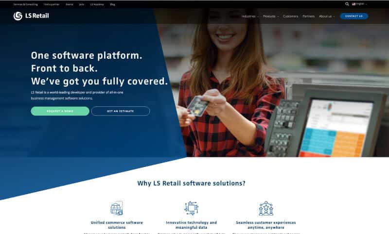
Dumping a whole mess of text and out-of-context images onto your homepage does nothing for visitors. Instead, have an eye-catching hero image that instantly tells them what you do and/or what you offer. A concise hero image and message is one of the most frequently recommended components in B2B website examples.

Take some extra time to craft the perfect, clear headline focused on all the benefits you can bring to the table. Make sure you include a call-to-action at the end to get them started with your product or services.

homepage content for website

LS Retail

2. Easy Navigation

After visitors are hooked, the next step is providing them with a smooth experience when navigating your website. Make sure that each category is clearly titled and organized- disoriented visitors will quickly leave if your website is not intuitive. The goal is to not make them “hunt” for anything- instead, you should focus on providing all the information they seek and more.

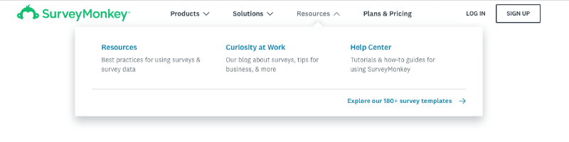
One important improvement to your navigation is making every navigation element clickable. Add an arrow to indicate drop-down menus and differentiate them from direct links. This ensures that people clicking on subcategories can find more pages pertaining to what they’re looking for.

Keep in mind that an important element of the menu items found on your homepage is being able to tell which one is active once they start exploring. A cleanly-designed top navigation uses hierarchies and color differentiation to make it obvious where they are located within your site. For example, using breadcrumbs or styling the menu link that is currently active within the top nav to have a different color and background can help users determine exactly where they are.

Don’t forget to make sure that clicking the logo takes them back to the home page. Users have come to expect this as standard practice, and good web design companies will know to implement a clickable logo.

It can be difficult to predict user behavior or what they’re looking for but brainstorming and testing different content hierarchies and sections of a website homepage can make a big difference. You can use tools like heatmaps to see which format works better over time.

website homepage content ideas

SurveyMonkey

3. Overview of Services or Products

When people come to your website, one of the primary things they are looking for is what you offer. You want to easily display your services or products offered so they can immediately see the different options. If someone is looking for what makes your company special compared to your competitors, they’ll want to leave if the message is muddled and hidden.

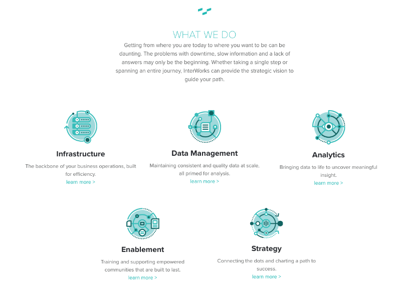
One of the best ways to avoid that scenario is to have simple visual representations with a sentence or two accompanying each one to summarize or elaborate each service. Keep the message direct and clear so that potential clients can zero in on what they want from you as fast as possible!

what content should be on a homepage?

InterWorks

4. Social Proof and Success indicators

People want to know they can trust your company. Luckily there are several ways to earn this trust. One idea for what content should be on a homepage is social proof. In marketing, social proof is a method of using third parties to influence potential customers.

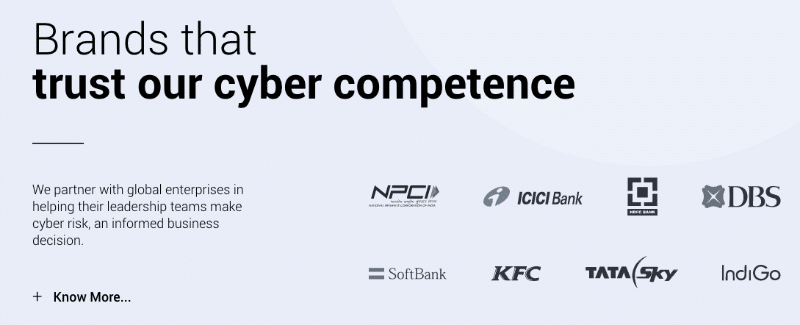
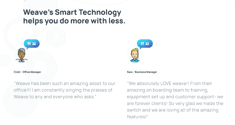
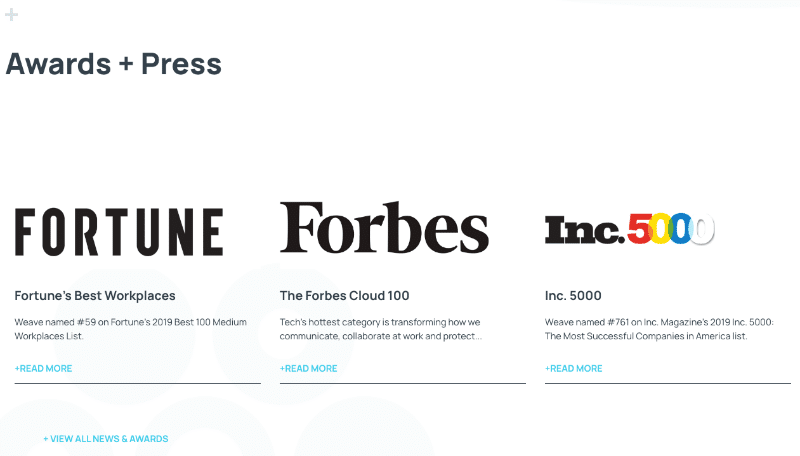
Social proof can come in many different forms. Anything that is evidence of your success is a good way to indicate your trustworthiness. For example: customer testimonials, a board of client logos or businesses you’ve partnered with, awards you’ve received, case studies, press mentions, positive statistics, etc.

The more examples you can provide of your company’s skill and superior performance, the more people will want to work with you.

You can start building social proof by learning how to get Google reviews for your business.

content for website homepage

Lucideus

what to write on a homepage

Weave

what to put on homepage of website

Weave

5. An Organized Footer

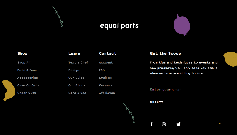
A footer is an underrated element of a website homepage. A good footer grounds a website by offering an organized view of the most important links on your entire website and useful external links such as social media profiles or partner websites.

If someone is having trouble locating something, they will often scroll to the bottom of the webpage looking for the footer as a guide.

One of the most important things you can do is include a contact page or even a way to sign up for your newsletter. Making sure customers can easily find contact information or frequently asked questions can help convert visitors into leads.

creating a website homepage

Aloha

homepage best practices

Equal Parts

Let MARION Help You Design Your Homepage

If you’re struggling to decide what content should be on a homepage, a custom website design company like MARION can help! Our SEO, content, and web design specialists come up with a straightforward plan to implement the best website homepage content ideas or your brand.

Contact us online today to schedule a free consultation!

Marketing emails you’ll actually want to read.

Get marketing tips and news sent to 
your inbox.

This field is for validation purposes and should be left unchanged.
Name(Required)

The Gutenberg Block Editor Revisited

Soon, I wonder, will web design companies and developers be going from mockup to live page without coding a custom template for every layout variation on a website? Will expensive and slow page building plugins be a thing of the past?

In this article we will look at some features that give the WordPress Gutenberg editor the kind of flexibility required to create complex modern website layouts. But before we get to that, it will help to understand why WordPress needs this much built-in editing capacity.

The Why

By default, WordPress can publish a blog, which consists of articles (also called posts) arranged in reverse chronological order and meant to be timely. Default WordPress also publishes pages: individual pieces of content of a more permanent nature and delineated more by subject than time. WordPress gives you blog posts and website pages along with an interface to manage both requiring no additional software or coding skill. It’s no small feat to do all that.

Which is great. Except that we want more. We often need more. In fact, making things look good isn’t only aesthetic. We aren’t being picky, fancy or high falutin’. In most cases, a website must look good to compete in the marketplace.

Web designers know that every company has a unique message and its website must be tailored to express that message precisely — which is nearly impossible without a custom web design template built by a developer.

Not long ago you hired a programmer if you wanted to include more than paragraphs and bullets in your WordPress web design. Or like me, you got a book about HTML and rolled up your sleeves.

Enter Drag-N-Drop Page Builders, which are plugins built to provide advanced control over the display of content without coding. This nearly eliminated the choice between CMS vs. website builder – now your CMS can function as both.

While some of them are extremely impressive, they have a few drawbacks. For one, they tend to cost money. And, some of them require more money to extend support and updates.

Secondly, they aren’t native WordPress code and must be actively maintained by their developers for the life of your WordPress website. If the plugin can’t be updated, then at some point it should be uninstalled for security reasons. And if you uninstall your page builder, chances are good your content will render as a giant blob of unformatted text littered with massive amounts of visible page builder code.

Third, page builders load a large amount of script and assets that can sometimes slow your website. Improving website load time can be a tedious task, and it’s much easier to avoid a bloated, slow website in the first place.

WordPress has evolved over time and will continue to do so. New features are added to make publishing easier along with countless other refinements.

Now, WordPress must compete with Wix, Squarespace and other content management innovations. While the original WordPress editor (TinyMCE) could handle routine content formatting tasks, anything beyond that required HTML either coded manually into the Text editor or into the page template itself.

Gutenberg addresses the lack of advanced content display in the previous editor. While it doesn’t yet have everything that’s included in a typical page builder plugin, it may already be sufficient to accomplish your goals without plugin overhead. And, as you might have guessed, there are many Gutenberg enhancement plugins already available.

On to the Fun Part

WordPress has been updating Gutenberg diligently since the first release. To use the latest version of the Gutenberg WordPress editor you can install the stand-alone Gutenberg plugin which is updated more frequently than the WordPress core version. WordPress 5.3 will be out in November 2019 and is expected to include all the improvements in the editor up through version 6.5.

WordPress Gutenberg Tutorial

Here are some features that let us build practically any layout you can imagine, without coding.

Reusable Blocks

Reusable anything is a major shortcut in website development. Re-using the same chunk of code almost guarantees a consistent appearance on the front end. With Gutenberg you can easily store blocks you’ll need again as Reusable Blocks.

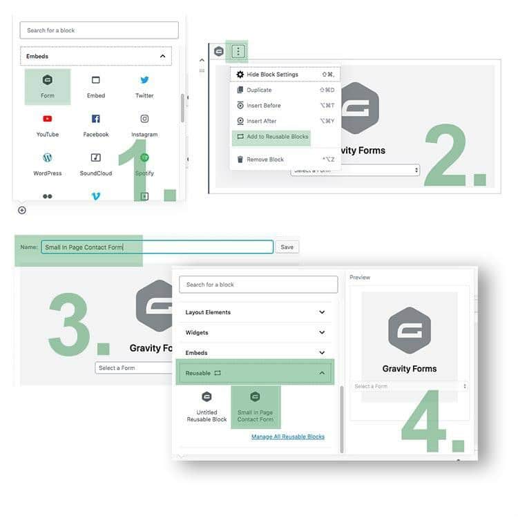
For example, here’s how to store a contact form you may want to quickly drop into pages later.

  1. Embed the Form into a block
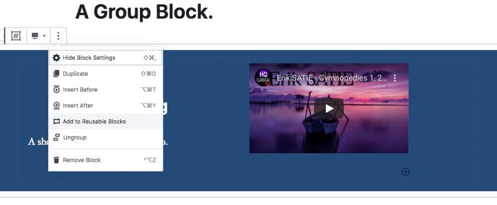
  2. Select Add to Reusable Blocks
  3. Give it a name
  4. Reuse it anywhere by accessing Reusable.

To create a reusable block, follow the four steps below:

Gutenberg block editor

Group Block

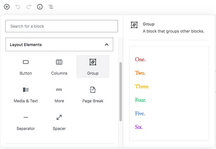
Group blocks allow you to create sections of content composed of multiple types of content and re-use them as Reusable Blocks. This feature is key to bringing WordPress up to date with the capabilities of page builder plugins, which can display practically any arrangement of responsive columns containing every conceivable type of content.

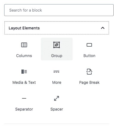
To create a Group Block, locate the Group icon from the Layout Elements:

WordPress Gutenberg guide

Within a group block, you can nest columns. Within the columns you can insert any content elements until you’ve created a page element or section. If you save the new group as a Reusable Block, you can drop the whole thing into any page or post on your website. And, everything will display responsively on mobile devices without adding the intricate CSS you would need otherwise.

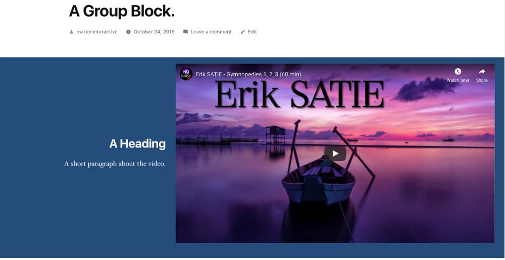
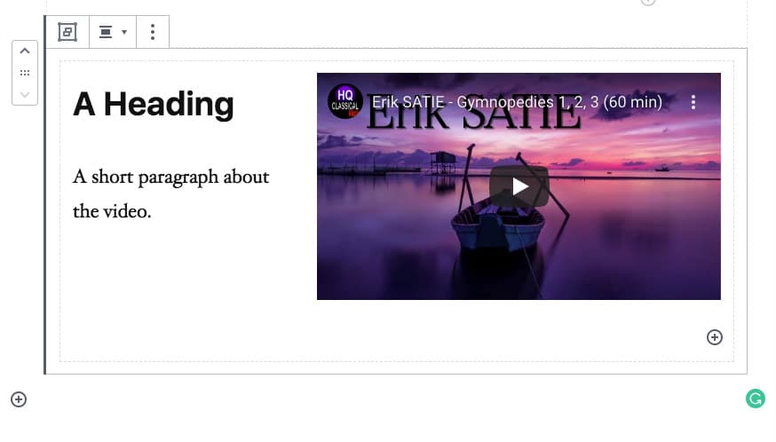
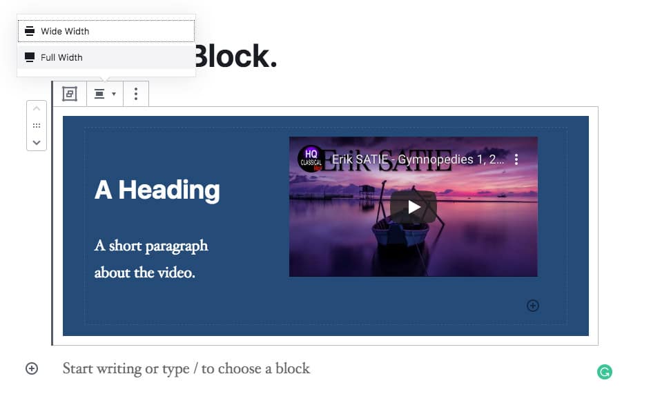
I created a full-width group block that displays text in a ⅓ column, and a YouTube video in a ⅔ column to the right using only Gutenberg. All I needed, besides WordPress, was the URL to the YouTube video, I did not need to grab the full embed code from YouTube.

WordPress block editor

Follow these steps to create this Group Block:

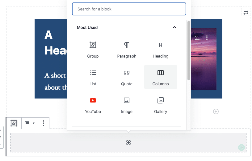
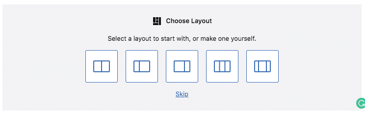
1. Add a Group Block from the Layout Options

WordPress Gutenberg tutorial

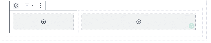
2. Add Columns

Add some columns, and choose a column layout of one-third, two-thirds. Later you can fine-tune the column widths with the column width slider, if desired.
WordPress Gutenberg editor

Gutenberg WordPress editor

Gutenberg WordPress blocks

3. Add Content

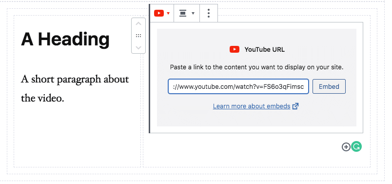
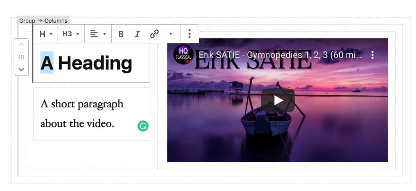
Add the content elements: A Heading and a paragraph in the left column, and a YouTube video in the right. Click Embed after pasting in the URL.

Gutenberg blocks

4. Alignment

After that you’ll see something like this in your editor:

how to use WordPress website editor

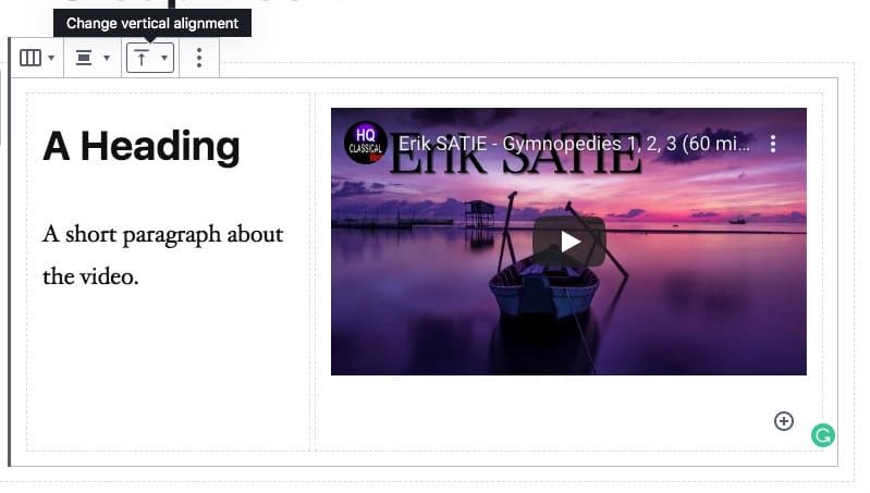
Now moving on to set the vertical and horizontal alignments and the full width. This is where a little practice helps. Soon you’ll be able to quickly select the elements you need, just be patient at first.

By default, content inside the columns is Top Aligned. But we want the text to align to the vertical middle of the video.

5. Delimiter Lines

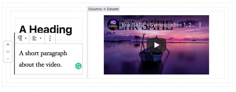
Click anywhere in the group so you can see the delimiter lines. Then mouse over the upper left corners of the delimiters until you can see the gray tab for the Columns group and click the gray corner tab.

content editor for WordPress

6. More Alignment

After clicking the tab you’ll see where to set the vertical alignment. Choose middle. You can use the same process to vertically align each column separately.

Gutenberg columns

We can now see the alignment we want:

WP Gutenberg editor

7. Block Colors

Setting the color and width of the Group Block:

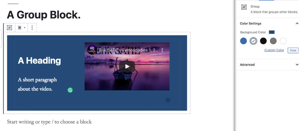
Clicking the outermost delimiter (Group) will allow you to set a background color for the entire Group Block. Choose the dark blue or any color you want. The Heading and text will instantly adjust to a light or dark color depending on the background:

using WordPress Gutenberg

8. Column Width

Next, click again on the Group delimiter and choose the middle icon to set the group to display Full Width:

WordPress Gutenberg handbook

9. Heading Alignment

You will also want to set the heading and the text in the left column to Right Aligned. The video will fill the column on the right so the horizontal alignment in the right is not critical, but you can set it to left, right or middle as needed.

10. Save ss Reusable

Then finally, save your Block as a Reusable Block:

new Gutenberg editor

11. Celebrate

 Do something nice for yourself. You deserve it.

Let MARION Handle Your Web Design!

Your time is valuable and guessing at website edits can waste both time and money. Texas businesses can trust a Houston or Austin web design company to create and maintain a high-quality website.

MARION has nearly 40 years of experience helping Texas-based businesses grow their brand. Contact us today to schedule a free consultation and see how we can help meet your needs!

Marketing emails you’ll actually want to read.

Get marketing tips and news sent to 
your inbox.
This field is for validation purposes and should be left unchanged.
Name(Required)

What an SSL Is, What It’s Not, & Types of SSL

What makes a good business website? One of the main components of a great business website is the safety and security of visitors on your site.

SSL, or Secure Socket Layer, enables the website you’re interacting with to exchange encrypted data with the computer or device you’re using. Without encryption, the data you exchange with the website could be read by third parties while in transit.

For example, if you fill out a form on an SSL secured website, the information you typed into the form fields is safe from prying eyes while on its way to the website from your computer or device. Also, transmitted data from the website to another computer (such as a payment processor) is encrypted as well.

How to Tell If You’re on a Secure Website

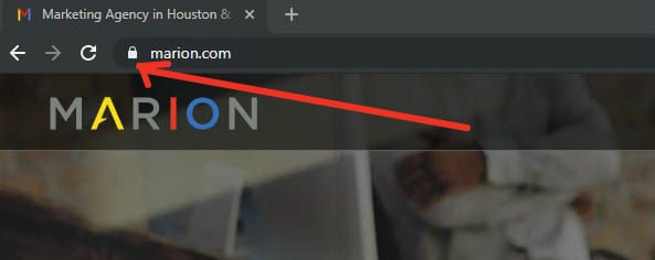
When you’re on a secure site, you’ll notice the address of the site begins with “https.” Without the secure connection, you’ll see an address that begins with “http” (without the final “s”). Typically, a secure site will also display a lock icon in the address bar. Some websites may only secure the portions of the site that exchange data.

what is an SSL?

What is the difference? HTTP, or Hyper Text Transfer Protocol, is the standard protocol for transferring data on the Internet. It was invented so that information could travel between computers, in other words, so that you can read this article online. When a site is secured with an SSL Certificate, it can use HTTPS, (Hyper Text Transfer Protocol Secure). After you secure your website with an SSL, computers can scramble the information in transit between them by means of the keys encoded in the certificate.

I Don’t Collect Data – Does My Website Need an SSL Certificate?

Yes, but not for security. For several years now, all websites, whether they include interactive elements like forms, need SSL to capitalize on HTTP vs. HTTPS SEO differences. All things being equal, a secure site will rank higher than a non-secure site. That means if you have an SSL Certificate active on your website, people will have an easier time finding your content.

What Are the Different Types of SSL Certificates?

types of SSL certificates

First, understand the different kinds of SSL certificates to know what you’ll need:

Domain Validation (DV)

A Standard (DV) SSL can range from free to a low per-year fee, depending on how you get it. For example, at MARION, we recommend the websites we host use Cloudflare to protect them from DDoS attacks and for other reasons.

One of the advantages of Cloudflare is free SSL! Learn more about Cloudflare. A DV certificate can be issued once simple electronic verification means such as email, DNS entries or text file uploads to your domain/website are completed. A DV certificate uses the same encryption methods as other certificates.

Organization Validation (OV)

An OV (Organization Validation) certificate offers your visitors information about your company.  (Clicking the secure icon in the address bar shows the certificate details and company information.) To obtain this type of certificate you must provide some of your business information to the issuer of the certificate. The issuer then verifies that you are a legal entity before granting the certificate.

The person requesting the certificate must also meet security requirements to prevent rogue certificate issuance. It normally takes 1 to 3 business days to obtain an OV Certificate. Prices for OV Certificates are higher than DV certificates but are still quite reasonable.

Extended Validation (EV)

An EV (Extended Validation) certificate displays your company name prominently on the address bar. EV certificates were created to help website users feel confident that the website is genuine and not an imposter site, such as a website used in Phishing attacks. To obtain an EV certificate you must pass a more stringent set of requirements and provide more information. Prices for EV Certificates are significantly higher than other kinds of certificates, because there is more human involvement in issuing these types of certificates.

What an SSL Is Not

An SSL is only one part of overall website security management.  An SSL protects data in transit. It does not protect your stored data or protect your website from malware, hacked passwords, DDoS attacks … the list goes on. Website owners must also make sure their sites are current with security best practices, a subject for a future MARION blog post.

Contact MARION for SSL Setup Help Today

Our Houston and Austin web design team has years of experience designing, developing, and securing business websites for customers like you. 

Contact us today to learn more about how we can improve your marketing process!


Marketing emails you’ll actually want to read.

Get marketing tips and news sent to 
your inbox.
This field is for validation purposes and should be left unchanged.
Name(Required)

6 Essential Tips for Creating an Online Web Presence for Your Business

For new or established businesses, online marketing is a huge opportunity for brand and financial growth. Learning how to improve your online presence will take your business to new heights, but it can seem daunting without the right guidance.

What Is an Online Presence?

An online presence is the representation of a business or individual entity on the internet. There is a spectrum of online presence, ranging anywhere from non-existent to strong. The stronger your business’s online presence, the more visibility and engagement you command across digital channels such as websites, social media, and email.

This six-step guide to setting up an online marketing presence will walk you through the most important aspects of growing your business online. After establishing an online presence, you can identify and focus on the channels that are most effective for your individual business.

6 Steps for Creating an Online Presence

You don’t always need an online presence consultant to get started with internet marketing. You can use this six-part plan to build a foundation, then bring a digital marketing agency in once you’re ready for the next stage of growth.

1. Set Your Online Marketing Goals

As an entrepreneur or marketing coordinator, you need to know what you’re aiming for. You probably hear buzz from your network about different methods for creating a web presence on a weekly basis. Chasing down every one of these leads will leave you exhausted, disorganized, and possibly even broke.

Entrepreneurs frequently self-identify as “doers,” which can leave you particularly susceptible to this approach. Before jumping in head first, learn how to set marketing goals that will help your business succeed in a sustainable way.

how to improve your online presence

Your goal-setting process should include:

  • Aligning your mission statement with your potential goals
  • Setting Specific, Measurable, Attainable, Realistic, and Timely targets
  • Building a strategy that ties in objectives that will help you reach your targets
  • Measuring your results and correcting course when necessary

An example goal might be: Leverage online marketing to grow profits by 25% over the next two years. You will then need to create short term objectives that help define the immediate activities required to reach your goals.

2. Create an SEO Strategy

With an estimated 3.5 billion Google searches per day, optimizing for search is a cornerstone of building an online presence. Not to mention, 35% of searches for products start on Google. The fact is, search engine optimization (SEO) should be baked into every digital marketing strategy you build at your business.

Identify the intersection of:

  • keywords that are valuable to your business
  • keywords that most accurately embody what your business offers

Don’t focus all your efforts on ranking for keywords that your customers or clients don’t recognize you for (unless you’re introducing a new product or service).

You can use tools like the Google Ads Keyword Planner or SEMrush to do keyword research. These tools can help you find popular search phrases and identify how competitive you must be to rank well for them.

Creating a solid SEO strategy will be paramount for your web design (in step 3) and content marketing strategy (in step 6). Reach out to MARION today if you need help from a reputable SEO company in Houston.

3. Build Your Business Website

The next step in creating an effective web presence is building your business website. But first, why create a website when you can make a Facebook page in 1/20th of the time for free?

The simple answer is that you own your website. If Facebook decides to make a change or Instagram throttles the reach of your posts, your digital presence could be smothered. However, you can always maintain control over your business website. The best approach is to keep your core web presence on your website and use other digital channels like social media and content syndication to drive traffic back to your site.

creating an online presence for your business

The next important question – what makes a good business website? The two main components are:

  1. SEO-friendly web design
  2. Good user-experience (UX)

Turn your website into a conversion machine and improve your revenue stream today! Download our free eBook with 24 website must-haves!

SEO Web Design

Most people naturally understand the need for a visually appealing website that makes it easy for users to navigate and find what they want. What some business owners don’t naturally intuit is the need for your website to cater to searchers and search engines. Your digital real estate cannot sit idly by – it must attract users.

You could feasibly generate all your web traffic through traditional advertising, digital advertising, referral sources and word of mouth, but why not tap into the 3.5 billion daily Google searches mentioned in step two? This SEO checklist for new websites will get you started.

For more advanced techniques, get help from an Austin SEO company like MARION today.

Good UX

What about the visual appeal and user experience of your business website? Keep in mind that there are differences in UX and web design – what looks best is not always the most effective.

You’ll have to choose between creating a website using website templates vs. custom web design. Website templates are more cost-effective but will limit the creativity of your site. However, with the right amount of competitor and user research, you can still maintain an effective web presence with a DIY site.

Custom design is usually the higher quality option, but it comes with a much higher price tag. Because of the significant investment, learn how to choose a web design company before signing any contracts.

Once you find the right firm to build your site, learn how to write a graphic design brief that communicates your brand message to your designer. Learning how to brief your designer ahead of time can reduce the length and cost of your project.

For more help from an experienced Austin web design company, schedule an appointment with a MARION strategist today!

4. Leverage Social Media Marketing

Did you know that 68% of adults in the US claim to use Facebook? For a platform that is said to have more than 2 billion active users, this is a huge opportunity for your business. It’s not just Facebook ads that you need to consider – platforms like LinkedIn, Instagram, and Twitter all have significant users bases that can be tapped into.

Setting up a company profile on each platform that you intend to pursue is highly recommended. A social media profile can provide your users with details about your product/service offerings, hours of operation, and contact information. This initial setup of social media accounts is critical for reaching your web presence goals.

building an online presence for business

An organic social media strategy is a free way to start engaging with your audience. Start by learning how to create a content calendar for each platform, and how to curate content for social media. Once you know when and how to share content effectively, you can develop your strategy based on each platform’s results.

It’s important to note that organic reach on some of the major platforms (like Facebook) has declined over the recent years. Learn how to advertise on social media for the best return on your marketing investment. A paid social media campaign can still be a cost-effective way to reach your audience and drive real results.

Reach out to MARION for help from an experienced social media agency in Houston. We can help you leverage social to build an online presence for business success.

5. Run Effective Email Campaigns

Surely email is too old and boring to be an effective marketing channel for your business these days, right? Even today, email continues to be a SIGNIFICANT method for maintaining or creating an online presence for your business. Email marketing is said to generate $38 for every $1 spent, which makes it one of the highest performing marketing channels available.

If you struggle to believe the statistics, it’s likely because your perception of “email marketing” and an effective email marketing strategy are very different. Email is more than just sending a blanket message to your entire contact database every time you release a new product or service.

Workflows, segmentation, and (a healthy amount of) personalization are the keys to an effective email marketing campaign. For example, imagine that you manage a lawn care business in the greater Houston area and you’re trying to use email marketing in Houston to grow your client base.

One approach is to use lead generation resources to grow a qualified list of potential customers. For example, put together a free fertilization schedule available for download on your website. In order to have the schedule emailed to their inbox, a web visitor must fill out a form with their email address and basic contact information.

After signing up for and receiving your free offer, you set up a workflow in your email marketing software that emails your new contact about a related free offer 7 days later. If they sign up for both free offers, you may send them a code for 20% off their first month when they sign a 6-month contract with your lawn care business.

By offering several free resources and maintaining different email workflows, you can build a database of engagement target customers that need help with their lawn care.

Learning how to build an online presence through email marketing isn’t easy. If you need email marketing in Austin or Houston, contact the marketing strategists at MARION today.

6. Build and Execute an Effective Content Marketing Strategy

creating an effective web presence

Content marketing is a key component of an effective SEO strategy. In fact, content marketing should play a major role in all B2C and B2B marketing strategies to help build your online presence.

The effectiveness and necessity of content marketing is due to the evolution of marketing over the past few decades. Marketing has shifted from a business-driven activity to a consumer-driven activity.

There are very few channels where a captive audience will subject themselves to an irrelevant product or service offering. Content marketing gives businesses a way to establish their relevance and solve consumer problems.

One of the most prominent uses of content marketing is business blogging. Maintaining a blog for your business is a great way to answer user questions that are relevant to your industry and highlight how your product or service is the best solution for that question.

Helpful and relevant blog posts can be used as a driving force in your social media marketing strategy, email marketing strategy, and SEO strategy. Not only are you able to share your insightful content via social media and email, but your blogs help to attract backlinks and organic traffic. You can even extend your content marketing to third-party sites by implementing a guest blogging strategy with related organizations.

Attracting interested users to your site is great, but understand that there is a difference in demand generation and lead generation. In order to generate new business leads you must use effective calls to action to capture contact info for your potential customers. By using the right internal links and calls to action, you can turn your blogs into a revenue-generating machine.

Trust MARION for Setting Up Your Online Marketing Presence

Best practices and free advice online will help develop your understanding of online marketing. With these new insights, we hope you’ve got a better idea of how to choose a marketing agency that will help you meet your goals.

For the best results, contact MARION today. One of our marketing strategists will identify opportunities for improving your business web presence and growing your brand!

Marketing emails you’ll actually want to read.

Get marketing tips and news sent to 
your inbox.
This field is for validation purposes and should be left unchanged.
Name(Required)

Going to Gutenberg

(Please visit this post as it was originally composed using the Gutenberg editor.)

I just about lost it the first time I had to edit something with Gutenberg … because I’m busy and I have to get work done on time. Just like you.

So, instead of using Gutenberg, I installed the Classic Editor. Probably just like you.

But, change is inevitable, and some growing pains come with it. We’ll have to learn this soon or later, and I must admit I like the new interface, it’s just that my fingers don’t know where anything is yet. So with that in mind, the purpose of this post is to make that first humbling learning curve a little less painful for you than it was for me.

Blocks

The Gutenberg editor uses the term “Blocks” to describe various elements of content you can add to an article or page. For example, this paragraph is a single paragraph block. If I move my mouse around inside the block, a pale grey line appears on the four sides of the paragraph to visually delimit the block. If I want to add another paragraph block, all I need to do is hit enter and

POOF! Another paragraph appears in its own block, so writing text is the same as you’re used to. When I mouse over any paragraph you can see its delimiter as well as the formatting bar in a tab on the left:

So how did I insert the screenshot? Simple. With the cursor inside the paragraph block, the tab menu appears. Click the More Options dots on the right. Choose Insert Before or Insert After and an empty block appears.

There are a couple of ways to insert the image. On the left is a plus icon which pulls up the block menu, just choose “image” and follow the directions. Or, use the shortcuts on the right side of the block which includes icons for adding images, headings and galleries.

This is an empty block. Start typing, or use the Plus icon or the icons on the upper right to begin.

“Blocks” is also a descriptive name. The new editor is designed to let you arrange and easily re-arrange your block-delimited content into practically any layout, without requiring a plugin or hand-coding in the text editor or updating a style sheet to manage the display of content across devices. Blocks can be dragged, even nested into other blocks. Layouts can be saved for re-use. This is a real gain for editors.

Types of Content

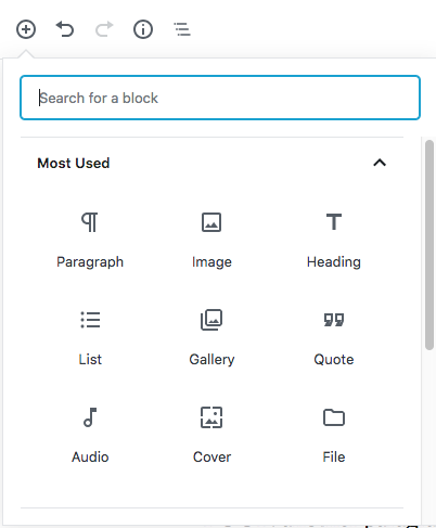
At the upper left of the content editor, click the Plus icon and many types of content available will display in a menu below the icon.

The top half of the drop down menu showing the most common types of Block content.


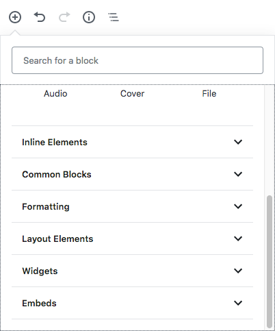
The sliding bar on the right reveals more categories of content available.

The sliding bar on the right reveals more categories of content available.

We won’t examine everything you can insert as a Block but let’s look at a few that will enhance your content right away.

Columns!

Although CSS columns have been around for a while, the old editor had no means of creating them without some hand coding in the text editor. Without CSS and HTML knowledge, editors depended on plugins or pre-defined layouts with custom fields to ensure columnar content displays appropriately on desktops and mobile devices. For some of us, this skill is still needed because it will take time for Gutenberg and plugin makers to catch up with each other, and many websites use pre-defined layouts with custom fields for which the Blocks editor may not be compatible.

But don’t worry about all that – that’s really my job. Let’s make some columns.

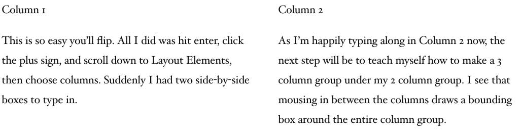
Column 1

This is so easy you’ll flip. All I did was hit enter, click the plus sign, and scroll down to Layout Elements, then choose columns. Suddenly I had two side-by-side boxes to type in.

The text of this blog article as it appears in columns.


HOW TO: 3 Columns

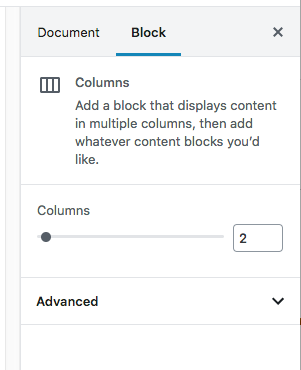
Making a 3 column group required me to Google a little, oh well. It turns out you need to select the column group, then determine the number of columns from the right sidebar column slider.

I discovered you must insert the default 2 column layout, then use the mouse to select the whole column group. It was a bit difficult to select it with the mouse, I found I had the best results by mousing near the middle of the columns. Once the mouse detected the group, the right sidebar changed to show the columns slider. I typed a 3 in place of the 2 and voila!

After labeling the columns to make it clear, I have this, below. You can insert more blocks into each column, i.e., nesting blocks within blocks.

I’m finding that as I write this first post, I’m getting better and better at selecting the elements, for example, the column groups. Just mousing slightly above the group revealed the group and the all-important plus icon for inserting blocks.

Beautiful Backgrounds

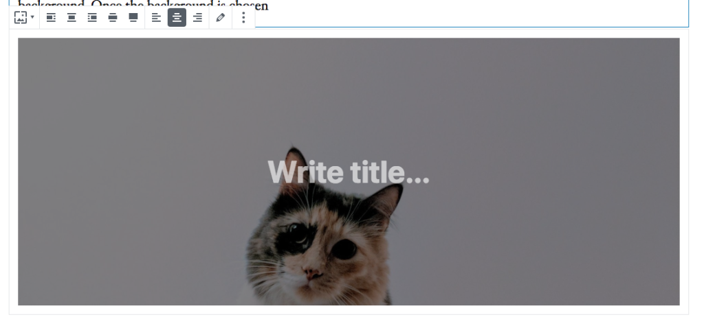
So how did I do that? It’s called a “Cover” and is available from the Add Block menus. But just to mess with you, I’m going to teach you a shortcut. Hit enter and type “/cover” without the quotes and hit enter again. Or just type a / and you’ll get a shortcut menu. Nice. Once you do that, you’ll see the obvious Cover options to upload or browse to your background.

Once the background is chosen, you’ll be able to type your title in the prompt.

Notice there are options for your cover in the tab menu at the top. You can make exciting 100% width content easily, just click the Full Width

icon and since this is enough learning for one day …

Marketing emails you’ll actually want to read.

Get marketing tips and news sent to 
your inbox.
This field is for validation purposes and should be left unchanged.
Name(Required)


12 Bad Website Design Mistakes & How to Avoid Them Today!

It can’t be said enough – in 2019 and beyond your website can make or break your business. Many small business owners try to save money by designing their own websites, but even those with the best intentions are prone to make a few web design mistakes here and there.

Web design is an art form. Unfortunately, many business owners treat their websites as a necessary evil and put minimal effort into the web design process.

Top Mistakes in Web Design

If this is you (and even if it isn’t) we’re here to help you understand that your website deserves a greater investment of your time and energy to ensure it delivers the user experience your customers need.

Check out these 12 bad website design features and how you can avoid them.

1. Your Website Takes More Than Three Seconds to Load

No one has the time or patience for your website to load slowly. Your site only has a few moments to render before visitor interest begins to wane. 40% of consumers will abandon a page if it takes longer than three seconds to load. That means one thing – improve your website load time or else!

2. Your Call to Action (CTA) Is Terrible

A good CTA will compel people to act. “Click here!” “Buy now!” “Share on social media!” A compelling call to action doesn’t involve guesswork – it’s clear and concise. With that being said, there are certainly ways to screw up your CTA.

For example, being too vague or overusing the “Buy Now” phrase can be surefire ways to turn your customers off. Double check the effectiveness of your CTA to ensure it’s clear and compelling.

poorly designed websites

3. Many of the Links on Your Website Open New Tabs or Windows

Committing this design sin will lose you potential customers quickly. Multiple tabs/windows often slow down computers and mobile devices and can eat up bandwidth. Avoid this issue by ensuring the links on your site open in the same window or tab and not a new one.

Great web design requires a professional touch. MARION’s custom web design services in Houston, TX are merely a click away!

4. You Don’t Use H1 or H2 Subheadings on Your Website

We live in a society that loves to skim. Even if an individual is interested in a webpage, they’re likely going to skim through to see if the content is truly worth reading. If your site has massive walls of text that make it difficult to skim, you run the risk of people losing interest in what you have to say. Bold subheadings make skimming a breeze and will encourage visitors to invest their time into your content.

5. Your Website Doesn’t Immediately Communicate What You Do and Why Customers Should Stick with You

On average, users only need a few seconds to form an opinion about your website. It’s up to you what that opinion will be. Bad web page design forces visitors to hunt around just to learn what your business brings to the table. But this begs the question – what makes an effective website?

Remedy this issue by having your services and products front and center on your homepage. It also doesn’t hurt to throw in a few confidence-boosting elements such as awards and testimonials.

6. Your Website Design Is Too Minimalistic

Minimalism is a major trend right now and can be effective when utilized correctly. However, when your website is minimalistic to the point of being cryptic, you may have a problem. Your visitors still need to know who you are and what you can do for them.

If your design relies too much on your visitors figuring that out for themselves, then you’re making a big mistake. Learn how to write an about us page to start communicating better with your potential customers.

7. Hidden Navigation

Common website design mistakes often include hidden navigation or hard-to-find search bars, which often infuriate site visitors as a result. Focus on making your site easily accessible by making your menus and search bars as visible as possible.

Having website design problems? Let an experienced Austin web design company build your website for you!

8. Hard to Find Contact Information

One prime example of how not to design a website is to make your contact information difficult to find. How do you expect your customers to get into contact with you if they’re struggling to find your contact page? If your “Contact Us” page isn’t one click away, then you have a design flaw that needs to be fixed.

common website design problems

9. The Font on Your Site Isn’t Reader Friendly

This is one of the top web design mistakes to avoid. If your visitors have to squint to read the font on your website, then you have a big problem. Using size ten font may fit more content on the screen, but it’s also extremely difficult to read.

Furthermore, difficult to read font can also serve as a turnoff to your customers. Use size 12 to 14 font and stick with Times New Roman or Arial to improve readability.

10. Too Many Ads

There’s certainly nothing wrong with placing a few ads on your website to generate some extra revenue. However, when you have ads at the top, bottom, left, and right of the page (along with pop up ads to boot) you might be overdoing it a bit. Too many ads will frustrate your visitors and site traffic will likely decrease as a result. Not to mention, Google pays attention to potentially abusive ad experiences on your site and could decrease your rankings accordingly.

No one is telling you to remove the ads on your website. Just don’t overdo it and you should be fine.

11. Your Website Is Too Confusing to Navigate

As far as website design mistakes go, this is one of the worst ones you can make. Have you ever visited a website where the homepage had navigation links, fonts, color palettes and images that had no relation to each other? They can be extremely confusing to navigate.

Businesses that make this design flaw often aren’t clear what their brand image is. Before designing your website, sit down with your web designer to ensure you’re both crystal clear on what you want your brand to communicate.

12. Your Site Isn’t Mobile Friendly

There are more than a dozen mobile marketing statistics that prove websites in 2019 and beyond need to be mobile friendly. In a world that’s mobile-centric, failing to optimize your site for mobile users is one of the most common mistakes made by websites.

To escalate this issue further, having a mobile-friendly site is a huge component of SEO website design. If your site happens to be an offender, this is something that needs to be rectified immediately.

Contact the Pros to Avoid Poorly Designed Websites

Web design can be tricky business but with the right tips, you can design a winning site that’ll captivate visitors and increase conversions. Always keep your brand image firmly in mind every step of the way and you’ll have a stunning and functional website in no time. One of the biggest marketing mistakes you can make is neglecting your brand, so always keep striving to provide a better experience!

Your website serves as the online face of your business. Make a good impression by working with the professionals. MARION is a marketing agency dedicated to helping small businesses grow and thrive online.

Rest assured our talented team knows exactly which web design mistakes to avoid so you won’t have to worry about the negative consequences associated with careless slipups.

Contact us today to learn more about how we can help you grow your business.

Marketing emails you’ll actually want to read.

Get marketing tips and news sent to 
your inbox.
This field is for validation purposes and should be left unchanged.
Name(Required)

5 Ways to Improve Website Load Time & Boost Performance Today!

Everyone hates a website that loads slowly. Consumers today have grown accustomed to near-instant results and a smooth online experience. Even the slightest hiccup on your website can cause visitors to abandon your site.

In today’s highly competitive market, having a fast website has become a requirement. Otherwise, your customers will turn to the competition for the online experience you fail to offer.

Why Does Website Load Time Matter?

A slow-loading website will kill your conversions. Consider some of the prevalent user experience and SEO statistics. On average, 47% of consumers have an expectation of two second load times or less. Even more shocking is the fact that 40% of consumers will abandon a page if it takes longer than three seconds to load.

More than half of all internet traffic comes from mobile devices. And according to recent mobile optimization statistics, most mobile sites take 15 seconds to load on average. With most visitors abandoning sites after 3 seconds it has become more vital than ever to improve web page load time for mobile devices.

Is your website holding back your business growth? Download this free 8 point website checklist today, and start improving your results!

How Is Page Load Time Measured?

Measuring page load times will give you an idea of how fast (or slow) your website is rendering for visitors. Tools such as Google PageSpeed Insights and Lighthouse Audits measure a variety of relevant metrics to determine the average web page load time of your website.

After running a few tests, you may find that your site sits below the average page load times. Unless you’re a web developer, you may not know how to improve the load time of a website.

Making the proper corrections will set you apart from your competition.

How to Improve Page Load Speed Across Your Site

how to improve page load speed

Average page load time is determined by a variety of factors. Understanding ways to reduce page load time will help you to greatly increase site speed and ultimately improve the performance of your website.

Here are a few tips to help you figure out how to speed up website load time.

1. Reduce the Number of HTTP Requests

When a web page first loads, numerous elements must download such as scripts, images, and stylesheets. It turns out that 80% of the load time for a web page is spent downloading the various elements of the page.

Each part of a webpage has an HTTP request made on its behalf; the more components on a page the longer it takes to fully load. To improve page load speed, determine how many HTTPS requests your website is making (this can be done by accessing Google Chrome’s developer tools).

Next, focus on the JavaScript, HTML, and CSS files found on the page. These files can significantly increase the number of HTTP requests made whenever a person visits your website.

Reduce the number of HTTPS requests your site is making by minifying and combining files. This process will accomplish two goals:

  • Reducing the size of each file on your site
  • Reducing the total number of files on your site

Minifying the files on your website will eliminate a lot of unnecessary code, formatting, and whitespace. The result will be a leaner, faster website.

What about sites that use PHP to deliver HTML, CSS and JS files? If you’re using a WordPress website, you don’t necessarily need to know how to improve website performance in PHP. Instead, consider installing the Autoptimize plugin. This will make the process of minifying your files simplistic and quick.

2. Use Asynchronous Loading for JavaScript Files

There are two ways scripts such as JavaScript and CSS load on your website – synchronously or asynchronously. Scripts that load synchronously render one at a time as they appear on your screen. Scripts that load asynchronously will load simultaneously.

Web pages typically load from top to bottom. When a synchronous JavaScript or CSS file is encountered during the rending process, the entire page will pause until that particular file is fully loaded.

If that file were asynchronous, the various elements of the page would continue loading even as that particular file continues to render. The answer is obvious – use asynchronous loading for non-critical JS or CSS files to speed up page load time.

3. Compress Images

Another great trick to speed up website load time is to compress images. The images uploaded to your site can be bulky and cause a significant strain on page load time.

WordPress plugins such as WP Smush are highly reviewed and provide the perfect solution to your image compression woes. With just a few clicks and a bit of patience, you’ll be able to compress the images on your site and experience a significant speed boost in the process.

Alternatively, you can losslessly compress images using free web platforms. TinyPNG is a popular tool for both PNG and JPEG compression. In 2016, Google publicly released their own image compression program called Guetzli. Unfortunately, there are very few free online tools using this program, but more tech savvy marketers can use the open source program on a local machine.

Don’t want to manage the technical details yourself? Let an experienced Houston SEO agency handle it for you!

4. Leverage Browsing Caching

Whenever you visit a website, the elements on the page you’re viewing will download to a temporary storage folder in your browser known as a cache. This allows for faster load times because the page won’t have to bother with another HTTP request for certain CSS and JS files the next time you visit the site.

You can experience website speed improvement by enabling caching on your site. Though this method doesn’t speed up your website for first-time visitors (you’ll have to rely upon other methods for that), you’ll significantly improve load times for returning visitors.

how to improve load time of a website

5. Use a Content Delivery Network (CDN)

You can leverage outside servers to improve page load times for your visitors. Hosting your site on a single server means that a request is sent to that specific server each time a user visits your site.

In instances of high traffic, all of your users will experience a significant slowdown due to the sheer number of requests being made at a single time. A Content Delivery Network (CDN) can help to alleviate the strain on your website.

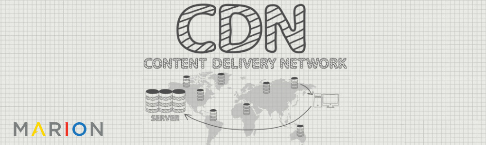
A CDN allows you to cache your site on a network of servers that are based around the globe. When a user visits your site, all requests will be routed to the closest server. CDN’s help to eliminate latency issues that users tend to experience when they’re physically far away from the hosting server.

Cloudflare is one of the most popular CDN’s on the web, but there are several providers to choose from.

Boost Your Bottom Line with Website Load Time Optimization

Knowing how to optimize website speed is a skillset every digital marketer should have in their back pocket. This list is by no means all-inclusive, but you’ll undoubtedly boost the speed of your site by employing the above tactics.

Looking to optimize your website the right way the first time around? MARION is a digital marketing agency dedicated to helping small businesses thrive online. We offer Austin and Houston website design services that follow site speed best practices for the best performance.

We’ll build your website right the first time, so you can focus on growing your business. Contact us today to learn more about how we can help grow your business.

Marketing emails you’ll actually want to read.

Get marketing tips and news sent to 
your inbox.
This field is for validation purposes and should be left unchanged.

Name(Required)