Category: Web Design

State of the Art Website Design in 2019

When someone first encounters your website, you have a few seconds to convince your visitor they have arrived on a site worth some of their precious time.  To make that first positive impression, it almost goes without saying your site must display quickly and navigate easily on a mobile phone, tablet or computer.  But just as importantly, it should look good. And how it looks often has a lot to do with how it works.

Visual appeal depends on many factors, including the eye of the beholder. But a website whose style has come and gone will not be visually appealing to most people.

Keeping your site in line with current design concepts and practices, many of which arise from simultaneously improving equipment and software technology, is one thing you must do to create a positive first impression.

Maximizing the initial user experience (UX, as it is often called) is essential in gaining user trust and getting her business. There is another reason to develop awareness of website design: you as the owner or planner should become more able to express how you want your site to look and feel to a designer.

Becoming more familiar with the essential elements of modern design will be helpful.  Our Houston website design experts have poured through several resources to arrive at a list of web design advancements in 2019, and we are not attempting to predict any trends. New websites are already showing these adaptations and innovation in animation, illustration, color, layout, typography, and photography.

State of the Art Web Development in 2019

Non-traditional styles such as asymmetrical layouts appear more frequently as browsers become more able to display them reliably. Here are several aspects of website design with examples showing showcasing their remarkable change in 2019.

Photography

Photography remains a primary communication element, and the kinds of photography in use today have evolved far beyond pictures of stock photo models in dated attire and hairstyles.

As we, gratefully, see less of that, we see more and more images showing people of color and varying ethnicities, background, and cultures, along with the use of color and effects to match brand to image.

The ever-expanding width of desktop monitors almost requires websites to deploy attention-grabbing images along with well-designed typography. The value of original, high-quality photography continues to become increasingly apparent in sites across all industries.

Video

The use of video on the web has dramatically increased in recent years, and will only continue to grow going forward. Video is now often found beyond the home page to better showcase product capabilities, amplify a message, or show product use scenarios and training.

All modern browsers have built-in video playing capability, which has contributed to this proliferation, along with powerhouse video websites such as YouTube, Vimeo, and others making it a snap to display their public videos on other websites, which can be a boon to your website metrics.

Typography Forward
state of the art website design

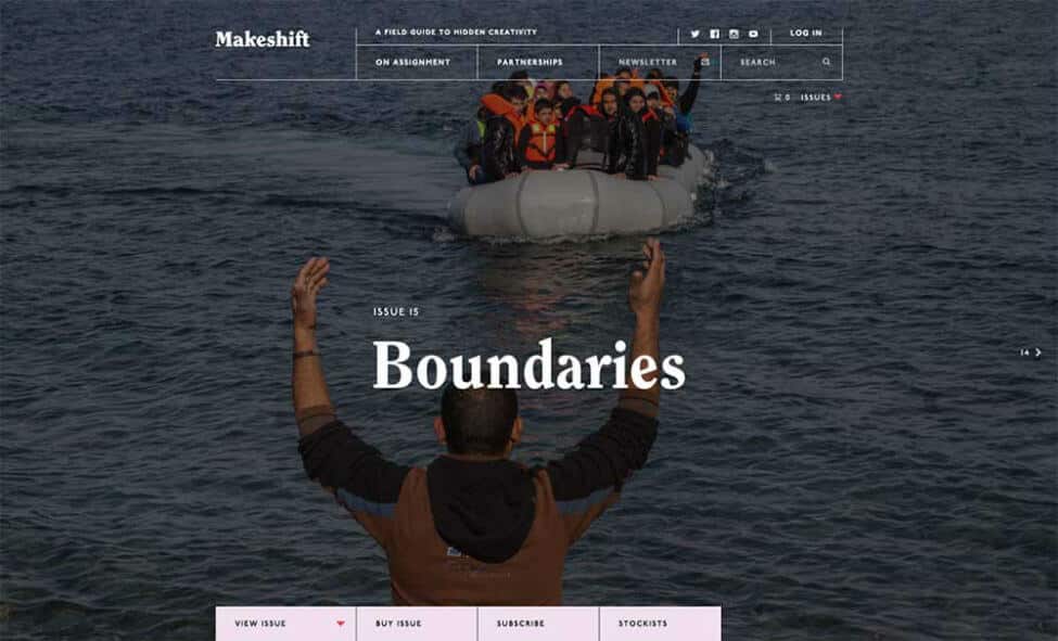
While not brand new, the variety of font and typography for the web exploded thanks to a BIG BANG of improvements in browser technology along with thousands of font faces made available by Google, Adobe, and many others, that load independently of the user’s computer.

Type once confined to use in rendered images (invisible to search engines) now displays reliably as real, searchable text. Designers have responded by putting typography front and center in all the text areas of a website, with big and bold letters, expressive and varied font and use of display type.

It can’t be stressed enough how important typography is to communicate your unique message and voice. Typography leads the user’s eye, organizes content, improves scanning, and keeps them reading: all important to good UX.

Shadows and Other Gradients

state of the art websites

Also not new, the drop shadow makes a come back. Sidelined for years by the dominant “flat” design aesthetic, its use in aiding usability returns, largely because drop shadows and gradients can now be rendered and animated easily with CSS and JavaScript.

And, big, bold, beautiful gradients are more faithfully rendered with modern browsers and mobile devices. All that means is a button can look and behave like a button without downloading several variations of a single image.

And, a page can explode with gradient color without “banding”, i.e., the visual distortion caused by screens that can’t display the required colors or because the image itself was reduced to save bandwidth.

This is crucial because the additional downloads, or server requests, needed for button states and large images now negatively impact the evaluation your website receives from search engines, especially on mobile devices.

Also, it matters because the human eye uses gradients in color and light to interpret distance and isolate objects in space. Shadows and gradients create a more dimensional space which, if used with care, both helps and intrigues the viewer.

An amazing site that uses gradients programmed to change colors depending on the time of day. https://onejohnst.com/

Particle Backgrounds and Other Animations
state of the art web development

Large animated images are an especially exciting arena in modern web development. As the use of resource hogging technology once required to display animated graphics has declined, technology has developed to provide animation without killing your processor or stalling page loads.

A text-only script can render a screen filled with animation that both engages and informs. Animation, on both your website and your social media pages, communicates your message effectively, briefly and entertainingly. Click this image to see it come to life:

Custom Illustration

Hand in hand with animation is custom illustration. 2017, 2018, and 2019 saw an increase in websites displaying non-photographic imagery in all kinds of ways.

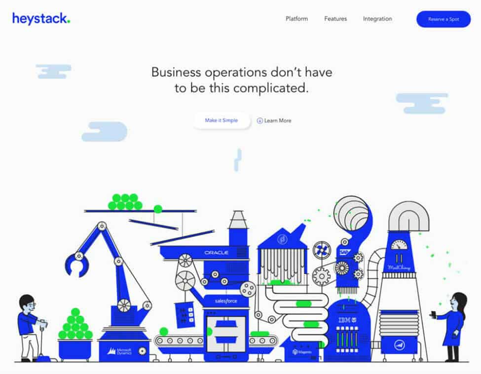
Custom illustration is both useful to elucidate factual information about products and systems, as well as delight the user with color and flair.

A custom illustration can be directly tailored or easily modified to match guidelines required by those creating a brand name for business, whereas photography by its nature is often less specific and can sometimes be extremely expensive or difficult to acquire.

Asymmetrical Layouts

Because browsers have become more flexible in how a page is finally rendered to the user, websites have begun to abandon the box.

A web page can have elements appear outside the visible or invisible grid boundaries that structure most pages, sometimes called “broken grid layouts,” and then pop back to neatly stacked boxes if that’s better for the rendering device, such as a tall and narrow phone screen. So, designers, no longer dependent on the rectangle, are exploring eye-catching and unexpected layouts.

Asymmetrical design is not always the appropriate way to communicate a message, depending on the nature of the business, or the amount of content, but this trend is making its way among brands who seek to set themselves apart from the competition.

The Take-Away of Modern Web Design

There are many other aspects of website design currently shaping what we see and experience every day on the web.  When you look at your current website you may find that you are on the forefront of the latest and greatest trends shaping the web right now, or you may find that your website could use a refresh.

Whether you’re looking to refresh your current website or ensure that a new project features current trends in web design, make sure that you don’t lose sight of you website usability goals along the way.

As you look towards your next web project, the best advice that can be offered is to work with a reputable web design company, or even a specialty WordPress web design firm to ensure that you aren’t lagging behind the mark straight out of the gates and that your website is focused on both form and function.  After all, your website isn’t just a vanity piece, it’s an important piece of your marketing mix that serves an extremely important function.

Marketing emails you’ll actually want to read.

Get marketing tips and news sent to 
your inbox.
This field is for validation purposes and should be left unchanged.
Name(Required)

The Elements of Good Web Design – Usability

One of the often overlooked and under-discussed topics of web design is the amount of time, effort, and money some companies put into building websites that are simply not effective. But, what makes an effective website?

There are many elements that make up a website design. These elements vary in importance.  A truly effective website will ensure that the most important aspects are fundamentally solid while allowing for leniency in terms of personal preference or aesthetic choices.

In my previous post on the subject, we discussed the importance of branding for your website.  Branding is an important element of your website design but is primarily focused inward on your company and how it is presenting itself. Contact a professional branding company in Houston for more tailored branding guidance.

In this post, we’ll approach your website design from another vantage point and discuss usability.  While the result of good branding primarily benefits your company, usability is aimed more directly at the users who are visiting your website.

Of course, when we discuss how users interact with your website it should go without saying that a positive experience is good for your company and a negative experience is bad.  So, while we will be discussing concepts in terms of whether they are good for your user, you can assume that if they are good for the user, then they are good for you.

Usable vs useful

Usability is a term that we use in the web design world to discuss the quality of a website in relation to how easy and natural it is for a user to understand, navigate and more broadly use your website.

I think that it’s important to distinguish at this point the difference between a website’s usability versus its usefulness.  A useful website can offer terrible usability, and a website that is not terribly useful can offer great usability.  The two are not mutually exclusive.

You can tell the difference between the two fairly easily by simply examining the experience you are having.  Here are two scenarios to consider:

  1. You frequent a website to gather important information about a topic on a regular basis despite continued frustration in initially finding the information that you are seeking.
  2. You find a website through search that appears to offer information on a topic but after navigating the website in a number of different, but intuitive, ways you determine that the information you are looking for is not on the website.

In scenario one, you have a useful website that offers poor usability.  In scenario two you have a usable website that is not useful.

You’d be better off owning the website in scenario one than scenario two, but neither website is optimal.

Ideally, your users would find your website useful and easy to use.  It’s that simple.

What makes a website usable?

A number of factors are considered when determining usability.  It will vary slightly in the terms used to describe the concepts, but in general, there are five key areas to focus on, which the Norman Neilson Group does a great job of laying out:

  • Learnability: How easy is it for users to accomplish basic tasks the first time they encounter the design?
  • Efficiency: Once users have learned the design, how quickly can they perform tasks?
  • Memorability: When users return to the design after a period of not using it, how easily can they reestablish proficiency?
  • Errors: How many errors do users make, how severe are these errors, and how easily can they recover from the errors?
  • Satisfaction: How pleasant is it to use the design?

As you can see, when we examine usability we are looking at a website design from the perspective of the entire lifecycle of a visitor.

We probe into initial interactions, common issues while interacting, the user’s ability to use the site again after leaving it for a period of time, and even how the site makes them feel.

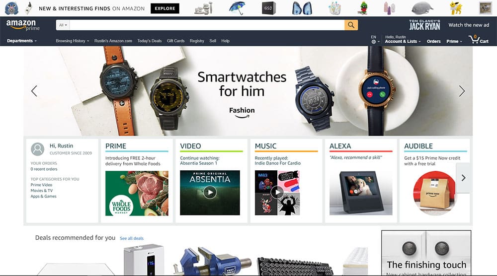
I love Amazon’s website.  For me, it is like a beautiful symphony, only one that generates a ton of revenue.

Amazon Web Design

If you look at it from a usability perspective, it’s fantastic.  What do most people do on Amazon?  They search for a product. So, search is prominently displayed center top and largely at that.

Alternatively, people browse, so we have all sorts of fun ways to browse that cater to every type of person.  It is a usability masterpiece.

All of the key concepts of usability are interwoven into the fabric of your website design and affect every aspect of the user’s experience.

For example, if a website is complicated to learn how to use, it can be expected that users will also struggle to remember how to use it the next time they visit, even if they had it figured out the first time.

Struggling to operate a website like this is inevitably going to frustrate the user causing their satisfaction with their website to go down as well.

Luckily for us, the world wide web is no longer in its infancy, at least not from this perspective.  We’ve got loads of data and examples of good usability to steal borrow from.

Don’t make me think

don't make me think

If there were a bible for web design, my vote would be for “Don’t Make Me Think!” by Steve Krug.  In fact, I’ve already written a post on this simple web design rule if you want to dive a little into the principles he lays out.

For the purposes of this post let’s just discuss it from a high level.  It’s pretty simple really, whenever and wherever possible take the opportunity to actively not make a user think about interacting with your website.

Do you have a cool idea about how you could display the navigation section on your website?  Well, if you do, I’m sorry to inform you, it’s probably a bad idea.

Users are accustomed to website navigation and making the “cool” change will most likely negatively affect one or all of the five key concepts of usability.

For example, you might think “Let’s put our navigation vertically on the right side of the page.  No one does that; it’ll make us stand out.”  To be honest, you’d be both right and wrong.

You’d stand out, but not in a good way.  Over the years we’ve learned, however subconsciously, that website navigation can be found horizontally at the top of the page or vertically on the left side of the page.  Changing that will only frustrate your users.

Let’s look at four common ways that you can ensure that you’re at least covering your usability bases.

1. Keep that navigation top or left

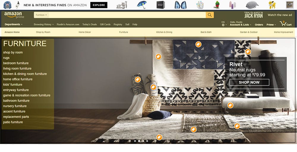
We’ve already touched on this, but let’s reiterate it’s importance. To do so, let’s refer back to that masterpiece of web design, amazon.com.  Only this time, let’s look at an interior category page.Amazon Web Design Navigation

Anywhere you want to go on the entire Amazon website can be reached by using only the highlighted areas.  Try it out for yourself.

By using the websites that we do, we’ve signed a social contract that says “we agree to look first to top or left of a website for navigational elements.”  Don’t overthink this, keep it simple and keep your users happy.

*It should be noted that there is one glaring exception in the case of blogs, which commonly provide post navigation and searching on the right side. There is a reason for this and it’s a long one, so, for now, we will just note this as an exception.

2. Button should look like buttons

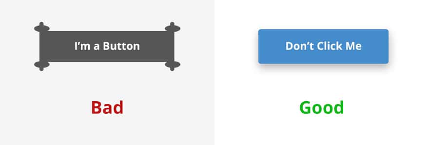
There, I’ve said it.  For some reason, people want to get creative with buttons.  Buttons are not art projects; they are design elements that are intended to, by their very nature, entice you to click them.

Web Design buttons

Which of these buttons are you more drawn to click?  Yeah, exactly, the one that looks like a button.  Extra credit if you noticed that despite what the buttons say, you’re still more inclined to click it, which brings us to our next point.

3. No one is going to read that

There have been studies done trying to understand why more people don’t sign up to be organ donors when they renew their driver’s license.  It’s easy; you just check a box that says something to the effect of “Yes, I want to be an organ donor.”

The answer that they found consisted of two things, A) people are inclined to stick with the status quo, and B) people don’t read!

When the question is switched with one that reads something like “No, I do not want to be an organ donor” roughly the same number of people checked the box, and voila, more organ donors.

I see the irony in writing about the fact that people don’t read, but it’s true.

So, if you’re faced with a situation where you have a possibly confusing area or element on your website and your answer is to put instructions there, you’ve pretty much guaranteed a bad user experience.

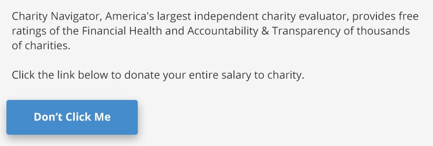
Web design button instructions

Despite the fact that I have provided instructions that clicking this donate your entire salary to charity, a surprisingly large number of people would click it because they didn’t read the instructions.

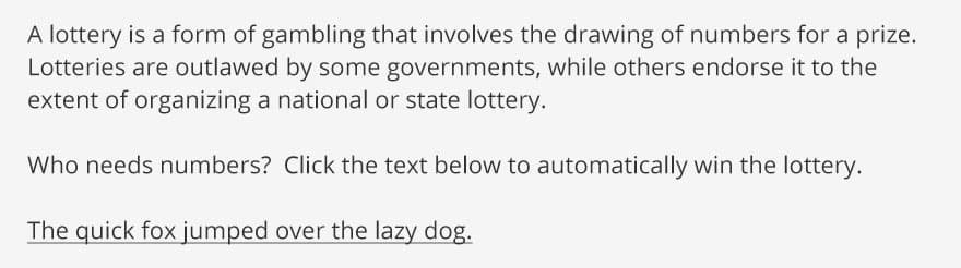
web design lottery text

The same is true with this example, except now we’ve deprived people of their lottery winnings by not visually representing the button very well and by assuming that they will read the instructions above it or much of anything for that matter.

4. Use headers, lists, and visual cues

Have you read every word of this post to this point?  For most of you, the answer is no.  As much as I’d like to think my writing is so engaging that you couldn’t bear to skip a single word, I know otherwise.

The fact is that, similar to not reading much at all, when we do read people tend to be skimmers.  It’s just how we are wired.  We want to get to the meat of the subject without having to go through the pain of reading the surrounding context.

You shouldn’t fight this; you won’t win.  Instead, make it easier for a user to find what they are looking for, and they will be more inclined to think that your website is useful… which you will remember from reading earlier in the article… something you definitely read and didn’t skim past, right?

web design high five

Also, whenever possible, include images, videos, or even gifs.  They make your content more visually interesting and engaging.

The Take-Away

Usability may be the most important aspect of your site’s design when determining how effective it will be. The good news is that any reputable Houston web design company will design these elements into your site almost by force of habit.

I hope that the real takeaway from this post is that you have gained a new perspective for judging the quality of the websites that you use.

Sure, a website may not be the most aesthetically pleasing site you’ve ever used, but if it is providing you with useful information in a way that doesn’t make you stop and think about how to use the site, the design is doing an awful lot right.

If you have concerns about the usability of your website, give us a call, and we can discuss it together.

Marketing emails you’ll actually want to read.

Get marketing tips and news sent to 
your inbox.
This field is for validation purposes and should be left unchanged.
Name(Required)

The Elements of Good Web Design Branding

Few things in marketing can drive straight to the bottom line of your business like a well-converting website.  Your website could be the difference between a struggling startup and a thriving trend-leader.

We frequently discuss the impact that your website can have on your business, but less frequently dive into the details of how the user experience and other various website design elements can impact it. So, what makes a good business website?

In this post, we will explore one of the common web design elements that convert well, branding, and how you can use your branding more effectively on your website. If at any point you feel you need help from an experienced branding agency in Houston, feel free to contact the team here at MARION.

Appropriate use of branding elements on your website

It’s hard to overstate the importance of good branding for your marketing efforts.  We talk about it frequently with our clients, but it’s often an after-thought for most website designs or refreshes.

The bottom line is this; there are few elements of website design that can have as large of an impact on your conversions as branding can.  So, how should you use branding appropriately on your website?

First, let’s discuss what branding is not:

  1. Branding is not just your logo. Yes, your logo is a piece of your brand, and an important one, but when we say branding, we don’t mean just your logo.
  2. Branding is not just your design aesthetic. Yes, your design aesthetic is a piece of how you position and present your brand, but it is not your brand.
  3. Branding is not what your company does. Yes, what you do is a part of your brand, but the bottom line is that your brand is what people feel about your company.

Whether the use of branding on your website is effective or ineffective can be answered in a single question.  “Are your website visitor’s feelings towards your company aligned with the feelings that you want them to have?”

In essence, developing a brand is storytelling.  Is your website telling the right story or are you unwittingly reinforcing the wrong feelings about your company?

walter landor branding quote

If you effectively and appropriately leverage your branding on your website, you can expect to see:

  • Increased credibility. Your website visitors have to make a judgment regarding your credibility, your reliability, your experience, your size, and a whole host of other qualifiers.  Excellent branding removes hurdles, objections, and concerns from your conversion process.
  • Increased visibility. Strong branding works to build credibility within your target audience, but it also helps establish you as an industry leader.
  • Increased conversions. When you proactively address concerns and establish yourself as an industry leader with both your target audience and your peers, you grease the skids on your sales funnel and improve the conversion rate at each step along the way.

So, how do you properly leverage your branding on your website?

3 Critical Elements of Web Design Branding

It’s good to understand the effects of web branding whether you create and manage your website yourself, or you’ve learned how to find a website designer that can implement branding elements for you. Here are three key steps to get you started:

1. Web design logo placement

Your logo belongs on the left-hand side of the header section of your website, period.  You may be toying with the idea of a center aligned logo on your new state of the art website, or god-forbid a right aligned logo, but you shouldn’t.

There are things that we have grown to expect when interacting with technologies.  We expect that if we want to close an application, there will be an “x” in the top right corner. We expect that if an element is clickable, it should look like it is a clickable element.  According to the basic logo rules of placement, we expect to find a logo in the top left corner of a website.

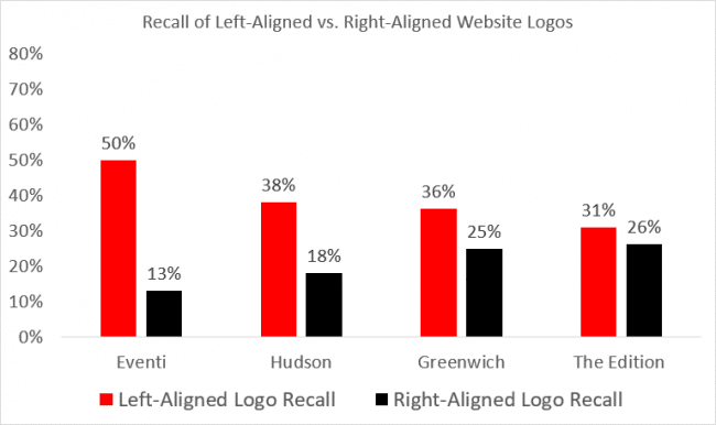
The Neilson Norman Group found that users are 89% more likely to remember logos shown in the traditional top-left position than logos placed on the right.

logo recall rates in web design and branding

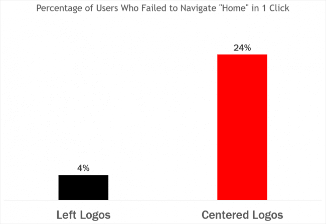
left logos elements of website design

Additionally, another study found that getting back to the homepage is about 6 times harder when the logo is placed in the center of a page compared to when it’s in the top left corner.

Don’t try and break the mold on logo placement.  If you want the most memorable and functional logo possible, keep it simple and keep it in the top left corner of your website.

2. Design aesthetic

When it comes to your website, you have a fantastic opportunity to let your brand flag fly.  Be you, authentically you, and your website visitors will respond.

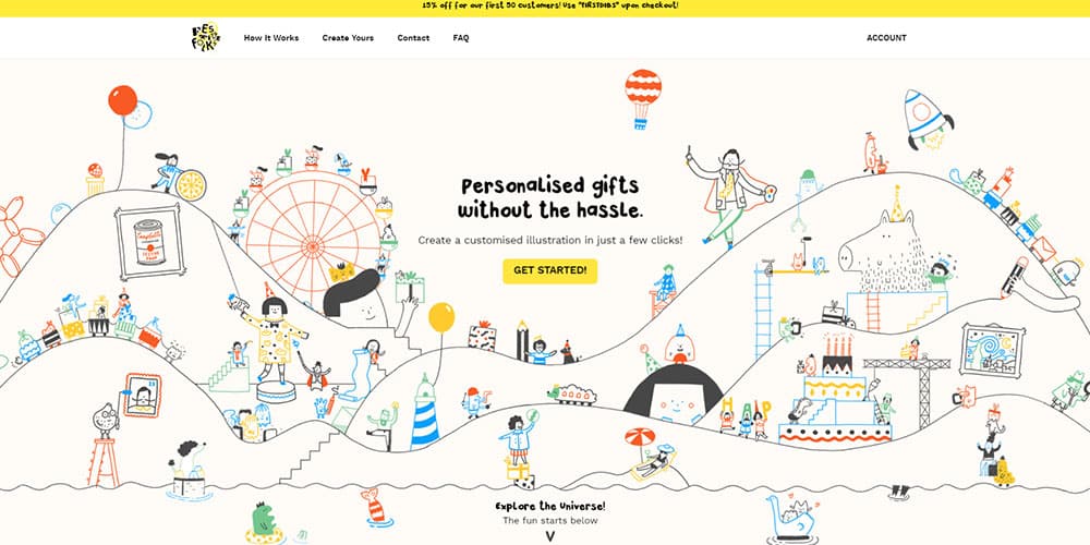
festive folks elements of a good website

Take this website design for Festive Folks, the experience that the user is presented with is certainly unique to their brand.

Whenever a potential customer interacts with your brand they should be presented a single and consistent design aesthetic and, today, your website may be the number one touch point between you and your potential customers.

Having a design aesthetic does not mean, however, that you need to over-design your website.  Sometimes using minimal design elements is more appropriate for your brand, and tells a more accurate story.

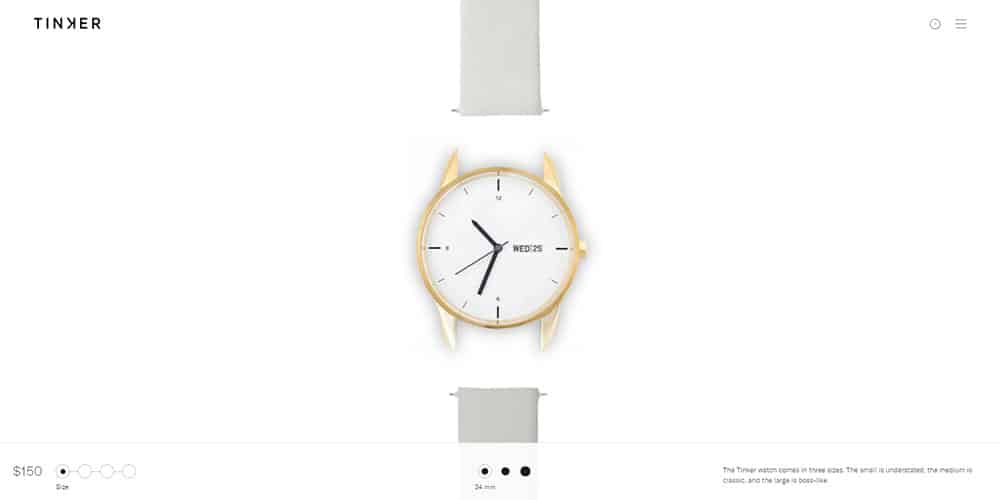
For examples, if you explore the Tinker Watches website, you will find they their use of website design elements, or lack thereof, to reinforce a sense of simple elegance.

Tinker elements of good web design

A simple website that is thoughtfully designed and executed will feel more sophisticated than a website with all the bells and whistles that is thrown together without careful consideration for a desired aesthetic.

Consider your font choices.  What does it say, albeit subconsciously, to your visitors that you’ve chosen that font?  Would another font more appropriately convey your brand message while still being a legible choice for users?

Consider your imagery.  Granted, we can’t all afford to shoot candid photos for every image we need on our website, but we can strive to use higher quality and stylistically appropriate stock images.

Most importantly, your website should be consistent with your other print collateral, like business cards and print pieces.  All your marketing should be created with the same elements of good web design in mind and practice. For help from a pro branding agency in Austin, reach out to MARION today.

3. About us pages

Branding is storytelling, and you must devote the proper website real estate to directly delivering your story.  Addressing deficiencies on your about us page may be the quickest and easiest way to more appropriately leverage your brand on your website.

Your about us page is an extremely effective way of giving your audience the facts that they need in order to draw the correct conclusions about your company; facts that they aren’t likely to get from any other source.

Have you been in business for 50 years?  Put it on your about us page.  Do you win tons of awards?  Put it on your about us page.  Do you have the best employees?  Put them on your about us page.  Do you have a driving principle that separates you from your competition?  Well, put that everywhere, but especially on your about us page!

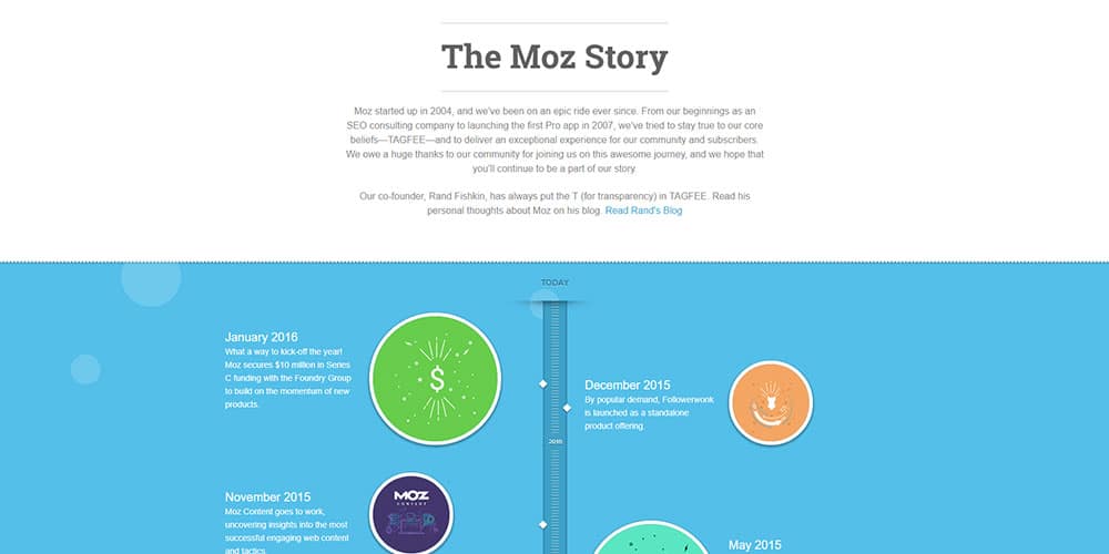
Around here, we love Moz; they’re an invaluable resource for agencies and internal marketing departments alike.  They also happen to have a great about us page, though admittedly it’s a very literal interpretation of storytelling.

design elements for websites

You don’t have to be so direct with your storytelling, just be aware that your visitors are forming a story in their minds and this is your chance to push your narrative.

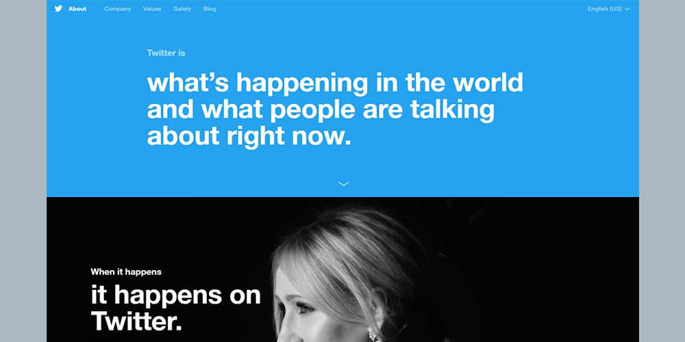
Twitter does a great job of using their about us page to both showcase their product and to paint a narrative of how they want you to see the world as interacting with their product.

Twitter about us web design branding

If you focus on making your about us page a key page on your website and use it properly, you can see major improvements in the quality and/or quantity of leads that your website generates.

Don’t believe me?  Log into your website analytics and compare the amount of traffic your about us page gets versus your services or product pages.  I think you might be surprised. If you’d like professional help, web design firms in Austin like MARION have the experience needed to be successful!

The Take-Away

For most small to mid-sized companies, a well-converting website can make or break their business.  One of the cornerstone design elements for websites is strong and appropriate branding.

If you lack the right expertise, don’t be afraid to leverage our web design services in Houston. To get your personalized quote, contact MARION today.

Unfortunately, small to mid-sized businesses often have an incomplete, poor, or frankly incorrect idea of what branding is and what it means for their company.

If you make the necessary investments – whether time, energy, or resources – into your brand, you will find that it will serve as a solid foundation for all of your marketing, including your website.  The bottom line is, better branding equals better conversion metrics.

Marketing emails you’ll actually want to read.

Get marketing tips and news sent to 
your inbox.
This field is for validation purposes and should be left unchanged.
Name(Required)

The Fastest 8 Point Checklist to Launch a New Website in 2019

I spend hours doing SEO and PPC every day.   When done effectively, search engine marketing should generate great results. The challenge comes when a new client hands you a website to optimize, and you didn’t design or have any input on the design or production.

This happens more than you probably realize.  Unfortunately, most web designers aren’t great at digital marketing, and most marketing folks can’t design a website.  Because of that, the new website SEO is lacking, and definitely not ready to be promoted.

By the way, one of the benefits of using a digital marketing or SEO agency is that your website designer and digital marketing specialist usually work within close proximity of each other.  If, and when your resources allow, you should consider working with a top marketing agency that houses all of the online marketing services you’ll need.

This quick website launch checklist is for any business owner who is launching a new website or a redesigned one.

It is also for digital marketers who deal with the challenge of optimizing a website that you’re unfamiliar with. As digital marketers, we know many SEO tasks can and should be completed during the build-out of the new website, even though they usually aren’t.

We’ve had new clients come to us from other agencies, and the basics aren’t even done! It makes you wonder what they were paying for.  Maybe that’s you… hopefully not.

There are several things to be done when launching a new website that will put you and your website in the best position to be successful.

This is the short, eight-point launch checklist I use when preparing to optimize and send traffic to a website.  Depending on this size of the website, it should take a couple of hours (maybe less).

Website Launch Checklist

1. Check Webmaster Tools

First thing’s first, make sure the website is registered with the search engines.  Google and Bing need to have you as the website owner so you can receive messages about links, errors or even manual penalties.

your website launch checklist should include verifying search console

Using your Google account, visit the Google Search Console.  Register your website using one of the methods offered. Once registered, complete the configuration.  Add your target country and the preferred version of your domain (www or not). Most importantly, submit your sitemap.

make sure your new website launch checklist includes verifying Bing webmaster tools

Go to Bing Webmaster Tools and register the website also.

Integrating Webmaster Tools with Your WordPress Website

If you’re website is built on WordPress (and I recommend that is is), then I suggest the Yoast SEO plugin.

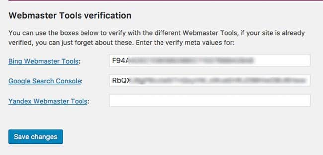
Within this plugin, you can add the meta data needed for Google Search Console and Bing Webmaster Tools registration.  The website sitemap needed to submit to both is also located there.

how to cover the webmaster verification within your website marketing checklist

2. Check the Website Content

Check all of the content on the website.  Thoroughly read it and have someone else read it too.  You’re looking for grammar errors and misspellings.

You’re also looking for opportunities to weave in long-tail and secondary key phrases.  If you have pages that cover similar topics and have thin content, combine those pages and redirect the URL.

While going through each page, click on every link.  You should click every menu item, every social link, every internal link and every external link.  Click everything.  Be sure that your external links open up in a different window or tab.

3. Check Functionality

Check the functionality of the website.  The last thing you want to do is send traffic to a website that isn’t functioning properly.

  • Make sure your cart works and people can checkout with ease.
  • Confirm that the contact forms are submitting, going to a conversion page and being received by the correct personnel.
  • Check that the email opt-in for your newsletter is working also.
  • Test the data that may be syncing with 3rd party add-ons like your CRM or any lead management tools being used.
  • Do you have any special features used by the website visitors like custom design tools?  Make sure they work! You’d be surprised…

Take your time and test everything.  The most common mistakes with website testing occur when you overlook something obvious because you’re moving too fast or you make assumptions about whether something is working or not.

4. Check SEO Basics

You must complete a basic SEO check.  Frankly, your SEO person should go into a full website audit.  At the very least though, check and make sure all the pages have optimized page titles.

Those page titles should include the target key phrase for that page, city where you provide service and your company name (if you want to work on branding).

The tricky part is doing all of that in less than 60 characters.  For example, the title for this post will read;

Website Launch Checklist | Marion Marketing

Update the page meta description when you finish with the page title.  You want to get the target keyword in the meta description as well as the main call to action (when possible).

The meta description for this page will read:

The fastest 8 Point Website Launch Checklist. Confidently Launch Your Website Knowing You’re Prepared for Ongoing Marketing.

**Pro Tip** Do you have active pay per click campaigns targeting the same phrases you are optimizing?  Do they perform well?  Use the best performing ad text as your meta description.

Break up long blocks of content with relevant keyword rich headers.  This helps in a few different ways.  The headers contribute to the page optimization.  They also give website visitors the ability to scan the page and determine if the content they are looking for is there.

Are you planning on doing paid search through Google Ads? If this page is also a landing page, make the page headers similar to the Ad Groups you have that will land on this page.  Watch your quality score rise.

Back to the SEO… verify that all images have been tagged correctly.   When possible, change the image file name to include the keyword.  That same keyword should be in the alt tag and the image title.

Lastly, confirm that the company contact information (Name, Address and Phone – NAP) is visible in the footer and on the contact page.  It must be consistent with what you have on Google My Business, Bing Places, Apple Maps, Yelp and Facebook.

By the way, if your NAP is consistent on those 5 places, your local ranking should rise (considering those profiles are claimed and completed).

5. Check Analytics

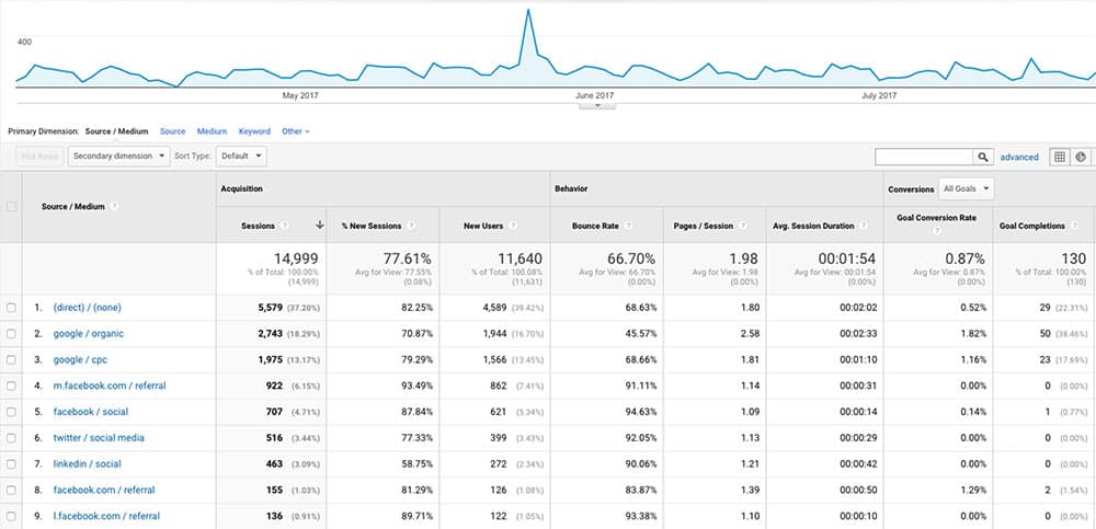
Tracking and monitoring website engagement is a must.  You must understand where the traffic comes from, what they did while on the site and more importantly, which traffic source converts the best.

Using the same Google account, go to Google Analytics and create an account for your website.  Next, add the tracking code to your theme.

To ensure that Analytics is setup properly, navigate to the “Real-Time” section of your Analytics account.  In another tab, window, or even on your mobile phone, visit your website and verify that you see the traffic on the real-time report.

include analytics in your WordPress website launch checklist

While setting up Analytics, create goals to monitor your website conversions.  You want to set goals that include phone calls, form submissions, email opt-ins, purchases, page visits and more.

At the very least, create a goal that measures the completion of the main call to actions on the website.

While you are still in Analytics, go ahead and enable the “Audiences”.  This will require you to setup or link to an existing Google Ads account.  You may want to do some remarketing (recommended) later and enabling this during site launch gives you early opportunities to build the audience list you’ll eventually target.

Since you’re in the mood to add code to the website, go ahead and add a Facebook pixel too.  These pixels identify website visitors and add them to your custom audience.

Chances are very likely that you’ll do some type of marketing on Facebook and having an audience already built and growing will help.

6.  Check Your Hosting and URL Structure

Make sure all of the URLs are search engine friendly and use the target keyword when possible.

Confirm that any pages or posts that have changed have been redirected to the new URL.  This step is so important.  I’ve seen a website’s ranking plummet because they changed URLs with no redirects in place.

Also, get an SSL certificate and put your site on a secure server.  Google has confirmed that HTTPS is a ranking signal, and when it comes to Google SEO HTTPS vs. HTTP offers a subtle rankings boost.

Not only that, but consider your website visitors too.  You want them to be assured that the web experience is safe and secure.

7. Check the Browsers

how to launch a new website that works in all browsers

This is probably one of the most missed steps…normally because the website should render the same, especially as of late with the various browser improvements.

Every now and then though, depending on what type of functionality is used on the website, it just may not render correctly.  Check Chrome, Safari, Firefox, Internet Explorer and Edge.  Check them on Android, IOS, Windows and Mac.

Website visitors will get to your site from various sources and devices.  You want to make sure the experience is the same.

8. Check the Google Test

Check the Google tests that they’ve made available.  Submit your URL to the Page Speed Test and do it again on the Mobile Friendly Test.

The goal is to try and pass the test.  You may not get the best score, and that can be okay sometimes… depending on what your website will be used for.

At the very least, you’ll get a report on how Google sees your site and some recommendations on changes you can make to improve it.

You’ll want to check the website security also.  Make sure you haven’t been hacked and your website isn’t blacklisted.  I prefer Sucuri for the check and having the plugin installed.  Scan your site for security issues.

If this is a new website, or a redesign, I’m confident that if you at least cover these eight basic website launch points, you’ll be in good shape to proceed with marketing.

Till next time…

Marketing emails you’ll actually want to read.

Get marketing tips and news sent to 
your inbox.
This field is for validation purposes and should be left unchanged.
Name(Required)

Is a DIY website right for your business?

I’m sure you’ve seen the ads for companies like Wix and Squarespace. They offer free or low-cost DIY websites that are “all you need” or “stunning.”  The question is, as a small to mid-sized business owner or marketer, is a DIY website like this really “all you need?”

There are a lot of things to consider when deciding how to build out your website. Included in these considerations must be:

  • What is the purpose of the website?
  • Is there a necessity or desire for a unique design for the website?
  • What are your search engine optimization needs and expectations?
  • What are your hosting performance needs and expectations?
  • What is your budget?

Right out of the gates let’s address whether you should even be considering a DIY website for your business. There are huge tradeoffs when it comes to using a CMS vs. website builder, and paying for custom website design vs. website templates. So, is a website from a company like Wix or Squarespace a viable option for your business?

Honestly, the answer is maybe, but with a few caveats. In this post, we will briefly cover these caveats and hopefully, provide a little food for thought when evaluating whether a DIY website is right for your business.

What is the purpose of your website?

We’ve reached a point in the current marketing environment where having a website for your business feels obligatory; it’s just something that you do. Don’t get me wrong, you need a website for your business, but the “why” of it all depends on the nature of your business and how your website will be used.

Are you a local shop that, more than anything, just needs to show up in local search results?  Do you want to sell you goods or services online?  Do you plan to blog frequently?  Are you planning to utilize a content marketing strategy?

These are important questions to answer before beginning the process of building your website and will influence whether you feel a DIY website is a good fit for you.

For example, if you plan to blog frequently as part of a larger content marketing strategy then you would probably be better served to develop your website using WordPress. If you are creating an online store of some kind, you would probably be better served to build your site using an eCommerce platform like OpenCart, WooCommerce, or even Shopify.

That is not to say that you cannot blog or sell items via a DIY website platform, with most you can. But working with a backend system specifically designed for your needs is always going to be a better solution than an “all-in-one” solution.

Does your company need a unique website design?

DIY websites are generally attractive, but not unique. That is the nature of the beast. These website platforms are designed around offering range of templates that can be customized, but they are templates none the less.

Bringing up the use of templates is not an indictment. In fact, there are plenty of successful businesses running websites that use pre-designed templates and no one is the wiser. Templates have their place and can even offer a better alternative to a poorly designed custom website.

You have to decide if your branding or required functionality necessitates custom designing and to what extent it does.

What are your search engine optimization needs and expectations?

For a long time, DIY website platforms were regarded as garbage from an SEO perspective. Some of that reputation was earned with poor URL structures and heavy use of flash, but some of it was a result of annoyed web developers and SEO techs trashing their competition. The fact of the matter is that regardless of how they used to perform the most popular DIY website platforms are fine for SEO today.

Please note the use of the word “fine” for SEO. Not “great” or even “good,” just “fine.”

The bottom line is that with a website from a DIY platform like Wix or Squarespace you’ll get all, or at least most of your on-page SEO basics covered. The basics. If you work with or plan to work with an SEO expert, they may find themselves hamstrung by the limited capabilities of the platform or at the very least frustrated by the lack of control that they have.

You can get by with a DIY website from and SEO perspective, but if you see SEO as an integral part of your marketing mix, and especially if you work with an SEO expert, you should seriously consider the long-term impacts of going with a DIY website over a more traditional website setup so you’re not paying those SEO rates for nothing.

What are your hosting and performance needs and expectations?

Your hosting and performance needs are inevitably tied to the first consideration regarding the purpose of your website. DIY websites like Wix and Squarespace are a hosted solution, meaning that hosting is part of the whole package.

For most small to mid-sized businesses, a hosted solution like what you get with Wix or Squarespace is perfectly adequate. In fact, Wix has good server uptime and relatively good server response time. It also comes with 500+ MB of storage which should be adequate.

More important than what you currently need regarding hosting, is what your needs will be in the not too distant future. You may be considering starting out with a DIY website and then moving to a more traditional solution once you are more established or have a more reliable revenue stream. One of the glaring problems with a DIY website is its limited ability to change and grow.

You may find that it is not as easy as you would expect for you to take your domain name and your content and transition to a more traditional platform when the time comes. That is not to say that it cannot be done, but there is no easy, quick process for doing this, and it can become cumbersome.

If you plan to move to a more traditional platform within a couple of years, it may make more sense for you to invest a little money now in getting the right platform setup with a basic design and invest in a more custom design when you are ready.

What is your budget?

Finally, we come to what is, in most cases, the consideration on which your decision will be made. So, what is your budget?  If the answer to that question is under $1,000, then a DIY website is probably for you. Unless you are a very technically inclined person with some experience in web design or development, you most likely won’t be able to get a more traditional website up and running for under $1,000.

If your budget is between $1,000 and $5,000, then you need to look carefully at the considerations that we have gone over today and decide what makes the most sense for your business. In this range, you may be able to get a reasonable amount of your needs covered, depending on your needs. Approaching your website in stages could allow you to work towards your goal without resorting to a low cost or inferior alternative.

If your budget is above $5,000, you should be able to work with a web design company to build out a website on a more traditional platform that is more suited to your specific needs. This is, of course, dependent on your needs and your budget. Don’t expect to custom program a Facebook replacement for $10,000. But for most small businesses $5,000 – $10,000 is a very reasonable range for a custom WordPress site that is set up nicely for future success.

The Take-Away

Be careful before you jump on the DIY website bandwagon. Wix and Squarespace offer a great service for the cost, but you get what you pay for.

If you consider your website an important part of your marketing strategy, and everyone should consider their website an important part of their marketing strategy, you should invest in it accordingly. How much you invest will ultimately depend on your needs and your budget. Perhaps a DIY website is a wise choice for your business, and perhaps a more traditional platform is best. Regardless of the outcome, take the time to consider the choices carefully before you commit to something that you will live with for the next several years.

Marketing emails you’ll actually want to read.

Get marketing tips and news sent to 
your inbox.
This field is for validation purposes and should be left unchanged.
Name(Required)

10 Reasons to Build Your Website on WordPress

If you are in the process of evaluating your current company website, looking for a custom web design company to build or redesign your company website, or considering adding new features or functionality to your existing company site, you will at some point have to decide which platform you want to build on.

Choosing a Content Management System (CMS) is a lot like deciding between a PC and Mac, PlayStation and Xbox, or Apple and Android.  In the end, it’s going to come down to which has the features you need at the price point you like.

Top 10 Reasons to Use WordPress for Your Website

In this post, we’re going to look at the top ten reasons we almost exclusively build websites on WordPress and recommend going with WordPress for your company website.

1.     It’s Cost Effective

Let’s tackle the first hurdle right out of the gates, cost.  One of the most appealing aspects of developing on WordPress as your CMS is that it’s extremely cost effective.  In fact, WordPress itself is free, so technically, you could be up and running with your company website for free.

Of course, nothing in life is truly free.  If you wanted to get your WordPress website up and running for free, you’d need to have a working knowledge of your hosting provider, you would most likely need an FTP application and understanding, and most importantly you’d need to be willing to use a free standard WordPress template.

For most companies, Houston WordPress web design for a custom template or theme for WordPress is the main cost associated with developing on the platform.  At MARION, the typical website project using WordPress averages between $5,000 and $15,000, depending on the client’s needs.

2.     It’s Reliable

It can seem like there is always something new on the internet and it often gets widely adopted before it’s stable and reliable.  Questionable reliability is not a problem for WordPress.

WordPress has been around for almost 15 years and has only grown in popularity and support.  In fact, WordPress is used by roughly 75,000,000 websites and makes up roughly 19% of all websites.

Those are absolutely staggering numbers, so if you’re having any doubts about whether WordPress is simply the flavor of the month, don’t.

3.     It’s Scalable

Scaling WordPress is vital for some small to mid-sized businesses.  As you grow, you need to know that your website can grow with you.

Well, WordPress is built to grow.  Adding pages, blog categories, tags, and even extending functionality with plugins (more on this later) is a breeze.

You can even extend WordPress to run multiple websites simultaneously with WordPress Multisite allowing you to scale your WordPress install beyond the boundaries of a single domain name.

4.     It’s Easy to Use

So, we’ve covered some pretty important business needs, but what about your needs?!  Who cares what you build your company website on if you can’t operate it?!  Good news, WordPress is super simple to use.

It’s clear that some website content management systems were not only built but designed by developers with little if any thought to usability.  Usability is not a concern with WordPress.  The everyday tasks of managing and growing your website are as intuitive as using Microsoft Word.

5. It Has a Blog Built-In

One of the most important aspects of modern digital marketing is your content marketing strategy.  Most content marketing strategies are built with a company’s blog as the foundation for generating and distributing content, making a blog an absolute must for many businesses. The benefits of business blogging our countless, so it’s critical that you prioritize a blog on your website.

More good news, every WordPress install has a blog built-in.  WordPress was initially designed as a blogging platform.  It was only after it had become so popular that developers began using it for much more than it was intended, that WordPress transitioned into its current state as a more traditional and complete CMS.

If you’re not up to the the task of consistently blogging, then let MARION provide you with professional content marketing services. Our SEO company in Houston has the technical skills to blog in a way that positively represents your brand while attracting relevant traffic that can improve your bottom line.

6. It’s Customizable

When you work with the right designers and developers, the sky is the limit for your WordPress site.  Everything about WordPress is designed to be customizable, meaning that your WordPress site can and should have a user experience design that is unique and on-brand.

7. It Has Multiple Users and Roles

Depending on what your company does, there is a likelihood that you will have multiple team members that need access to the back-end of your website.  That does not, however, mean that all of your team members should have the same ability to update and change the website from the back-end.

WordPress addresses this issue by allowing you to create multiple unique users and assign them to roles that give them different privileges within the back-end.

8. It Has Expandable functionality

One of the most popular features of WordPress is your ability to expand its functionality using free and paid plugins.  Plugins range from very simple tools, like adding social share buttons, to game changing plugins like BuddyPress, a plugin that turns WordPress website into a social network.

Possibly more importantly for business owners and marketers, are the vast number of plugins that exist to integrate your website with the tools that you already use.  Popular plugins to integrate with 3rd party tools include Google Analytics, SalesForce, HubSpot, MailChimp, Constant Contact, PayPal, Facebook, Instagram, Twitter, and so much more.

9. It’s the most popular CMS in the world

If you aren’t sold on WordPress yet, let’s just look at pure popularity statistics.  WordPress is preferred more often than its closest competitors, Joomla and Drupal, combined – currently holding 55% of the CMS market.

10. It’s Virtually Future-proof

Building a new website, or redesigning an old website can be a daunting, even scary endeavor.  The decisions that you make today will affect your business for years to come.

Building your website on WordPress is one of the best ways that you can hedge your bets against the uncertainty of where the internet will go in the future.  To date, WordPress has pushed out more than 100 versions to their users.  This commitment to staying current is a huge indicator of future stability and relevance.

With almost a quarter of websites registered every day being built out on WordPress, it will only continue to lead the way for content management systems into the foreseeable future.

The Take-Away

There are many big decisions to make when building a business website, choosing the best content management system is just one of them.

The reasons to choose WordPress for your company site are numerous, and we’ve only covered the top ten.  If you are looking for a WordPress design company, reach out to MARION today to schedule a consultation and we can explore the best way to move forward with your project.

Marketing emails you’ll actually want to read.

Get marketing tips and news sent to 
your inbox.
This field is for validation purposes and should be left unchanged.
Name(Required)

Does Your Website Pass The Performance Test?

Your website is a vehicle for delivering your marketing message, selling your products, and communicating with your target audience.  And like any other vehicle, your website needs to be properly built and well maintained to perform at its best.

In this post, we will look at several tools that you can use to score how well your website is performing and explore the factors used to calculate your performance scores.

Before you’ve finished reading this post, you’ll hopefully have a better understanding of what factors play a major role in your website performance and Identify some low hanging fruit that can help you improve performance quickly.

The Website Performance Test

For most of this article, we will focus on a tool from HubSpot called Website Grader.  This tool has been around for years, and HubSpot has done a great job of continuing to update the factors that it considers as the environment websites exist in has changed.

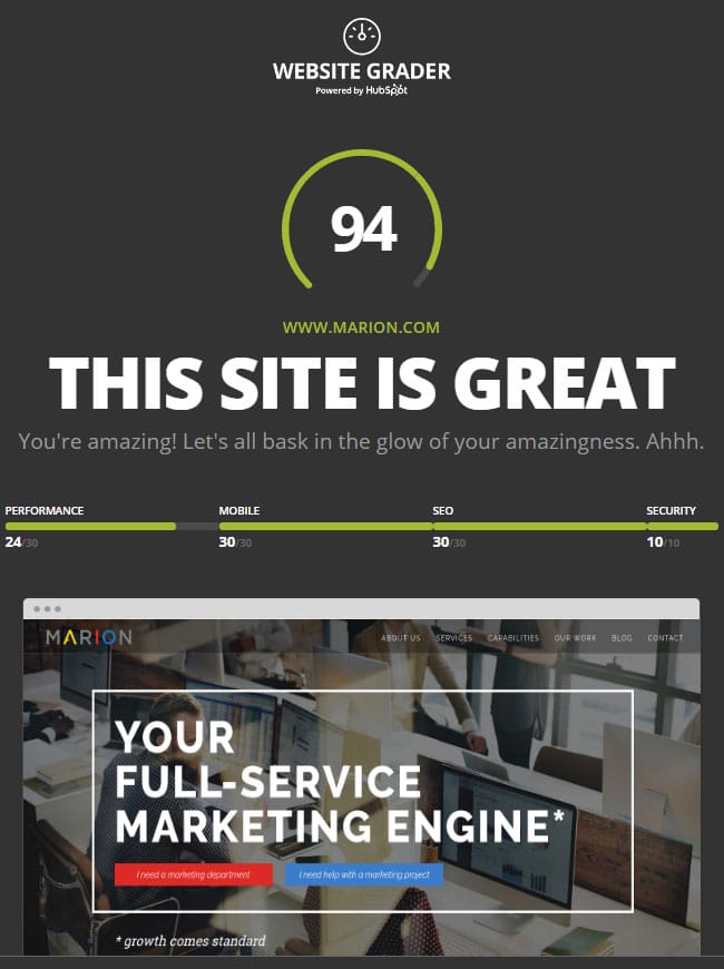
Here is the grade we received for the MARION website:

Website Performance Grader by HubSpot

The test grades websites on a scale of 100, so a 94 is looking pretty good.  The grade considers factors from four categories:

  • Security
  • Mobile
  • SEO
  • Performance

The MARION website scores well on Security, Mobile, and SEO, but only gets 24 of 30 points for performance.  Let’s look at the different categories and explore why we got the scores that we did.

Your Website’s Security

This category is a very simple category, and only worth 10 points on the Website Grader.  Does your website have an SSL Certificate installed and is your website running all of its elements through it?

Site protected by SSL

Since we have an SSL Certificate and are loading all page elements through the SSL we scored 10/10. When you have an SSL Certificate you can also use a secure hyper text transfer protocol for your site called HTTPS. There are even HTTP vs. HTTPS SEO benefits when your site is secure, so make sure to use an SSL.

SSL Certificates ensure that all the data passed between your website and a user’s computer or device is encrypted and safe.  Having an SSL certificate helps to protect against attacks on your website and keeps your user’s data safe.

More and more people look for SSL certificates as a sign that a website is authentic and trustworthy and even search engines have begun considering SSL certificates in their algorithms.

SSL certificates can get pretty complicated.  There are simple ways to ensure that your site is secure, which we will cover later, but, as a general rule, leave SSL installations to the professionals unless you are just a glutton for punishment.

Your Website’s Mobile Version and Responsiveness

We’ve discussed in previous posts the numerous reasons why mobile or responsive web design in important, but here’s a quick recap:

Given the constant push towards mobile and tablet browsing, websites simply must work well on a range of devices.  That’s why the Website Grader scores a hefty 30 points for mobile responsiveness.

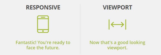
The website grader looks for two key indicators that your website is mobile-friendly:

Website responsiveness diagrams.

The first is responsiveness.  The grader is looking for pieces of code in your website’s stylesheet that tell a browser how to display the website based on the screen size that they are on.  These bits of codes, called media queries, are essential for developing a good user experience across multiple devices.

The second is whether your website declares a viewport.  The viewport lets you control your page size and scale across multiple devices and screen sizes.

The MARION website declares a viewport and uses media queries so we scored a 30/30.

Generally speaking, you won’t find that your website has one of these, but not the other, so you are likely to either score 30/30 or 0/30 depending on whether your website is mobile-friendly or not.

Additionally, you may try running your site through Google’s Mobile-Friendly Test.  This test will determine if Google considers your website mobile-friendly and offer links into your webmaster tools where you can dive deeper into pages that may have issues like content that is wider than the screen, clickable elements that are too close together, and more.

Your Website’s Search Engine Optimization

Search engine optimization is such a key element in the marketing mix of most small to mid-sized businesses that it just simply cannot be ignored or pushed to the back burner.

And SEO is so all-encompassing that all of the factors of your website grade, from security and mobile to its speed and performance, will be taken into account by Google and other search engines when ranking your website.

This website grader is simply looking for the most basic elements of SEO as a gauge of whether you have considered SEO when developing your website.

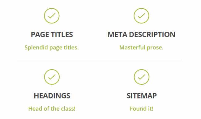
SEO categories display in the grader.

Here are the four elements that this website grader is looking for, why they are important, and tips for optimizing them:

  • Page Titles – Page titles help search engines understand what a page is about. Page titles should be a maximum of 70 characters in length and should not repeat keywords.
  • Meta Description – Meta descriptions are used by search engines to display a description of your page below its title and URL in search results. Meta descriptions should be a maximum of 155 characters and should be an accurate description of the page’s content.
  • Headings – Search engines also use headings in determining what a page is about. Whenever possible, include keywords in your headings.
  • Sitemap – Sitemaps are the quickest and easiest way for search engines to locate and index your entire site.

If you are just getting started with your website’s search engine optimization, this is a very good place to start.  If you are a little further down the SEO road, you may consider using a more in-depth report to identify more far-reaching or technical issues your site might have.

If you’re searching for SEO companies in Houston, make sure their own website is effective at what they’re selling. Since the MARION website uses page titles, headings, meta descriptions, and a sitemap, we received 30/30 points for SEO.

Your Website’s Performance

Website performance is one of the most overlooked aspects of most small to mid-sized business websites.

We’ve discussed how important it is to address your website’s security, its mobile-friendliness, and its search engine optimization, but the truth is, its performance will directly affect all of these factors.

The bottom line is that we have become impatient, and especially so where the internet is concerned.  If a user is sitting around waiting for your website to load, the likelihood that they will abandon your site for one that loads quicker dramatically increases by the second.  A good goal to shoot for is a page load speed of around 3 seconds.

Personally addressing most of the areas we are about to discuss will be beyond the technical capabilities of most business owners or marketing professionals, but understanding these performance factors will help you better communicate with your webmaster or web design company to address performance issues that you may identify.

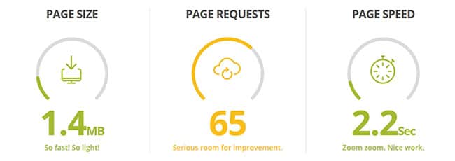
Website performance was the area where the MARION website was lacking the most, specifically when it comes to how many page requests our site makes.

The website grader has three main performance factors that we will cover, but it does highlight additional impactors that you can and should further explore.

Website performance metrics

Page size is an important factor that only gets more important as we see more and more mobile web browsing.

Downloading a 10MB page on your desktop while connected to your high-speed broadband is nothing, it happens in the blink of an eye.  When you try loading that same 10MB page over a 3G wireless network, you will have a very different experience.

Page size is the number one factor in determining how quickly someone can load your website.  You should shoot for pages that are a maximum of 5MB and ideally under 3 MB.

Another factor in your page speed is how many requests from outside sources your website has to make.  This may seem a little strange to you, but most websites actually connect to other websites for important resources, both visual resources like fonts, and functional resources like tracking scripts.

As you can imagine, the more of these that need to load, the longer the page will take to load.  Loading these resources is an area where our website falls short.  The MARION website has a high number of outside resources that must load.  However, we offset this with very small page sizes allowing us to have good page load speeds still.

Finally, your page load speed is a good indication of how all of the different performance factors come together on your website.  Ideally, you want to see a page load speed of somewhere in the 3-second range or faster.

A Deeper Dive Into Performance

Let’s take a little more in-depth look at your website’s performance and identify some low hanging fruit that you can quickly address to improve your website’s performance.

For this portion, we will be looking at factors identified by Google’s Page Speed Insight tool.  This tool offers a detailed look at your web performance and rates factors, or “rules” as it calls them, as “passed,” “consider fixing,” and “should fix.”

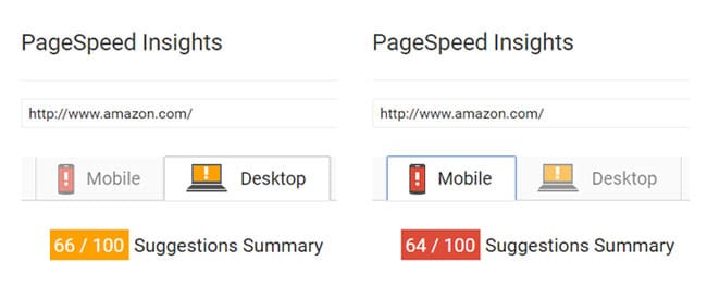
We should start by noting that this tool has a tendency to look at things from a “perfect world” perspective.  Some of the rules are great in theory but are almost impossible to fix in a real-world scenario.  For example, when I run Amazon’s website through the tool, they score a 66/100 for their desktop version and 64/100 for their mobile version.

Google's page speed insights tool.

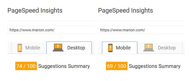
The MARION website scores 74/100 for our desktop version and 69/100 for our mobile version.

Google's page speed insights shwoing scores for Marion's website.

It is fair to say that the MARION website is not a higher performing website than Amazon, nor does Amazon have a poorly performing website.  Amazon has the advantage of a very high performing website hosting solution to make up for areas where their site is lacking, like image optimization.

The point is that in some cases the pros of loading a script, not combining a file, or any number of factors may outweigh the cons.  These “rules” are not absolutes; they should be considered on a case by case basis.

We won’t discuss every rule that Google identifies, but we will address the low hanging fruit from which most websites can benefit the most.

1. Image Optimization

Image optimization may be the single most important change that you can make.  Considering that page size is the most important factor in your page speed and images are the biggest contributor to page size, image optimization can have a dramatic impact on your website.

First and foremost, where it’s possible, exchange images for code.  As browsers get more and more capable, many visual elements that used to be created using images can now be created using HTML and CSS code.  This code will load much quicker than images will.

Secondly, use vector files (.svg) whenever possible.  Since vector files are made of lines and shapes instead of pixels, they scale perfectly and can be created at much smaller sizes.

Lastly, optimize all images before you put them on your website.  Consider this example of the difference between an optimized image and an image that has not been optimized:

Image optimization before and after showing a photo of a manta ray in the ocean. Before is the original size of over 4 megabytes. After shows teh same image optimized to 183 KB.

The original image was 4000px wide and 4.41MB when I downloaded it from a stock image website.  That’s larger than an entire web page should ideally be.

With proper optimization, this same image was reduced by 95% and still comes in at an impressive 2000px wide, which is plenty large for most website usage needs.

Ultimately, the lowest hanging fruit for your website will be the optimization of your images.  A quick google search will yield plenty of tools you can use to optimize your images.  It may be a time-consuming endeavor, but it will be worth it.

2. Browser Caching

Every time a user hits your website, they must download all of the images, scripts, and code before the page can display.

If you leverage browser caching the user’s browser will store items, like images, so that when a user lands on your website those images don’t need to be re-downloaded but rather just loaded from the browser cache.

Since many of the same elements are used on every page of your website, this can offer great speed improvements.

3. Compress and Minify

When we develop the code that websites run on, we include a bunch of comments, spaces, and line returns so that we can read and understand the code that we’ve written.

Computers do not need these comments, spaces, and returns to read the code.  When you compress and minify your website code, you remove these unnecessary bits of information and can cut a file size down by as much as half.

It’s a good idea to compress and minify as much code as you possibly can on your site.

CloudFlare – A Word To The Wise

Ok, you’ve made it this far, you should be rewarded. Here’s a pro tip: the easiest way to address many of these website performance factors is to run your site through CloudFlare.

We run all of the sites that we host for our clients through CloudFlare.  It offers huge advantages for their websites.  Many of the factors that this article discusses can be addressed directly with ClouFlare. Here’s an overview of just some of the advantages:

  • Security – CloudFlare adds both an SLL certificate and basic firewall protection to your website.
  • Caching – Not only can you control browser caching, but your site will be cached within the CloudFlare CDN (content distribution network) offering additional caching and speed benefits.
  • Compression, Minification, and more – CloudFlare will on the fly compress and minify your code allowing you to keep those comments and spaces in your original code while serving up nicely minified code to browsers. Plus, CloudFlare has optional pre-loading of the requests your website makes to outside sources.

The Take-Away

We’ve grown so accustomed to them that we forget that websites are actually very complicated marketing vehicles.  It takes a lot to optimize a website and then keep it running on all cylinders.

There are some things that you, as a business owner or marketing professional, can do to improve page load speed and optimize your site like paying for higher quality web hosting.

However, for the most part, you will need to rely on a trusted partner, whether in-house or outsourced, to properly design, develop, and manage your website.

Discussing the results of any of the tools discussed in this article with your trusted partner can be a great way to start a conversation about website performance and gauge how your website and your web design partner are stacking up.

Marketing emails you’ll actually want to read.

Get marketing tips and news sent to 
your inbox.
This field is for validation purposes and should be left unchanged.
Name(Required)