Category: Branding Design

How to Hire a Marketing Manager or Executive and What They Do

The emergence of smart technology has changed the world in dramatic fashion. It has crept into the way people live and exist and has significantly impacted the media landscape.

These shifts have drastically changed the trade of a marketing manager, adding more to their plate. In turn, this makes the task of hiring marketers more challenging as well.

The question now is how to hire marketing executives when the traditional role of a marketer has evolved. The best way to understand what marketing manager and executives do is to take into consideration the role of marketers in the modern day and age.

What Is a Marketing Manager and What Do They Do?

A marketing manager develops and executes strategies that align your company’s goals with industry demand and trends. To be effective, marketing directors and managers must collaborate with internal and external stakeholders to make sure marketing objectives help all departments work together optimally.

They understand customers want experiences and are moving away from materialism to reduce clutter and waste. Marketers must build better stories to relay experiences to their target audience. Thus, they have a more substantial role than before and must focus on a wide-ranging strategy spread out over long term periods encompassing a plethora of aspects, unlike the short-term, one-track focus of traditional marketers.

What Are the Qualities of a Good Marketer?

Technology is shaping the way people engage with brands, and this has integrated itself into the basic structure of marketing. When you’re deciding how to hire a marketing person, look for these qualities.

how to hire marketing manager

Social Media Savvy

In the era of social media, building an effective digital footprint is important to create a steady reputation. Hence, a good resource must be adept with mainstream technology and social media platforms such as Instagram, Twitter, Facebook, Snapchat, YouTube, Pinterest, and LinkedIn.

Social media savviness benefits brands that tap into the millennial digital media culture. For example, Gucci has grown its sales revenue by 48.7% to a whopping $2.2 billion in 2018 thanks to social media marketing. Most online trends influence social media marketing campaigns, so hiring someone versed in this channel will positively impact your results.

Creative Yet Analytical

Marketing managers must deal with data and research on a regular basis. This requires a keen eye for the identification and extrapolation of valuable information for effective campaigns. They must possess applicable knowledge of how to utilize marketing tools like Google Analytics, Eloqua, Salesforce, HubSpot, email metrics, and PPC campaigns.

Proficiency in understanding numbers and data is not sufficient. Your marketing manager needs to be able to develop innovative, game-changing ideas using this information. Data needs to be converted into a creative brand development strategy that connects your brand with your target audience while surpassing competitor noise.

Looking for a marketer with a creative AND analytical mind is not just a choice, but a necessity when hiring marketing managers.

Lively Personality

Dull, dreary, and boring people seldom win any points from their team. More often than not, they suck the enthusiasm right from its core.

Hiring a good manager should result in finding a dynamic individual, articulate with words, and successful at forming connections. The marketing manager you hire should be cheerful, friendly, and proactive enough to keep the productivity flowing.

At MARION, we make sure all our marketers possess the skill sets we’ve listed so far. These qualities ensure that as your full-service marketing company, we cater to your needs with the best of our abilities.

How To Improve Your Search When Hiring A Marketing Manager

Finding a good marketing manager can be a long and difficult process. Moreover, you are unlikely to find someone suitable if you’re unaware of what you are looking for. Here are a few tips on how to find a good marketer and reorganize your efforts.

how to find a good marketer

Attract the Right Skill Set

You should know what you are looking for in a marketing manager before you start searching. Understanding the needs of your business and the skills your brand requires is the first step towards finding a good marketer. Job descriptions that are too vague or entail too much may end up attracting the wrong kind of candidates.

Focus on attracting generalists who already possess a degree of knowledge and certain applicable skill sets to overlook diverse marketing efforts. At the base of it all, a manager should be able to manage various specialties without needing specializations. Ideally, these generalists can lead specialists under them. This way, the execution of strategy-specific projects is less likely to falter under their more holistic supervision.

Find A Jack of All Trades

Most organizations hire a marketer who emerges from the roots of specialization. Although such a resource may have much more to offer in terms of functionality, concentration in one area of expertise may limit a marketer’s contributions. In search marketing in particular, this limitation is part of the debate between hiring and in-house SEO vs. an agency.

A marketer should have an interesting blend of multiple tricks up their sleeve. In short, you need a sweeping leader, with the skills of a visionary who sees beyond the limitations of their craft. Hiring a marketing manager should result in finding a resource that brings experience and understanding of both traditional and digital marketing channels.

A manager should function as a generalist who can observe problems from various viewpoints, and analyze and provide brands with multilevel, research-based strategic solutions. Managing content, creating strategies, and having the fundamental knowledge of various avenues proves useful for a marketer in the long run.

In short, try to hire a marketing executive that doesn’t limit their tactics to their previous field of specialization. If this doesn’t seem possible, open the discussion about in-house vs. outsourced marketing up within your organization. You can save a significant amount of time and money when you outsource marketing services to an effective agency that has a steady operating track record.

Research Online

In-house recruitment is a great way to fill positions. However, do not shy away from snooping around. According to LinkedIn, 85% of the hiring is done through people you may know.

Search professional profiles and ask mutual connections about people you find interesting. Connect with marketing leads in the industry, even those not sharing mutual connections. If they seem up your alley, call them for an interview or a casual chat.

The point is to build a network of potentials and find what you require. Do not take your social and professional network for granted. A lucrative hire could be only 2 degrees of separation away.

As the marketing realm blows up, small to medium organizations once again have a fighting chance. However, more often than not, the fighting chance is too expensive of an investment. With resources already scarce, such firms should consider outsourcing their marketing to expert agencies such as MARION.

MARION can provide you with a holistic conventional and digital marketing service. From the creation of a logo to the integration of SEO practices, and even trade show participation; you’ll never have to worry about exposure or engagement with us by your side.

Contact us today to find out how we can improve your marketing results!

Marketing emails you’ll actually want to read.

Get marketing tips and news sent to 
your inbox.

This field is for validation purposes and should be left unchanged.
Name(Required)

How to Choose Your Brand Colors

Your brand colors are the foundation for your business’s visual aesthetic. Choosing brand colors seems simple enough, but it is a deceptively large investment that should be approached carefully. The branding color scheme you choose will be consistently displayed through your logos, websites, advertisements, literature, products, and more.

Brand Color Psychology

Learning how to pick colors for your brand is more than just identifying complementary colors on a color wheel (more on that later). Depending on what your brand is, you want your colors to reflect that personality. The company color scheme you choose will embody the essence of your business.

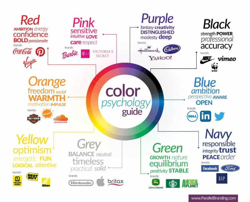
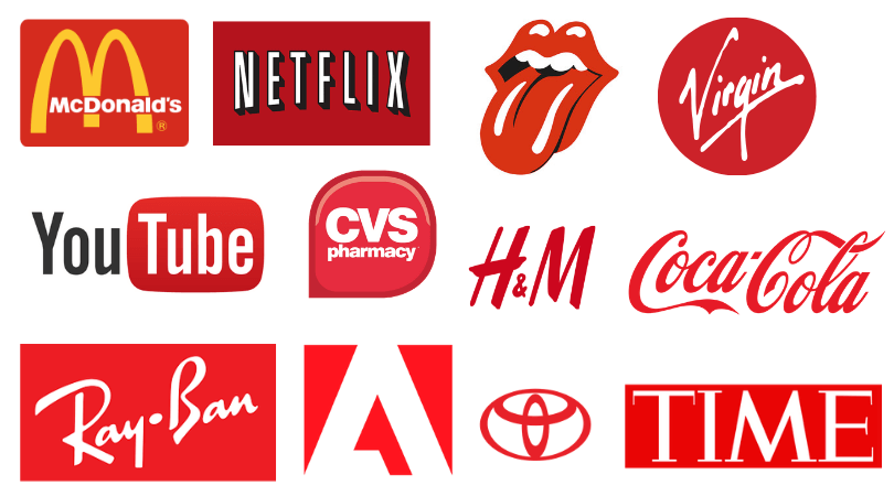
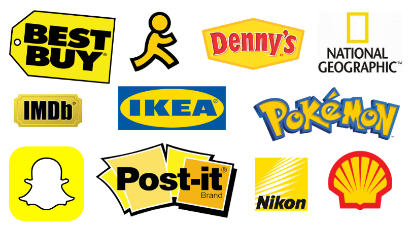
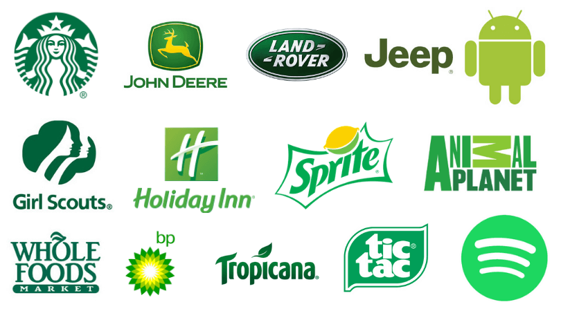
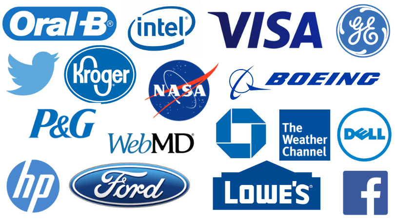
Different colors in branding psychology evoke different emotions, which is why similar companies will use similar colors. For example, fast food companies will use a lot of red to stimulate hunger and to seem exciting and energetic. Tech companies use blue to convey trust, security, logic, etc.

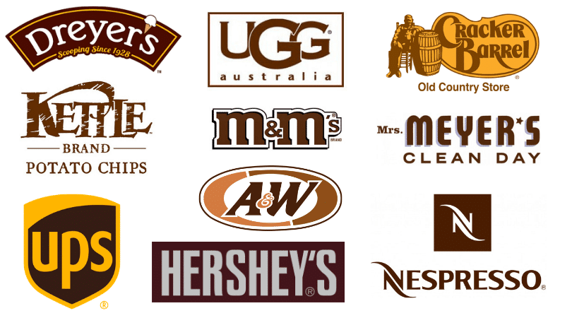
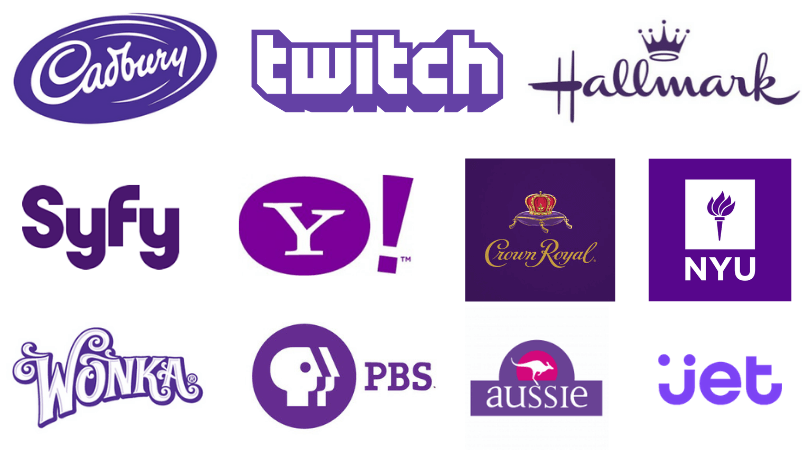
While the effect of colors on emotions and feelings obviously differs from person to person (and culture to culture), there is a general neurological response toward certain colors that most humans have in common. The meaning of different brand colors can easily be seen when comparing logo colors of various companies (see graphic below).

branding color schemes

Several companies have been successful with choosing their corporate color schemes to market a certain image. Color psychology is not something to be underestimated, which is why choosing the right color in marketing and branding is extremely important. Now that that’s understood, how exactly do you pick which colors?


Do you need help building a better brand? Download this free four step process and create a more powerful brand today!

How to Choose Brand Colors

First off, your business should have 1-3 main colors maximum (1-2 is ideal). If your brand was a person, what would its personality traits be? Is your brand fun, innocent, and friendly? Is it happy and creative? These traits conjure up orange or yellow- you wouldn’t want to choose black, gray or brown to represent your brand’s identity.

Let’s look at what each color might mean to the general population:

Red

Red is a bold color that evokes feelings of passion, hunger, warmth, anger, energy, romance, and excitement. Using red makes a powerful statement and when used correctly, will make your logo pop out from the crowd.

color and branding

Orange

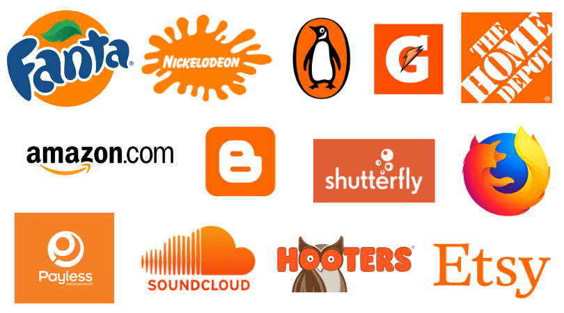
Orange is a friendly color that evokes feelings of creativity, warmth, youth, affordability, and playfulness. Using orange lends an active and vibrant feel to your brand. Luxury and traditional brands should avoid using orange.

choosing colors for branding

Yellow

Yellow is a cheerful color that evokes feelings of optimism, happiness, and spontaneity. It can also signify sunshine, gold, or electricity. Yellow can be a risky choice because it is often used in cautionary signs and the wrong shade can look gaudy. However, when utilized effectively it broadcasts a friendly and energetic vibe.

how to pick colors for your brand

Green

Green is often used to signify peace, health, nature, money, freshness, and growth. Green is a natural choice for environmentally-focused brands (or brands that want to appear sustainable). Darker greens are used to convey wealth and prestige.

how to choose brand colors

Blue

Blue is a calm color often used to express stability, trust, clarity, reliability, communication, and security. It is the most commonly preferred color in the world and thus, is a favorite “safe” color in logos. Blue can also signify water, skies, and the cold.

color palettes for branding

Purple

Purple is a sophisticated color associated with royalty, power, mystery, luxury and imagination. It is a less common color used with brands, so if your brand aligns with this color it’s a good opportunity to stand out!

how to choose colors for your brand

Black

Black is a timeless color that exudes mystery, power, tradition, credibility, authority, elegance, and security. It can signify balance or darkness. If your brand leans more formal or luxurious, don’t write this color off as boring. Several retail and fashion brands use black in their logos.

choosing brand colors

Pink + Magenta

Pink is a sweet and versatile color that expresses femininity, romance, excitement, creativity, passion, and innovation. A softer shade often referred to as “millennial pink” has taken over the marketing world due to its youthful appeal. Bolder pinks and magentas have been used to stand out (like by T-Mobile or as an accent color by Flickr).

color in marketing and branding

Brown

Brown is a rustic color that is often used in food, beverage, organic, and nature brands. It expresses sturdiness, reliability, authenticity, practicality, wholesomeness, and warmth. It can signify the earth, leather, chocolate, wood or coffee.

colors in corporate branding and design

Color Palettes for Branding (Main Colors, Secondary Colors, Accent Colors, etc.)

After choosing your main color, you need to choose your neutral and accent colors.

Your neutral colors will be used for things like your text and backgrounds.

Accent colors are used whenever you need something to “pop”, like a call-to-action or floating button. When used sparingly, they can immediately draw the eye to an important element. When overused, these bolder colors can quickly clutter a design and make it look jarring.

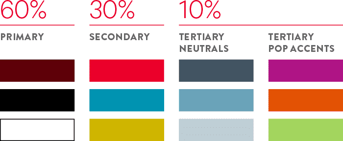
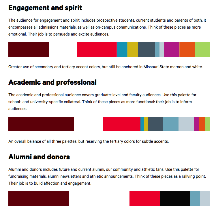
Having a cohesive color palette for your brand makes your marketing materials look polished and professional. Below, Missouri State University shows how you can mix and match colors to reach different marketing goals while keeping the 60-30-10 rule of having primary colors occupy 60% of the focus. Secondary colors take up 30%, and your accent colors will take up 10%.

marketing colors schemes

Missouri State University

company color schemes

Missouri State University

Color Palette Generators

You can also use a color palette generator to automatically pick a pleasing palette. Some of them allow you to “lock” a color and generate a palette around that color.

If you know what your business’s personality traits are but are still struggling to come up with the perfect color, try either one of these color and branding personality quizzes.

Contact MARION for Professional Branding Help

If you’re in need of professional help, contact the experts at MARION today.

Our branding agency in Houston has helped hundreds of companies develop stunning marketing materials and powerfully positioned brands over the last 38 years.

Marketing emails you’ll actually want to read.

Get marketing tips and news sent to 
your inbox.
This field is for validation purposes and should be left unchanged.
Name(Required)

How to Design Product Packaging – 5 Design Process Steps

What is packaging design, and how can it help your product? From the Snickers you buy at the grocery store to the school supplies you buy for your children, you’ll find every product has a unique packaging design.

If you’re trying to create packaging for a new product, understand there’s more to the process than meets the eye. Your packaging should engage your customers through touch, sound, sight, and possibly even smell and taste. Most importantly, your packaging should convey your brand message.

Questions to Ask Before You Create Product Packaging

Before coming up with product packaging design ideas, it’s important that you answer these essential questions in your graphic design brief.

Who Will Buy the Product?

Who is your target audience? Men? Women? Children? Business owners? Moviegoers? Your product packaging should appeal in some way, shape, or form to the target audience.

What Is the Product?

Think about what you’re selling. Is it big? Small? Delicate? Durable? Your product will ultimately determine what type of packaging you will use. For example, if your product is fragile, such as glassware, you’ll need secure packaging to protect the contents.

How Will Your Product Be Purchased?

Where is the product being purchased? Online retail? Your local brick-and-mortar retailer? Selling online vs. selling in-store will require different packaging requirements. For example, selling at a local retailer will require that your product stands out from your competitors.

If you go the online route, you’ll likely want your packaging to include security features, so your product will be protected during shipping.

Content That Must Be Collected

how to design product packaging

As you plan your packaging design, consider whether your product is representing a brand or if it’s standalone. Ultimately, your product packaging should properly communicate your brand message. Before you begin, gather the following items in order to maintain brand-consistency:

  • Company/Product Logo – Request or create a vector file if you desire to put a logo on your packaging.
  • Colors – Use brand-consistent Pantone (PMS) or CMYK colors
  • Fonts – Choosing the right fonts is essential for legibility and properly representation of your product, so double check this aspect of your packaging design.

Don’t leave your branding up to chance. Download this free sample style guide today and start positioning your brand as an industry leader!

How to Create Design Packaging for Your Product

Once you’ve gathered the above information, you can move to the packaging design process.

Learning how to create packaging for your product can be done in five simple steps. Successfully following these packaging design guidelines will ensure the best possible outcome when it’s time to launch your product.

1. Packaging Layers

One aspect of learning how to make packaging designs is understanding that most packaging comes with three layers:

Outer Packaging

The outer packaging protects your product from the outside world. It’s also the first thing your customer sees.

Inner Packaging

how to design packaging for your product

The inner packaging provides even more protection for your product. Take a sealed bag for example or packing paper that keeps your product from jostling around.

Product Packaging

This is the most common form of packaging that you see when you visit your local store. Examples include the wrapper around a candy bar, the bottle that contains your Coke, the label on a can, etc.

2. Choosing the Right Type of Packaging

There are countless types of packaging designs to choose from. Choosing between a bag, bottle, or box may not be as simple as it seems on the surface.

As you determine your product packaging design layout, consider what your competition is doing, your budget, and the product itself. Not only do you want to stand out from the rest of the competition, but if your product is composed of a specific material, your packaging options may be limited.

For example, if you’re selling organic foods, you may require BPA-free frozen meal packaging. This will have a big impact on the manufacture and design of your final product packaging.

3. Set Up Your Printer

types of packaging design process

Get your printing questions answered early, before the product is even ready for release. That way you’ll be able to calculate costs early. You’ll also have plenty of time to get your Houston graphic design firm the information they need to get the job done promptly.

During this phase, keep these considerations in mind:

  • Color options
  • Digital vs. offset printing
  • Die-lines
  • File-format requirements

4. Create Your Information Architecture

There are several ways you can make your packaging stand out in the minds of your customers— informative graphics on how to properly use your product, customer testimonials, a bold and memorable tagline, etc.

While all of these aspects of your package design are essential, shoppers will likely only remember one aspect of your packaging. As a result, choose a centerpiece that stands out from the rest of your design elements and focus on making that the highlight of your packaging.

5. Collect Feedback

Before moving to the final phase, create a product packaging design questionnaire that you can give to a test group (and your key stakeholders), so that you can collect essential feedback.

Here are a few questions you should include in your questionnaire:

  • What is the primary message you get when looking at this packaging?
  • Who is this product designed for?
  • What does the product do?

The collective feedback you receive will help you determine whether you should move forward with your package design, make a few tweaks, or go back to the drawing board.

When everything is said and done, double check to ensure you have the right file formats so you can send them off to your Austin graphic design firm for printing and production.

The Takeaway

Great package design takes time and patience, but once you’ve reached the final stage of your design, there’s nothing more satisfying than seeing your product displayed prominently on an e-commerce site or on a store display.

Knowing how to design packaging for a product takes nuance and expertise. Thankfully, you can rely upon MARION to meet all of your package design needs.

MARION is a marketing company in Houston and Austin that has created compelling designs for hundreds of clients for over 35 years. You can rest assured your package design is in good hands.

Contact us today to learn more about our graphic design services.

Marketing emails you’ll actually want to read.

Get marketing tips and news sent to 
your inbox.
This field is for validation purposes and should be left unchanged.
Name(Required)

Raster Vs. Vector – Some Clarity on Image Types

There are so many different graphic file formats and image options available, you may be confused about what they are, how they work, and how they can be used efficiently to display images and graphics across different platforms.

This article is a quick overview to help you understand which types of files are best for common graphics like photos, logos, and other graphics displayed on the web and used in printed collateral.

What Is the Difference Between Raster and Vector Images?

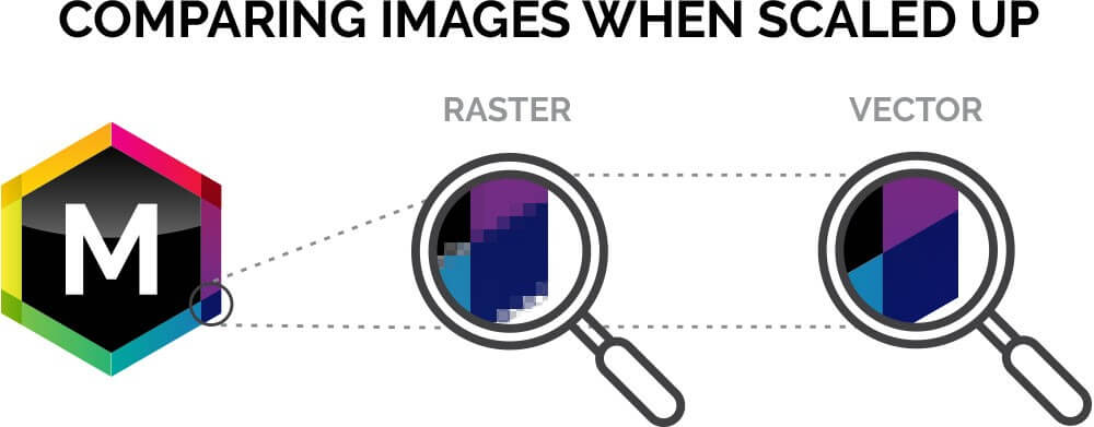
There are two types of digital graphic files—raster and vector. Raster graphics are composed of a combination of pixels, but vector graphics are composed of paths and are based on mathematics so that they can easily scale larger or smaller.

This is a highly simplified summary, so let’s explore raster and vector graphic files in more detail.

What Is a Raster Image?

Raster images are made up of tiny squares of colors or shades of black called pixels. When magnified enough, you can see the individual pixels of the image and that each one is a single color. When all those pixels are viewed as a whole, they work together to form a rich, detailed image with intricate color variations and soft gradients.

Digital photographs you see on a website, pictures you take with your phone or digital camera, or scanned artwork are all raster images. Because of the amount of digital information contained in a raster image in all those little pixels, file sizes tend to be larger than those of vector graphics.

What Is a Vector Image?

Vector graphics are built mathematically and are made up of points and paths. Generally, vector graphics are less detailed containing fewer gradients and less diversity of color. And, even though they can be used to form nearly photo-realistic graphics, they tend to be used in building graphics with more uniform, solid colors and fewer details.

Vector graphics are commonly used to produce logos and other simpler graphics that may need to be used at different sizes and have the benefit of maintaining crisp, sharp edges, even when they are enlarged greatly.

difference between raster and vector

Advantages and Disadvantages of Common Raster Formats?

Raster images are extremely versatile and are the preferred format when realistic, photographic-type imagery is desired.

When you take a photograph on your phone or digital camera, a raster image is automatically generated every time you tap the shutter icon. They can be displayed on any common electronic device, shared through email and text messages, and posted to social media sites such as Facebook, Twitter, or Instagram.

Raster files can also be used to print photographs or in any piece of printed collateral such as a brochure, poster, or magazine. Creating raster images doesn’t require any special software knowledge or training, and they are easily produced by anyone that can use a smart phone or camera.

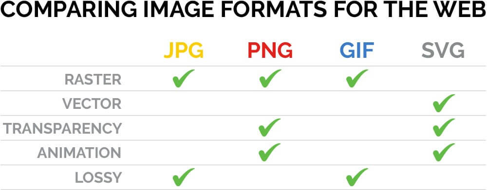
Many different raster file types can be displayed on the internet — with JPGs, PNGs, and GIFs being the most common. Each one contains advantages and disadvantages over the others.

JPG Raster Files

JPGs are the most commonly used graphic files on the web because of their ability to display millions of colors with photographic quality at low file sizes. These lower file sizes allow websites to load and display quickly, which is crucial in today’s mobile-friendly world. Most digital cameras and smart phones save pictures as JPGs as the default format.

One disadvantage of the JPG is that they are “lossy,” meaning each time they are opened in a photo editing software and re-saved, they lose some graphical information, and jagged edges or pixelated areas can appear on close examination, especially when opened and resaved multiple times.

PNG Raster Files

PNGs also deliver photographic quality but are generally larger and slower loading on web browsers than JPGs — But PNGs are lossless when edited and resaved.

The biggest advantage of a PNG over a JPEG is the ability to have transparent (see-through) areas saved in the file. This is especially useful when placing the PNG over another color or graphic where you want the background to show through.

GIF Raster Files

GIFs are also lossless, but the main advantage of GIF files is that they can be animated. However, they are limited to a display of 256 index colors and are best used for smaller, more simple graphics and animations.

TIF Raster Files

Another widely-used raster file type is the TIF, most commonly used in the graphics and print industry. TIFs have all of the full-color display ability of JPGs, but they are lossless. TIFs can also contain editable layers and transparent areas when needed.

raster vs. vector graphics by using JPG, PNG, GIF, SVG, and TIF

What are the benefits and disadvantages of different vector formats?

Because vector images use mathematical equations and are generally less detailed than raster images, they are usually smaller in size. Therefore, vector files are easier to distribute through email and take up less space on your computer.

While hard drive space may not be as much of an issue today as in the past, because of the easy availability of external hard drives and SSDs (solid-state drives), the main benefit of a vector image is the ability to resize it without the degradation, or pixelation, that occurs to raster images when they are increased in size.

You should avoid using raster images to create a logo for this very reason. When creating a logo or illustration, a vector format is the best option, because it allows you to use the graphic at any size with no loss of image quality. This is quite important for using your logo across many different platforms, both digital and print.

One disadvantage of vector graphics is on the production side. To produce a vector graphic, some basic knowledge and software training is usually necessary — it’s not as easy as pressing a shutter icon on your smart phone. There are many vector creation and editing apps available, but Adobe Illustrator is the industry standard for creating vector graphics and has been the leader in this area for graphic design professionals for many years.

Another disadvantage of vector graphics is that most are not compatible with internet browsers— except for the SVG. The SVG is a very versatile vector file format that can be used on the web. SVGs support transparency, can be animated, and maintain all of other benefits of vector formats, including clarity at any size and resolution.

Other common vector formats such as EPS, AI, and some PDFs are used in the printing industry — most commonly for logos and other simple graphics.

Takeaway for Raster and Vector Images

Using and producing the right file formats at the right sizes can help save time and avoid unwanted issues in both digital and printed materials.  Avoiding problems with compatibility, download speed, and print quality will help your business get its message in front of your audience with the efficiency and quality your products and services deserve.

Are you searching for Austin graphic design firms or Houston graphic designers that knows how to leverage the right design tools and consistently provide you with the best value?

At MARION, we take design seriously, and we know our way around file types. You can trust the experts at our Houston marketing agency to use the absolute best practices when it comes to efficient and effective use of the right raster and vector images when creating beautiful graphics for your business.

Contact us online today or call us at (713)-568-4826 to learn how we can help you design and create something special to help your business look its best.

Marketing emails you’ll actually want to read.

Get marketing tips and news sent to 
your inbox.
This field is for validation purposes and should be left unchanged.
Name(Required)

What is Growth Driven Design? – How to Begin Data Driven Website Design

Redesigning a website can be a huge struggle for any business. It takes a lot of resources to redesign a website, and with the amount of work involved your marketing team will likely be pushed to their limits.

Typically, a website redesign will require around three months of concentrated effort. That’s three months of your marketing team focusing their attention away from your brand’s recurring marketing efforts. Pulling away the main focus of your marketing team for such large stretches can be potentially harmful for your business.

Thankfully there’s a faster more efficient method that can be used. This method is called growth driven design and it can truly transform the way you approach website design for your business forever.

What is Growth Driven Design?

Growth driven design (GDD) is an adaptive web design and digital marketing model. The core components of GDD are test, learn and adapt. The growth driven design methodology minimizes various risks commonly associated with traditional website design by focusing on meaningful data that reduces the time it takes to launch your site.

In essence, GDD is a combination of marketing and design where the two goals are fused together to become one.

How Does the Growth Driven Design Methodology Work?

Growth driven website design is an ongoing process that leverages collected data (such as customer behavior on your website) in concert with continuous learning and constant testing to make strategic and impactful performance improvements to your website.

Data driven web design calls for shorter planning which allows it to be accomplished in shorter amounts of time. This is a safer and more effective method of web design, and it ultimately saves the user money.

The problem with traditional web redesign is that it can take three months or more to gather the data needed to make the proper design changes. This data includes usability testing, content audits, consideration of budget and so on.

growth driven design

The beauty of data driven website design is it doesn’t take up all the time and collective effort of your marketing team because it integrates itself with both marketing and sales.

Analyzing the behaviors of site traffic can help both your marketing and sales team improve the way they go about accomplishing their goals and can help them improve the tactics and strategies they need to be successful.

How to Implement Data-Driven Website Design at Your Own Business

You could say it takes two phases to build a data driven website. The first phase is the strategy and launching phase. This will last around one month. The second phase is the development and continuous improvement phase. This phase will be continuously in use for the following eleven months.

Getting started with the first phase of GDD

The following three steps will help you execute the first phase of data driven website design.

Strategy and buyer personas

To begin, you should formulate your strategy and form goals so you have an idea of what you’re trying to accomplish. Next, create buyer personas to find out who your ideal client base is. This will also help you identify what customers care about and what they like, which will allow you to create an effective marketing strategy.

data driven website design

Auditing your website

Once you’ve finished the above step, you will move on to a detailed website audit. You’ll analyze where your customers are coming from, your average bounce rate and how users interact with your site (amongst other analytics).

Analyzing the above data should ultimately allow you to discover the pain points of your visitors which in turn will allow you to improve the overall user experience on your website. The goal of your website audit is to learn the behaviors of your visitors and why they perform specific actions. You can then act on that information and make improvements.

Create a wish list

The final part of the first phase is to create a wish list of everything you would like on your website that would improve the overall user experience. This can include an updated home page menu, implementing SEO for your About Us page, simplified navigation, additional pages, new calls to action, etc.

Create a list where you gather both the changes you absolutely need for your website and the changes you’d like to make onto your website. As you proceed, you can begin moving the less pressing items further down the list which you’ll eventually target later in the 11-month cycle. Through this process of elimination, you’ll eventually figure out where your website’s true strengths and weaknesses lie.

Phase Two of Growth Driven Design: Development and ongoing improvement

The first stage takes place over the course of a month. The second phase will continuously be in use for the next 11 months.

As opposed to redesigning a traditional website your full attention should be on the actions of your visitors. Your visitors should be at the forefront of your mind with every update, new feature, and new strategy you implement on your data driven website.

growth driven design methodology

With that being said, there are four steps to the development and ongoing improvement phase:

1. Planning

During this phase, you’ll constantly be analyzing your site’s performance on a month to month basis and comparing it to your overall goals for the site redesign. From the data you obtain, you can determine the goal’s that need to be accomplished in the future.

2. Developing

Working with the appropriate business units in your business (marketing, sales, etc.) you will create the tasks needed to improve your site based on user feedback. You will then create a marketing campaign to direct targeted traffic to your new and improved pages. Implement validation tracking codes to continuously track the metrics on your site so you can continue to make improvements by gathering additional data.

3. Learning

As you split test and experiment with improvements you’ll find that certain assumptions you’ve made, such as adding “more intuitive” navigation to your site to improve user experience, may not be what your data driven website needs after all.

Therefore, you can throw that idea out and replace it with something that directly benefits your users. Perhaps you’ve identified that your website redesign SEO strategy will be more beneficial to focus on in the immediate future.

4. Transfer

The final step is to transfer the data you’ve gathered to your marketing team. Your team can then proceed to use that data to improve their ability to locate and attract your ideal customer.

Implementing growth driven design for your website

There are numerous data driven website advantages you can enjoy if you go about the process correctly. Data driven web design is all about improving your website in small, meaningful chunks until you create the ultimate user experience. You should always be analyzing data to make future improvements.

At MARION, we know what it takes to build and continuously manage a growth driven website. Marion is a full-service marketing firm that offers highly rated custom website design services. We build every website with the client’s brand and bottom line in mind. Our experienced team has helped hundreds of industry-leading brands build effective websites that have grown their businesses, and we can do the same for you.

Contact MARION today for help with building a data driven website for your business.

Marketing emails you’ll actually want to read.

Get marketing tips and news sent to 
your inbox.
This field is for validation purposes and should be left unchanged.
Name(Required)

3 Ways Graphic Design Affects Your Business’s Bottom Line

You work hard to provide quality products and services to the marketplace, but in our visually busy culture, it’s not easy to capture the attention of potential clients. We’re relentlessly surrounded by promotions contending for our recognition on a daily basis. The marketplace is overcrowded with products, and this results in an enormous amount of competition for customers. And let’s be honest — many of the promotions out there contain sub-par design that just gets lost in the clutter.

With all of the options available to consumers, quality graphic design just might be the difference that can help communicate your message effectively and separate your business from the competition. Alternatively, inferior graphic design can communicate a message of apathy or disinterest in presenting a product in the best possible light. Quality graphic design can help connect your business with the intended audience, and in turn, increase sales.

If you need help taking your design to the next level, contact Austin graphic design firms like MARION for a quote today!

3 Ways Quality Graphic Design Can Help Impact Your Bottom Line

Graphic design is an investment. Learn about these three ways that graphic design positively impacts your bottom line.

Consistent Branding

When properly leveraged, brand recognition is a valuable tool that allows the audience to identify a business and its products by simply seeing the logo, color scheme, tag line or other notable elements of the brand. A consumer’s ability to recognize or recall a brand is essential to purchase decision-making. A business transaction cannot happen unless a consumer is first aware of a product. And remember, developing a brand extends beyond your logo.

graphic design bottom line

According to the American Marketing Association, A brand is a name, term, design, symbol, or any other feature that identifies one seller’s good or service as distinct from those of other sellers. In other words, don’t neglect the other parts of your advertising efforts — including your website design, print or digital advertising, print collateral, or anything else a potential or existing client may see.

Communication

You have identified a specific need in the marketplace. Clearly delivering information about your product is key in sparking consumer interest. A clear exchange of information may be difficult in an overcrowded marketplace, but quality visuals through imagery or graphics, when properly executed, can help communicate a message more clearly than words alone.

Effectively and persuasively communicating relevant information to your audience about your products and services will inspire consumer confidence. You have identified a specific need and are able to provide a solution to that need — this will impact your bottom line. If you’re not the one doing the graphic design work, make sure you know how to write a graphic design brief so your designer can communicate the appropriate message!

User Experience

If a potential client has identified your company as one qualified to provide the product or service they need, they will more than likely visit your website to learn more about you before they make a call or visit. But an opportunity to achieve instant credibility and trust will be lost if you have a poorly designed website.

building a better brand

Your website must be mobile-friendly, visually appealing, uncluttered and brand consistent. According to www.socpub.com, 57% of users say they won’t recommend a business with a poorly-designed mobile site.

Remove everything that doesn’t help convert a visitor to follow through on the call-to-action.  Easy website navigation is a must, especially on mobile devices. A poor mobile device presence can make your organization look unprofessional and out of touch with the modern consumer. Have your site optimized for mobile to make the right impression.

The Takeaway

You may have your competition beat by having the best products and services available — but is your business getting noticed, or are your advertising efforts falling flat because of low-performing, inferior graphic design? Is your branding consistent across all media, print and digital? Has your website been updated recently, and is it user-friendly, responsive, and quick-loading on mobile devices?

These issues can make your business look inconsistent, out of touch, and cost you clients. You don’t want your credibility and reputation to be damaged because of poor graphic design.

At MARION, we take graphic design in Houston and Austin seriously! We deliver quality at a level that most marketing and advertising agencies in Houston can’t match! We are certain we can provide you with graphic design you can be proud of, will be recognizable and distinct, and will present your products and services in the best possible light.

Check out our work portfolio and contact us today for all of your graphic design needs.

Marketing emails you’ll actually want to read.

Get marketing tips and news sent to 
your inbox.
This field is for validation purposes and should be left unchanged.
Name(Required)

6 Logo Design Basics – How to Create a Good Logo for Your Company

If you want an instantly recognizable symbol that represents your brand, you need a logo. But most business owners don’t know all the logo rules, making it hard to create the perfect visual representation of their brand. So, what should a logo contain?

6 Tips on How to Create a Good Logo

It’s time to learn the main logo design considerations before you create (or recreate) this marketing essential. Here are the top logo design best practices to follow for a stunning final product.

1. Get Everyone Involved in the Logo Design Process

how to develop a logo concept

You want everyone at your company to feel good about the logo that represents your business. The easiest way to do this is to create the opportunity for everyone in the office to provide input. Not only are they more likely to feel proud of a design they helped create, but you’re also going to need everyone’s ideas in the first place.

As you start on the logo design essentials, schedule some brainstorming sessions with employees. This is a chance to collect input on the shape, color and other things to consider when creating a logo. You can even ask employees to sketch out their logo ideas, so you can decide which ones to further develop.

2. Be Sure Your Logo Fits Your Industry

Maybe you feel your new logo describes your company, but does it work in your industry? If you’re in a serious or professional field, make sure your logo reflects that. If you’re in a casual or lighthearted field, your logo can be a little more playful.

For example, if your business is a funeral home, then a pink, bubbly logo with a happy face isn’t appropriate. But if you sell cotton candy or ice cream, pink and bubbly is more likely to be on target. Consider the logos of the other businesses in your industry to get an idea of how serious or playful you can get as you learn how to design an effective logo.

building a better brand

3. Keep the Logo Simple

One of the most important logo design essentials to keep in mind is to stay simple. The most effective logos are simplistic, not complicated and hard to remember. You want your audience to immediately identify your company from the logo alone, and a complicated design doesn’t allow for that.

Think about some of the most famous logos and how simple they are, from the Nike swoosh to the Target bulls-eye. Keep this in mind as you work on figuring out how to develop a logo concept. If you’re having trouble with keeping things simple, you might benefit from MARION’s logo design services, so learn more about how we can help.

4. Choose the Right Colors

how many colors should a logo have?

Color is another one of the logo design basics to consider throughout your logo creation process. Thanks to color theory, the colors you choose will affect how consumers see your brand.

For example, blue is a shade that many well-known companies use to be viewed as reliable and professional, because that’s the impression this color leaves in the minds of consumers. On the other hand, restaurants are more likely to use red, since this shade has the power to make people hungry. Additionally, yellow and orange are good for grabbing your viewer’s attention, while green signifies money and growth.

How many colors should a logo have? One to three colors is a good range, since you don’t want to complicate the logo with too many colors. Some other logo rules and regulations include:

  • using shades that are near each other on the color wheel
  • avoiding super bright colors
  • ensuring the logo looks presentable in grayscale or black and white

5. Make Sure Your Logo Looks Good at Any Size

Your logo will be resized multiple times over the years, and you need it to maintain its high quality whether you shrink it or enlarge it. As you determine how to create a good logo, test it out at different sizes.

You might need to scale it down to fit on print collateral like an envelope or even a promotional pen or button, so make sure it’s still clear and recognizable at its smallest. And you might need to make it larger to fit on a poster or television ad, so enlarge it and print it out before you decide it’s the perfect logo for your brand.

When you go with MARION’s Houston logo design services, we’ll create vector logo concepts that look good at any size so you don’t have to resize it yourself.

6. Pick the Right Font

logo typography tips

If your logo will include letters, you’ll need to choose which font to use. No list of logo design rules would be complete without some logo typography tips.

To start, decide if you’ll use a serif, sans serif or script font. Note that serif fonts are often seen as professional or even academic, while sans serif fonts give off a fresh feel. Many popular script fonts have a classy look, though some look casual.

You’ll have to test several fonts to get an idea of what best suits your brand as you consider logo design best practices for your industry. If you can’t find anything that works for you, think about having a custom font made. This concept has worked for companies like Coca-Cola. But no matter which font you choose, make sure it’s legible when you scale it down.

Find a Design Firm That Follows the Logo Design Basics

Now that you know some effective logo design tips, you can start the process of coming up with a logo for your company. Of course, this can be a difficult task for someone trying to run a business at the same time, so it’s best to call in a professional marketing firm in Houston when you need a custom logo for your company.

Contact MARION for a quote today if you’re interested in our logo design services!

Marketing emails you’ll actually want to read.

Get marketing tips and news sent to 
your inbox.
This field is for validation purposes and should be left unchanged.
Name(Required)

State of the Art Website Design in 2019

When someone first encounters your website, you have a few seconds to convince your visitor they have arrived on a site worth some of their precious time.  To make that first positive impression, it almost goes without saying your site must display quickly and navigate easily on a mobile phone, tablet or computer.  But just as importantly, it should look good. And how it looks often has a lot to do with how it works.

Visual appeal depends on many factors, including the eye of the beholder. But a website whose style has come and gone will not be visually appealing to most people.

Keeping your site in line with current design concepts and practices, many of which arise from simultaneously improving equipment and software technology, is one thing you must do to create a positive first impression.

Maximizing the initial user experience (UX, as it is often called) is essential in gaining user trust and getting her business. There is another reason to develop awareness of website design: you as the owner or planner should become more able to express how you want your site to look and feel to a designer.

Becoming more familiar with the essential elements of modern design will be helpful.  Our Houston website design experts have poured through several resources to arrive at a list of web design advancements in 2019, and we are not attempting to predict any trends. New websites are already showing these adaptations and innovation in animation, illustration, color, layout, typography, and photography.

State of the Art Web Development in 2019

Non-traditional styles such as asymmetrical layouts appear more frequently as browsers become more able to display them reliably. Here are several aspects of website design with examples showing showcasing their remarkable change in 2019.

Photography

Photography remains a primary communication element, and the kinds of photography in use today have evolved far beyond pictures of stock photo models in dated attire and hairstyles.

As we, gratefully, see less of that, we see more and more images showing people of color and varying ethnicities, background, and cultures, along with the use of color and effects to match brand to image.

The ever-expanding width of desktop monitors almost requires websites to deploy attention-grabbing images along with well-designed typography. The value of original, high-quality photography continues to become increasingly apparent in sites across all industries.

Video

The use of video on the web has dramatically increased in recent years, and will only continue to grow going forward. Video is now often found beyond the home page to better showcase product capabilities, amplify a message, or show product use scenarios and training.

All modern browsers have built-in video playing capability, which has contributed to this proliferation, along with powerhouse video websites such as YouTube, Vimeo, and others making it a snap to display their public videos on other websites, which can be a boon to your website metrics.

Typography Forward

state of the art website design

While not brand new, the variety of font and typography for the web exploded thanks to a BIG BANG of improvements in browser technology along with thousands of font faces made available by Google, Adobe, and many others, that load independently of the user’s computer.

Type once confined to use in rendered images (invisible to search engines) now displays reliably as real, searchable text. Designers have responded by putting typography front and center in all the text areas of a website, with big and bold letters, expressive and varied font and use of display type.

It can’t be stressed enough how important typography is to communicate your unique message and voice. Typography leads the user’s eye, organizes content, improves scanning, and keeps them reading: all important to good UX.

Shadows and Other Gradients

state of the art websites

Also not new, the drop shadow makes a come back. Sidelined for years by the dominant “flat” design aesthetic, its use in aiding usability returns, largely because drop shadows and gradients can now be rendered and animated easily with CSS and JavaScript.

And, big, bold, beautiful gradients are more faithfully rendered with modern browsers and mobile devices. All that means is a button can look and behave like a button without downloading several variations of a single image.

And, a page can explode with gradient color without “banding”, i.e., the visual distortion caused by screens that can’t display the required colors or because the image itself was reduced to save bandwidth.

This is crucial because the additional downloads, or server requests, needed for button states and large images now negatively impact the evaluation your website receives from search engines, especially on mobile devices.

Also, it matters because the human eye uses gradients in color and light to interpret distance and isolate objects in space. Shadows and gradients create a more dimensional space which, if used with care, both helps and intrigues the viewer.

An amazing site that uses gradients programmed to change colors depending on the time of day. https://onejohnst.com/

Particle Backgrounds and Other Animations

state of the art web development

Large animated images are an especially exciting arena in modern web development. As the use of resource hogging technology once required to display animated graphics has declined, technology has developed to provide animation without killing your processor or stalling page loads.

A text-only script can render a screen filled with animation that both engages and informs. Animation, on both your website and your social media pages, communicates your message effectively, briefly and entertainingly. Click this image to see it come to life:

Custom Illustration

Hand in hand with animation is custom illustration. 2017, 2018, and 2019 saw an increase in websites displaying non-photographic imagery in all kinds of ways.

Custom illustration is both useful to elucidate factual information about products and systems, as well as delight the user with color and flair.

A custom illustration can be directly tailored or easily modified to match guidelines required by those creating a brand name for business, whereas photography by its nature is often less specific and can sometimes be extremely expensive or difficult to acquire.

Asymmetrical Layouts

Because browsers have become more flexible in how a page is finally rendered to the user, websites have begun to abandon the box.

A web page can have elements appear outside the visible or invisible grid boundaries that structure most pages, sometimes called “broken grid layouts,” and then pop back to neatly stacked boxes if that’s better for the rendering device, such as a tall and narrow phone screen. So, designers, no longer dependent on the rectangle, are exploring eye-catching and unexpected layouts.

Asymmetrical design is not always the appropriate way to communicate a message, depending on the nature of the business, or the amount of content, but this trend is making its way among brands who seek to set themselves apart from the competition.

The Take-Away of Modern Web Design

There are many other aspects of website design currently shaping what we see and experience every day on the web.  When you look at your current website you may find that you are on the forefront of the latest and greatest trends shaping the web right now, or you may find that your website could use a refresh.

Whether you’re looking to refresh your current website or ensure that a new project features current trends in web design, make sure that you don’t lose sight of you website usability goals along the way.

As you look towards your next web project, the best advice that can be offered is to work with a reputable web design company, or even a specialty WordPress web design firm to ensure that you aren’t lagging behind the mark straight out of the gates and that your website is focused on both form and function.  After all, your website isn’t just a vanity piece, it’s an important piece of your marketing mix that serves an extremely important function.

Marketing emails you’ll actually want to read.

Get marketing tips and news sent to 
your inbox.
This field is for validation purposes and should be left unchanged.
Name(Required)

Using Emphasis for More Effective Designs

Imagine a motivational speech or sales presentation in which every word was spoken without a pause or change in tone. Would the speaker’s message be interesting or memorable? Would you be persuaded to buy their product or excited to pursue their advice?

Even if the speaker really believes the product or information he’s promoting is valuable or even life-changing, we might expect the only visible results of his uninspiring efforts to be heavy eyelids and bobbing heads.

In this post we’ll discuss emphasis; what it is, why it’s important, and some common dos and don’ts when trying to incorporate emphasis into your designs.

What is emphasis?

We use emphasis to draw attention and create a focal point. Emphasis is achieved by minimizing or toning down compositional elements while accentuating other elements in order to bring attention to the focal point.

When you go to a museum full of art, would you expect to see the same bland color used on every single painting? The absence of variety produces a dull uniformity. Yes, beauty is in the eye of the beholder, but, how would you honestly critique such uninspired work?

Sometimes, in an effort to avoid monotony and add emphasis, nearly every pixel on a webpage or every square inch of white space in a brochure is packed with graphics and content, leaving a busy, eye-crossing patchwork of imagery and text that is difficult to navigate. Using emphasis in graphic design is vital in creating a compelling design that communicates a message. Emphasis in design can be accomplished in many different ways.

For help creating the appropriate emphasis in your design, let graphic design agencies in Austin like MARION lend an expert hand today!

Emphasis Dos and Don’ts

When attempting to add emphasis to a design, consider the following dos (or don’ts):

Don’t: Make the logo too big.

logo size

Unnecessarily increasing the size of a logo is a very common request—and we get it. You’re proud of your logo, and you should be. It identifies your business, and you don’t want to be overlooked.

You want to be recognized, but your logo is only a small part of your brand. Increasing the size of your logo may come across as visually shouting, or, an act of desperation to be seen and stand out from the crowd.

On the other hand, a legible and tastefully sized logo conveys confidence and approachability. And don’t discount the importance of other design elements in addition to a logo in the quest to get noticed and communicate a message.

Don’t: Add too many or irrelevant pictures.

emphasis in design

You want potential clients to know all about the products and services you offer, but, using more photos may not be the answer.

Overwhelming a potential client with imagery may come across as aggressive, and, a visually cluttered design may hinder your marketing efforts by causing more confusion than clarity.

Consider the effectiveness of fresh, clear designs used by successful and influential companies like Apple or Coca-Cola. The most successful companies use attractive, well-thought-out images in limited numbers to support compelling messages that drive people to their products and services. This is the essence of successful marketing.

Do: Choose font-sizes carefully.

typography hierarchy

Readability is one of the most important parts of a successful design. After all, if your content is hard to read your message gets lost, no matter how exciting or useful it may be.

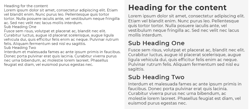
A clearly legible font size ensures usability for most every user across multiple platforms. But, to help ensure readability, there should always be a clear distinction between headlines, subheads and body copy—also known as typographic hierarchy.

Helping a reader navigate by arranging and organizing type in a clearly established pattern is as important as using a legible type size. This allows the reader to determine the most important parts of a design quickly.

Do: Use plenty of color, but thoughtfully.

thoughtful color

Calm and soothing; Passionate and daring; Warm and welcoming. Choosing the right color scheme can have a significant positive impact on the desired mood and perception of a design.

An average design can be brought to life by using the right color, not necessarily more color. Just like adding more photos to a composition, randomly adding more color can become a distraction and may have the same adverse effect in communicating your overall message simply and effectively. When using color for text it should be easily readable, inviting, and easy on the eyes.

Don’t: Fear the white space.

white space good

White, or negative, space can be defined as the area of a design that is left blank or unused for text or graphical content.

It’s simply the space between elements of a design. Filling white space with text and graphics can lead to user confusion and visual fatigue.

Conversely, the proper use of white space, along with other basic graphic design rules, can be very impactful in creating a sophisticated, elegant design and clearly communicating your message.

If everything is emphasized, nothing is emphasized.

One of the most important rules to follow in design is this: If everything is emphasized, nothing is emphasized.

Emphasis is needed to direct and focus attention on the most important parts of a composition, speech, website, or a piece of marketing collateral.

The proper emphasis in design is accomplished using structure and direction to help guide the audience through the design. And visual interest can help accomplish the most important goal of your marketing efforts—communicating your message in a simple, easy-to-understand way, and ultimately driving customers to use your products and/or services.

The Take-Away

Great designs are not created by focusing only on the content of what you are designing or by giving no consideration to the content of what you are designing.

In reality, effective designs are created by giving careful consideration to the content of what you are designing and creating a visual hierarchy that is both appealing and helpful for the end user in their efforts to consume the content.

If you have concerns that your designs are not as effective as they could be, consult an experienced graphic design company to help you identify areas of obvious deficiencies.

Finally, never be afraid to ask a designer why they have made the choices that they have, they should always be able to explain why their choices will help the end user use the piece more successfully.

Marketing emails you’ll actually want to read.

Get marketing tips and news sent to 
your inbox.
This field is for validation purposes and should be left unchanged.
Name(Required)

Your Outdated Print Collateral Is Bad for Business

Too many brands change their social media and web content daily, even multiple times daily, but forget about old, outdated print materials.

What Is Print Collateral?

Print collateral is physical marketing items like branded letterhead, business cards, brochures about products and services, fliers, direct mail pieces, branded folders, business signage, and similar material. Print collateral for some online businesses is deemed obsolete, but some business models still rely heavily on it.

Print collateral has excellent staying power. That may be its greatest strength but can also prove to be the source of your toughest marketing headache.

You may be tempted to expend less effort on your print collateral or go paperless altogether.  Despite cries that print is dead, high-end brands are spending up to three-quarters of their ad spend on print. If you’re in need of Austin or Houston graphic designers to update these valuable assets, reach out to MARION today.

Reasons to Update Your Print Collateral

When you go to a conference or event of any kind, one of the questions you hear over and over is, “Do you have something I can take with me?” In old world sales, that used to be called a dodge. That’s not true anymore. In the new world of collaborative buying groups and complex customer journeys, print collateral has returned to prominence as a critical tool for sustaining brand messaging at the top of mind.

1. Business collateral has dial up engagement.

Blogs and websites featuring numbers, images and bullet points tend to get more traffic because people are going over them quickly, according to research by San Jose University. “The screen-based reading behavior is characterized by more time spent on browsing and scanning, keyword spotting, one-time reading, non-linear reading, and reading more selectively,” said research lead Ziming Liu.

If you want prospects to spend more time and consider your value proposition more carefully, put it in print. MARION’s graphic design in Austin and Houston can help!

2. You can’t afford to send the wrong message.

Today’s consumers consider channels to be irrelevant. They see brands as a single entity that they interact with in-store, online, on mobile, or in print. 60 percent of millennials surveyed expect a consistent experience from brands across all channels, so a mismatch between print and online messaging registers as a mistake. Your buyer personas will change and evolve over time. Make sure you apply your market research to all of the messaging going out and that they share a unified message.

3. Aging marketing materials can damage brand reputation.

The CMO Council found that 70 percent of companies surveyed had no tools in place to track the obsolescence of their marketing materials. 40 percent of respondents said they waste at least a fifth of their marketing budgets on out of date materials. This not only makes your company less competitive, but it may also be working counter to your existing messaging. If customers don’t know where you stand, they will simply move on.

4. The quality of marketing materials indicates the quality of the brand.

An exhaustive study of the meaning of “quality” at MIT revealed that a majority of consumers are dissatisfied with existing levels of quality in what they buy and business managers ranked “producing to high-quality standards” as their No. 1 current concern. Researchers explained that “Because consumers do not always possess complete information about a product’s attributes, they must frequently rely on indirect measures when comparing brands.” Marketing materials are the earliest, and sometimes only way prospects have to evaluate the quality of the brand.

Contact MARION today to get a quote on your upcoming print marketing collateral.

Focus on Updating These Marketing Collateral Items First

what is print collateral?

1. Business Cards

First and foremost, update those old business card designs.  Quite possibly the most used piece of print collateral in your arsenal, your business cards will quite often be the first interaction a person will have with your brand.  Make sure it’s a good interaction.

print collateral design

2. Leave-Behinds

Your leave-behinds can come in many forms but are characterized by the fact that it is collateral you leave with someone expecting that they will return to it at some point.  Ensuring that your leave-behinds are clear, self-explanatory, and on brand can drastically alter their effectiveness.

print marketing collateral

3. Print and Outdoor Ads

Are your print or outdoor ads a couple of years old or older?  Then it’s time to update.  Good marketing is visually different today than it was a couple of years ago.  True, there are timeless marketing principals at play in constructing your ad.  And perhaps it was well constructed.  But the bottom line is that if the overall ad feels dated, then it’s effectiveness will dwindle dramatically.

print marketing material merchandise

4. Promotional Items

Perhaps this should be at the top of your list; perhaps it belongs at the bottom.  Depending on how often you use it and how it plays into your overall marketing strategy, updating your promotional items could be the most important print collateral for you to focus on.  Almost nothing in marketing is more of a reflection of your brand than the promotional products that you use.  High quality, well designed promotional items represent a strong brand, while we just call the other stuff “tchotchkes” and throw them away.

The Take-Away

The takeaway here is that outdated or poorly designed print collateral is bad for business, especially in the fast-moving digital world where completion may be only a finger-swipe away. Give your customers a consist, reliable experience across channels to earn their loyalty. The rewards in engagement and referral traffic are more than worth the extra effort.

Work with a brand style guide to ensure that all of your collateral, regardless of the channel is on message and on brand.

Finally, approach all of your collateral with the same mindset.  You are trying to translate your brand into an item, whether physical or digital, that an individual will interact with.  This interaction with your collateral will either build brand affinity or brand wariness.

If you are working without an in-house designer or design team, try to work with a multi-faceted outbound AND inbound marketing agency to help with both your digital design and providing your print design services.  Working with the same firm is a great way to ensure consistency in look and feel across all marketing mediums.

Marketing emails you’ll actually want to read.

Get marketing tips and news sent to 
your inbox.
This field is for validation purposes and should be left unchanged.
Name(Required)