Category: Branding Design

Is It Time to Refresh Your Logo?
Your logo holds a lot of meaning to you, and it should.  It represents something that you’ve worked hard to build and cultivate.  And the chances are that you put a fair amount of time, thought, and effort into creating the logo as well.

Not to mention the fact that designing a logo isn’t always the simplest or most enjoyable process.  It can be one of the more artistic aspects of your business, and art is subjective.  The nature of a logo design project can make it hard to come to a consensus among those involved.

Despite all of this, there will come a time when you need to update or refresh your logo.  There are a lot of reasons why it may be time for a refresh, and we’ll look at these in more detail, but the bottom line is that it’s time for a refresh when your branding is no longer as effective as it could be.

Logo Refresh versus Rebranding

You may be thinking to yourself that refreshing your brand every so often defeats the purpose of all your brand awareness efforts. If this is the case, you’re probably thinking more of rebranding versus refreshing your brand. (Just make sure you avoid these common rebranding mistakes!)

A rebrand is usually representative of a much more drastic change than a refresh.  It usually involves a new name, icon, design, or combination of the three being created to specifically develop a new and differentiated identity.

Here’s an example. Time Warner Cable had a notorious problem with its brand; it had become synonymous with terrible customer service. In May 2016, Charter bought Time Warner Cable, and within six months, Time Warner Cable ceased to exist, and Spectrum Cable was operating in its place.  It is the same company, offering the same products only under a different name, and we can only hope with a revamped customer service approach.

Time Warner Cable logo changed to Spectrum

When a company completely changes its brand identity, it’s rebranding. This shedding of a brand usually occurs when the upside of creating a new identity outweighs the loss of brand recognition. brand preference, and brand loyalty – which we often just refer to as brand equity.  I think it’s fair to say that Time Warner Cable didn’t have much brand equity left with its customer base when it was rebranded to Spectrum, making it an understandable move.

On the other hand, there are many times when it is appropriate to update your logo in a way that specifically retains its most identifiable features in an effort to stay relevant while trying to maintain as much brand equity as possible.  In some cases, this can happen every few years, but for most, it is much less frequent.  This refresh cycle is demonstrated well using the 20-year life span of Google’s logo:
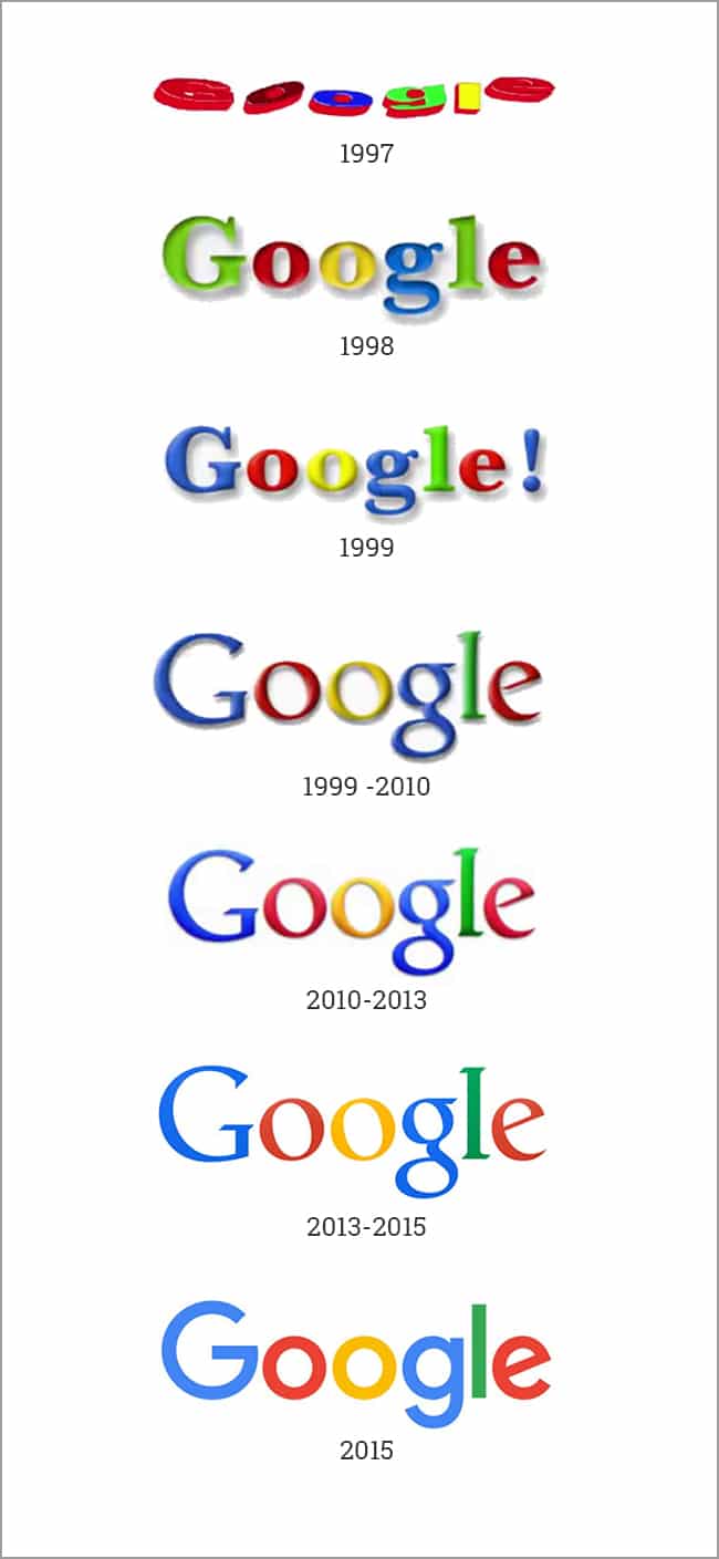
Evolution of Google's logo.

How to know if it’s time for a logo refresh

There are any number of reasons that your logo may need to be refreshed because there are any number of reasons why your branding may be less effective than it should be.  Here are some of the most common reasons:

Your logo looks old

While the average consumer may not look at your logo and think that the typography is dated, or that the glossy nature of your icon indicates that it was designed in the 90s-2000s, they probably can tell you that your logo feels old and out of touch.

Whether we like it or not, design is, in many ways, a cycle of trends, just like fashion.  And just like trends in clothes, eyewear, or hairstyles, it doesn’t require expert training to identify outdated styles.

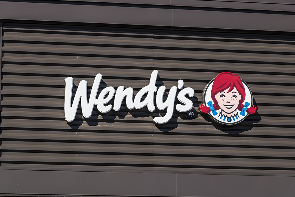
Here’s a great example of taking a dated logo and refreshing it, while effectively retaining its most recognizable features:
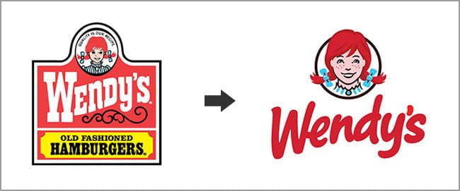
Wendy's logo refresh

Your logo is busy/complicated

More than ever, your busy logo may be hurting your brand.  Busy logos have existed since the dawn of logos.  In fact, many of the first logos were complex line drawings.  In the digital era, complex logos don’t translate well onto the screen that we use every day.

Whether it’s scaling your logo down on the mobile version of your website, or using your logo on your social media accounts, simple is better in the modern world.  Here are three examples of icons that were simplified while maintaining their brand equity:
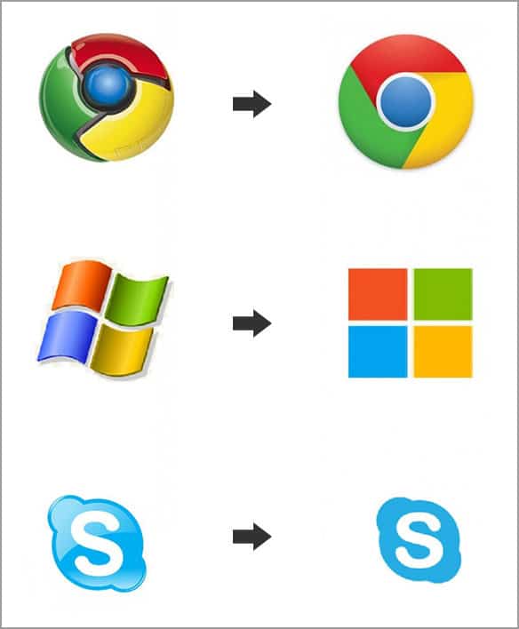
logo too complicated

Your logo no longer represents your company well

Good businesses evolve with the changing times and good brands evolve with them.  It’s important that your brand represents your company, and as your company changes, it only makes sense that your logo would evolve as well.

Take Wells Fargo, for example.  Wells Fargo started as primarily a financial courier services company but has slowly evolved into primarily a banking and financial institution.  While they still use the iconic stagecoach to represent their long and storied history in marketing collateral and advertising, it has been phased out of their logo.
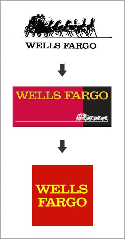
logo does not represent company well - shows evolution of Wells Fargo  logo.

You’ve established that your logo is dated, and busy; it doesn’t represent the evolution of your company, or perhaps all three  – it’s time for a refresh.  Keep these guidelines in mind during your logo refresh project.

Trendy designs will age more quickly

When you go through the process of redesigning your logo, you or others involved may be tempted to design something that is really stylish or super trendy.  Don’t do this; you will regret it when you find yourself back at the drawing board with a dated logo again in just a few short years.

Let’s return to the fashion analogy for just a moment.  When thinking about the design of your logo, you want to create a simple black dress or a pair of blue jeans.  These items are versatile, never go out of style, and only require minimal updates to be brought up to date.  These are the traits that you want to cultivate in your logo.

Consider your logo usage

Designing a logo today may be more difficult than ever, given the sheer number of mediums, both online and offline, in which your logo will be used.  Ensure that you consider and share with your designers all the ways you plan to use your logo.

You can assume that you will use your logo on various digital applications, like your website and social media, but be sure that you consider other applications like outdoor advertising, promotional products, print collateral, signage, and/or car wraps.

Identify and keep key features

Ensure that you begin the logo refresh project by identifying the features of your logo that are key to your brand recognition.  Maintaining and growing your brand awareness and brand preference needs to be top of mind during your refresh process.

Work with your designers to simplify and modernize your current brand without completely losing elements of the logo that people associate with the brand.

It’s not an art project

Don’t get carried away with your logo refresh project.  It’s not an art project and should not be treated as such.  Yes, there is a strong artistic element involved in logo design best practices, but your logo is a functional tool in your marketing toolbox and should be designed in such a way.

Avoid trying to make your logo cool.  Instead, focus on creating an effective graphic representation of your business.  If you have accurately captured your business, then your logo should be appealing to your target audience.  When in doubt, stick with the mantra “clear, not clever.”

The Take-Away

Assessing the effectiveness of your brand should be something that you regularly do, with special attention given to the design aspect of your brand at least every few years.

If you are honest with yourself and approach the subject as objectively as possible, you will know if it is time for you to refresh your logo.

If you still aren’t sure if it’s time to refresh your logo, consult a professional logo design agency for a logo consultation.

Marketing emails you’ll actually want to read.

Get marketing tips and news sent to 
your inbox.
This field is for validation purposes and should be left unchanged.
Name(Required)

What are Print Finishing Services?

You may have experienced this for yourself.  You’ve worked diligently for weeks perfecting the content and design of a print piece.  You take it to your printer, ready to just drop off the files and move on to the long list of things you just haven’t had time to to get done.  That’s when the questions start.

Do you want this on a 100lb stock?  Are you thinking of using a nice linen for this piece?  Any coatings?  UV Spot?  Foil Stamping?  Did you want this laminated?

At this point, you are most likely either blankly staring back at them or beginning to pull your hair out.  Don’t worry.  It’s a common reaction.  There are a ton of options for printing, and it can be overwhelming.

The best approach for finding and using the right print finishes is to design with a finish in mind.  It eliminates those last-minute decisions and can inform the design choices that you make.

Here are the most common print finishes, how they are applied, and how they look.

Paper stock

Paper Stock examples

Ok, so paper stock is not a print finish, but in any print conversation it must be top of mind.  The quality of the stock you choose has a lot to do with your brand style and the look and feel that you are trying to achieve.  It should work with your design to project a professional image that reinforces your brand.

Single page items like postcards and business cards are usually printed on thicker, heartier paper stocks.  A 16-point paper stock is a very common choice. For multi-sheet projects like catalogs, a combination is more appropriate.  Use a thick stock for the cover and a thinner stock for interior pages.  Using a thinner stock for interior pages also has the added benefit of saving you money.

Outside of the thickness of the paper stock that you choose, there are texture considerations.  Laid, linen, ribbed and felt are all options that can add a wonderful tactile as well as a visual element to your print pieces.

Lamination

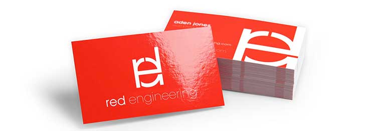
Lamination example

Lamination adds a layer of protective coating to your print pieces.  Lamination comes as either a glossy or matte finish.  In addition to its visual enhancement, lamination adds strength and resistance to moisture.

High gloss lamination is often applied to prints to enhance the contrast and sharpness of the design.  Matte laminated prints may appear quieter but with an added element of luxury and elegance.

Lamination is a lot like varnishes.  However, while it can create appealing visuals, lamination is typically more expensive and used in situations where added strength is a requirement, like in the case of soft covered books.

UV / Varnishing

UV/Varnishing example

Varnishing is the process of applying a liquid coating to your printed pieces.  It comes in a variety of options—matte, glossy, satin or UV.

UV (ultraviolet) varnishing is very popular, relatively cost-effective, and adds a particularly high-gloss, shiny coating. It is achieved with the use of special machines that incorporate ultraviolet light to “cure” the coating and achieve the final effect.

Spot UV

Spot UV example

A spot UV finish is the application of a UV varnish to very specific areas of the printing surface before it is cured or hardened during the printing process. The results are a glossy coating on only the specified surface areas of your print.

Spot UV can be a very effective approach for visually separating similarly colored areas, or creating a false sense of depth.

Embossing

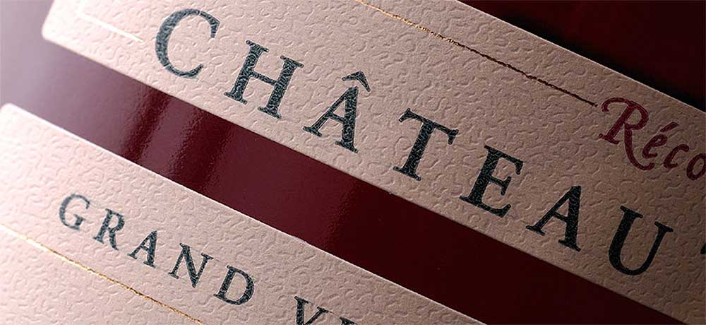
Embossing example

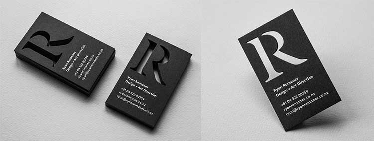
Embossing is achieved when a three-dimensional die is used to stamp a desired design or shape into a print piece.  Don’t confuse embossing with letterpress, or “debossing.”  The two are very similar and often confused.  Embossing makes an impression on the paper, raising the desired design off of the paper and toward the viewer as they look at it.

There are two different techniques for embossing, blind and matched. Think of them as with and without color.

Blind embossing is achieved by simply pressing the stock, as is, with a stamp. A matched embossing is achieved by first printing color on the paper and then pressing the stamp directly on top of that color to achieve the desired effect.

In many ways, embossing has waned in popularity over the years.  Compared to some coating options, embossing can be pricey.  However, if used correctly, it creates a sense elegance that is unmatched and is still fairly common in many industries today, including legal, medical, and design.

Letterpress / debossing

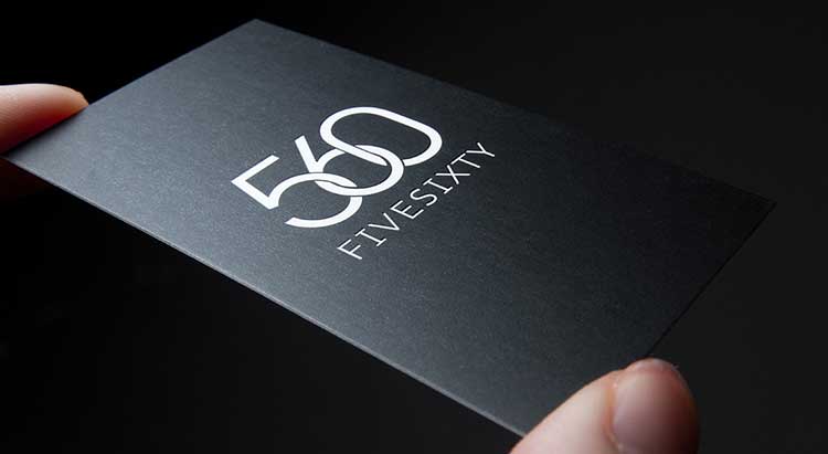
Letterpress / debossing example

Letterpress, also known as debossing, is the physical opposite of embossing. Instead of using a stamp to raise a pattern off of the paper, letterpress depresses or indents the pattern into the stock to achieve the desired result.  Like embossing, letterpress can be accomplished with either a blind or color printed technique.

Given a higher threshold for cost within the industry, letterpress is most commonly used for printing wedding invitations, though its use on business cards has been growing in popularity.

Foil Stamping

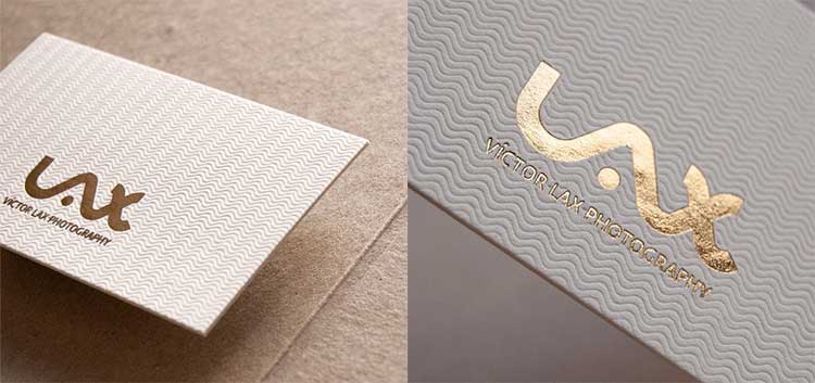
Foil Stamping example

Similar to gold leaf, foil stamping is a thin, usually metallic, finish that is applied in a visually similar way to spot UV.  Unlike a spot UV, however, foil stamping is accomplished with machines that use heat to transfer metallic foils to a print stock.

Foils come in a large selection of colors.  Naturally, the most commonly used colors are gold, silver, and bronze, though foils with pearlescent and holographic effects are also very popular.

Die-Cut

Die-Cut example

Any print piece that is cut to an unusual size or shape is considered a die-cut. Creating a die-cut print piece requires the manufacturing of a specially designed cutting tool, or “die”, that is used to punch the shape out of the stock.

To create a die-cut design, a template or “die-line” must be created to the specifications of the die.  A designer can then design to that specific die-line.  As you can imagine, die-cutting is one of the more complicated and therefore expensive print finishings.

Some commercial printers offer a selection of pre-designed die-lines the can be used to create die-cut designs without the cost of manufacturing your own custom die.  These can be great solutions for creating unique print pieces in a cost effective manner.

The Take-Away

If there is one takeaway we would want you to walk away with, it would be this; ask questions.

When you’re working with a designer or printer, and they throw out some print jargon that you don’t understand, don’t just smile and nod to avoid some sort of embarrassment.  It’s not your responsibility to know all of this; it’s their responsibility to explain it.  So, ask questions, lots of questions.

As much as possible, try to decide on the desired print finish before you begin to design a piece.  In many cases, the finish will inform the design.

Reach out to us with any questions that you may have, we have over 30 years of experience with Houston graphic design and brochure design and printing in Houston, and can walk you through just about an obstacle you are facing.

Image sources:  Paper stock | Foil Stamping | Spot UV | Lamination | Letterpress | Die-Cut | Embossed

Marketing emails you’ll actually want to read.

Get marketing tips and news sent to 
your inbox.
This field is for validation purposes and should be left unchanged.
Name(Required)


Print Design Trends To Watch In 2017

Let’s look at the top trends we anticipate seeing in print designs for the year.

“Authentic” is the word of the year

Last year was a turbulent year, filled with uncertainty and anxiety for many. On the political stage, we witnessed a rise of populism characterized by an overwhelming distrust of large corporations. Marketers across the country sat up and took notice and “authenticity” will reign supreme this year as companies large and small try to shed the slick corporate veneer of which so many have struggled to let go. Approachable, familiar, and personal designs will replace glossy, aspirational, high dollar designs. National brands will actively work to appear “local, ” and high-end brands will try to maintain the luxury status while projecting less elitism. Here are some examples of print design trends that we think will play a role in this shift away from the traditional in 2017.

1. Vintage-Modern

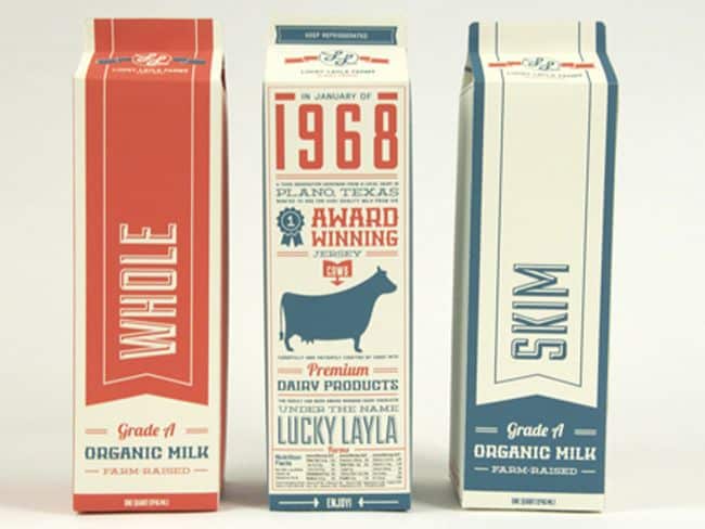
Vintage-inspired Milk Carton Designs

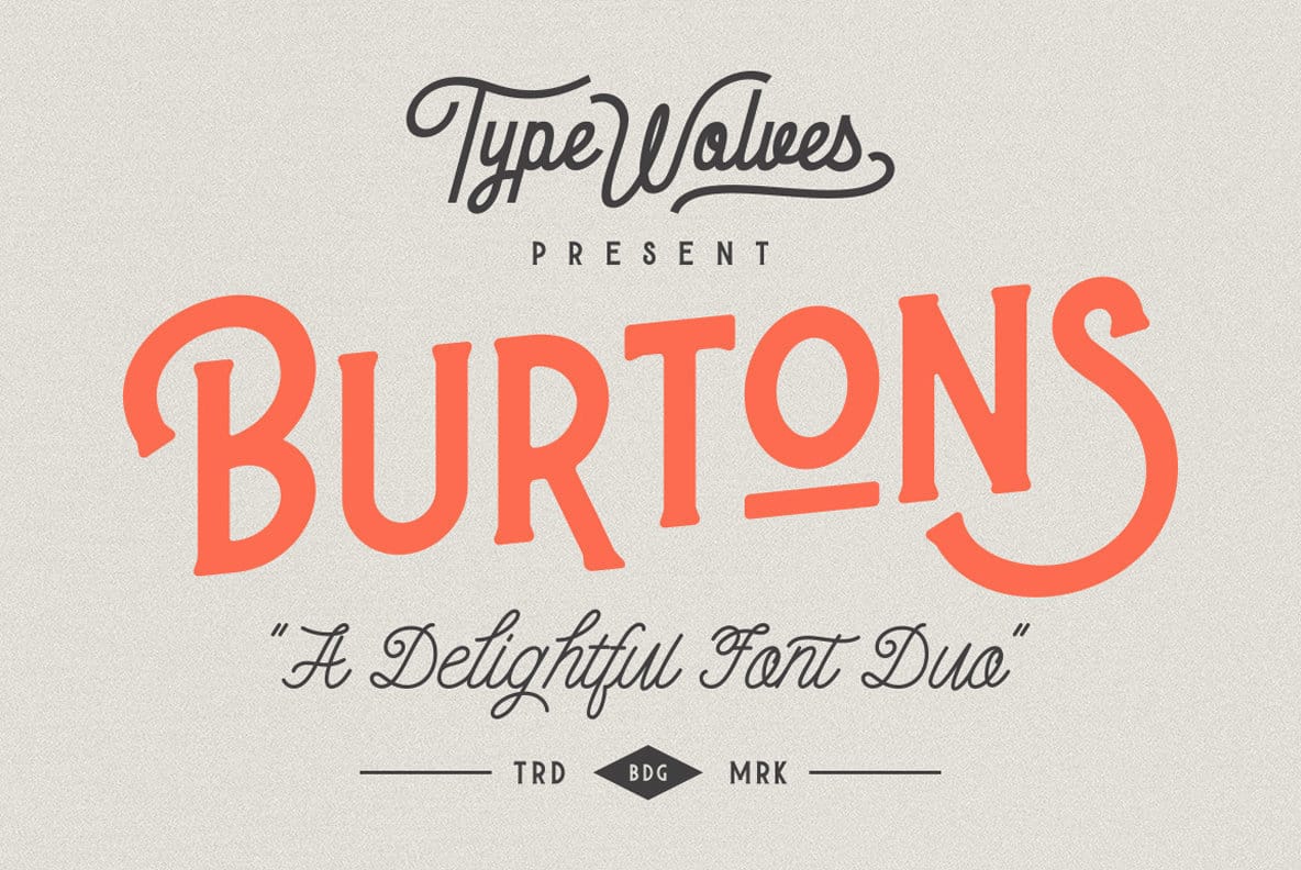
Vintage-modern isn’t a new trend, but it’s far from losing steam. We will see an even stronger push towards vintage-modern in print this year as the power of localization continues to gain marketing momentum. Characterized by retro typefaces and color pallets on a modern face, vintage-modern designs are the antithesis of the sleek corporate designs of the early 2000s. Vintage-modern has become a very popular trend in the world of branding design as well, giving it a high likelihood of being around for a long while. This retro style is best suited for, and most often used by companies that want to drive home the “local” or “family owned and operated” feel for their brand.

 2. Minimalism

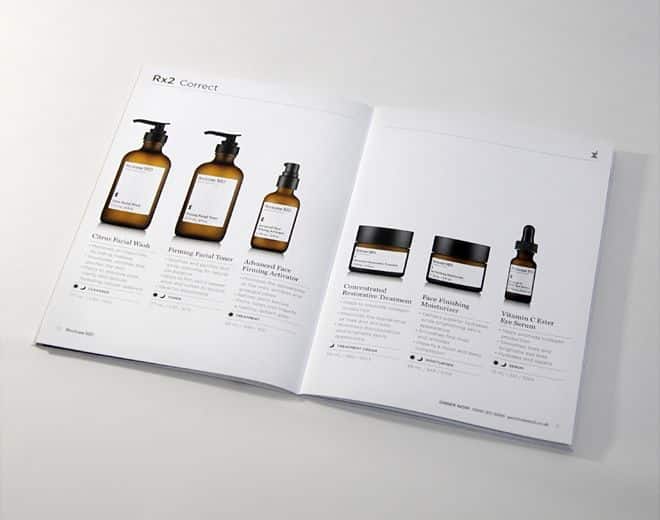
Minimalist packaging and labeling

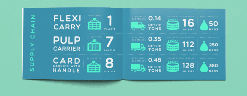
Another well-established style, minimalism is characterized by a strong use of white, or empty space surrounding key elements of a design. “Don’t be afraid of the white space” is a common encouragement you’ll hear just about any designer passing on to his clients. White space is a necessary, though often misunderstood, element in design. It allows the most important aspects of a design to stand out. Minimalism takes this to the next level, using empty space to create a distinct, often elegant, style in and of itself. You’ll continue to see higher-end companies moving toward minimalism in their print designs and particularly in their catalogs. It fits well into the “uncluttered” trend that you see across the country as people explore minimizing their lives.

3. Custom Illustrations / Handmade

Custom illustration examples

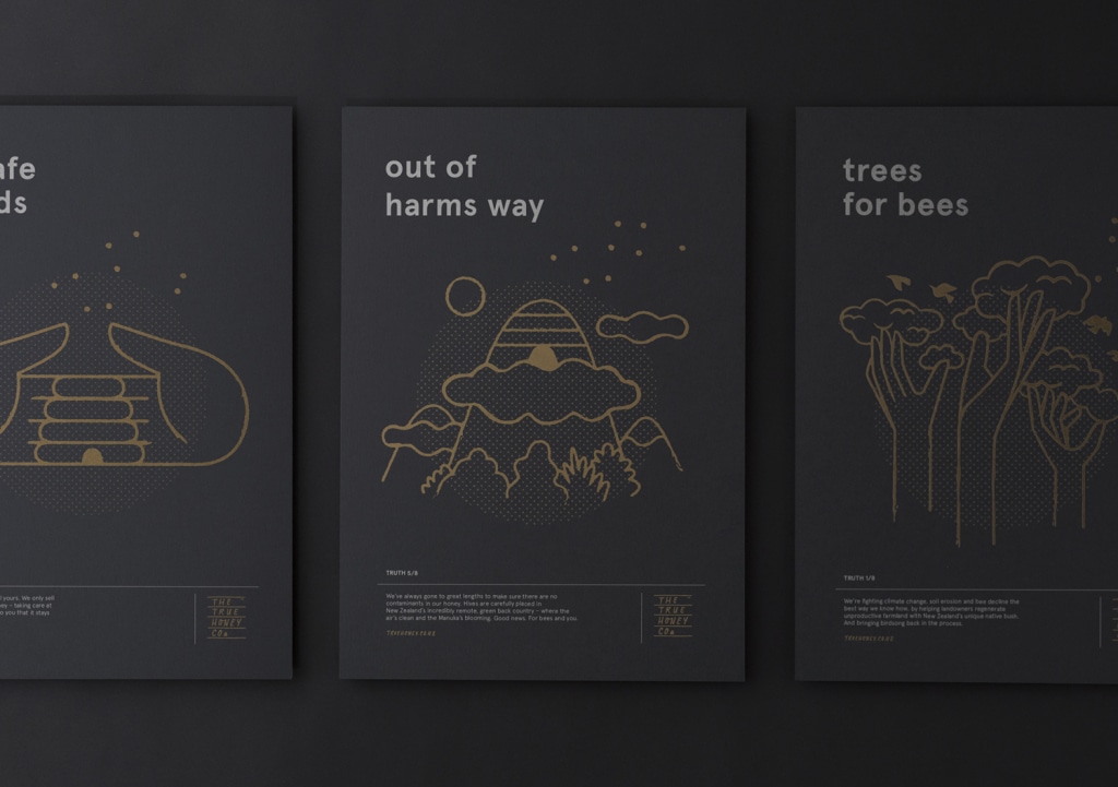
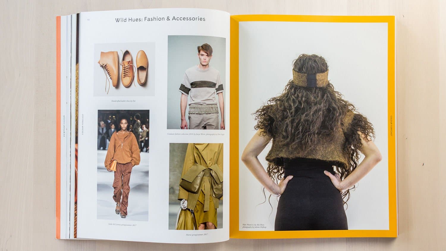
These illustrations by New Zealand’s Marx Design are a great introduction to our third trend.  It’s no surprise that, in a year where distrust of large corporations is rampant, “handmade” designs would trend. Custom illustrations lend a personality to a design that is hard to fake. People tend to see these “handmade” designs as sincere, trustworthy and honest. Be prepared to see this trend flow up to the very top as even large corporations try to take advantage of the humbling power of custom illustrations.

4. Unique Typography

Superb typography based design

We may be in the middle of the typography renaissance, but just like the vintage-modern trend (and possibly married to it), unique typography will continue to play a significant role in designs this year. With sites like You Work For Them churning out absolutely stunning typefaces, designers have vast resources available at the click of a mouse. These resources enable designers to easily pair brands with fonts that are so on-brand they might as well be custom. Companies will use these unique fonts to express their personality, better convey their marketing messages and connect on an emotional level with their target audience. The real beauty of typography is that it can be used to reinforce brand personalities stretching across the gamut. Among other things, like SEO for law firms in Houston, a small to mid-sized law firm could use a distinctive serif to reinforce the professional nature of their business. A national skateboard clothing company could use a chunky sans-serif to strengthen the hip nature of their brand. Or, just to tie it all together, a local jam company could combine a retro font, minimalist design and custom illustration to reinforce the “handmade” nature of their products and give a local feel to their brand.

5. Flat Design

flat design example

By this point, everyone should be familiar with flat design. It made a big splash in 2016. Wikipedia describes it as “a style of interface design emphasizing minimum use of stylistic elements that give the illusion of three dimensions (such as the use of drop shadows, gradients or textures) and is focused on a minimalist use of simple elements, typography, and flat colors.” We even witnessed one of the largest, most recognizable brands in the world, Google, redesign their logo as a flat design. It’s not breaking news that we would continue to see flat designs play a prominent role online, but we think this year will see a jump from screen to paper for flat designs. Flat design has come to represent the modern look in the post-glossy online world, and it will continue to be popular, especially with companies in the tech sector, in 2017.

6. Candid Photography

Non stock photographic, instagram inspired photography examples

Welcome to the social media age. This year will see companies large and small abandoning traditional photo shoots for shots that mimic the candid, authentic nature of the photography that people regularly see on social media. Faithful to the word of the year, authentic imagery is the name of the game moving forward as people are increasingly turned off by images that are obviously stock photography and images that feel disconnected from real life. Marketing Experiments performed a test comparing the use of stock photography versus real imagery on a website and each of their effects on lead generation. What they found was that photos of real people out-performed the stock photos by 95%. Stock images tend to feel irrelevant or unauthentic. Any company that uses photography at any level of their marketing should take this shift in society’s aesthetic tastes seriously. This doesn’t mean that stock photography can’t be used, only that more care should be taken to find stock images that are appropriate and feel genuine.

Beyond Print Design

Without question, one of the over-arching trends that will define print design in 2017 orbits around the desire for companies to come across to potential customers as more authentic. Most of these trends, however, won’t be confined to use print designs only. You will see these and similar trends creeping into TV and Radio advertising, social media strategies, content marketing, and overall branding strategies.

Marketing emails you’ll actually want to read.

Get marketing tips and news sent to 
your inbox.
This field is for validation purposes and should be left unchanged.
Name(Required)

E-learning Pocket Brochure with Stepped Inserts

brochure with pocketRecently, MARION developed an impressive, custom designed capabilities pocket brochure for K Alliance, an e-learning company. MARION worked with the company to develop the content and our design team did a tremendous job on the layout and graphics.  The brochure has four pages plus a cover measuring 9”x12” and included four stair-stepped inserts in the back pocket. The inserts provided information on four of K Alliance’s most prominent product and service offerings, such as information technology training, soft skill training, desktop applications training, and the enterprise server library. K Alliance ordered 1500 copies of the brochure design for their sales team and to be mailed as part of a larger mail campaign to prospective clients.

K Alliance is an e-learning corporation, specializing in the most comprehensive educational solutions available on the market. Their mission is to continually provide a superior level of creating and delivering high quality, instructional, educational content.

For more information on our Houston brochure design services and how we can help create them for your company, please contact us.

Marketing emails you’ll actually want to read.

Get marketing tips and news sent to 
your inbox.
This field is for validation purposes and should be left unchanged.
Name(Required)